Chart Reports transform raw data into intuitive visual representations that make it easier to identify trends, compare values, and analyze relationships at a glance. These visual formats are especially useful for dashboards, presentations, and decision-making scenarios where clarity and quick interpretation are essential.
Quixy offers a wide range of chart types that help you convert complex datasets into meaningful insights. Whether you’re tracking project timelines, comparing performance metrics, or analyzing statistical patterns, Chart Reports provide the flexibility to visualize data in the format that best supports your goals.
Note
Chart Reports do not alter your source data. They visually represent your data to support faster comprehension and analytical decision-making.
Quixy offers two ways to create chart-based visualizations:
- Chart Report
- Charts Report
Both options use the same charting engine and present data visually in the same way. The difference lies in how many charts you want to display at once.
¶ 1. Chart Report
A Chart Report allows you to create one chart at a time. It is ideal when you want to focus on a single visualization, such as:
- A trend line for monthly performance
- A bar chart comparing category totals
- A pie chart showing percentage distribution
Chart Reports are best suited for individual reports, printed summaries, embedded visuals, or when you need one clear insight at a time.
¶ 2. Charts Report
A Charts Report allows you to create multiple charts in a single consolidated view. This option is useful when you want to:
- Compare different metrics side by side
- Display multiple visualizations on one page
- Build analytical report pages without creating a dashboard
Charts Reports enable richer analytical storytelling because they bring several visual perspectives together in one place.
¶ 3. Initial Setup for Chart Reports
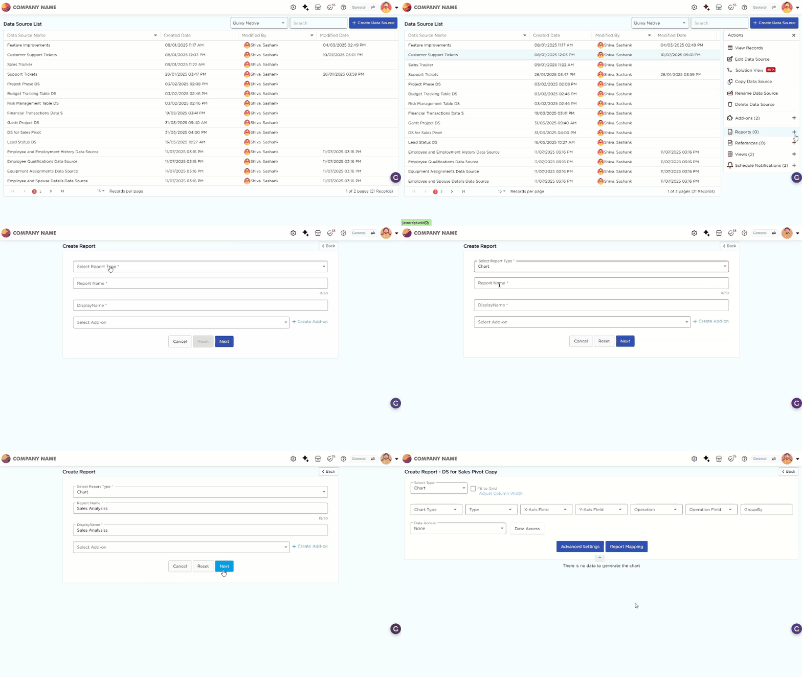
Before configuring any chart type, you must complete the initial report setup. These steps are common for all chart reports and remain the same regardless of the chart type you choose. You can create a chart report in two ways.
¶ 3.1. From the Data Source List Page
- From the Data Source List Page, select the required data source to create a report.
- Click the selected data source to open the Actions panel on the right.
- Click the "+" icon corresponding to the Reports option in the Actions panel to start creating a new report.

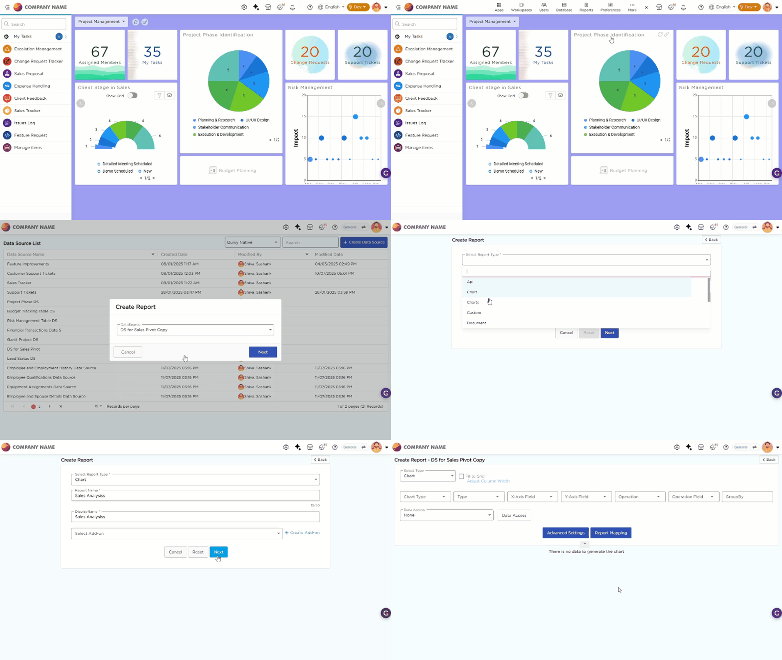
¶ 3.2. From Admin Menu
- Go to Admin Menu → Reports → Create Report.
- Select the data source that you need to use to generate reports. The report configuration page opens.
- From the Select Report Type drop-down, select Charts.
- Enter the Report Name and Display Name.
- Click Next. The Chart configuration page opens.

¶ 4. Types of Charts
Chart Reports help you understand data through visual formats, making it easier to spot patterns, relationships, and deviations that may not be obvious in tables or text. Below is the list of chart types available in Quixy, along with a description of how each one helps you interpret your data.
| # | Chart Type | Description |
|---|---|---|
| 1 | Gantt Chart | Gantt Chart helps you visualize project schedules, tasks, durations, and dependencies. It is ideal for project tracking and timeline planning. |
| 2 | Multiple Series Chart | Multiple Series Chart displays more than one dataset on a single chart, helping you compare trends between multiple variables over time. |
| 3 | Area Chart | Area Chart highlights the magnitude of data values over time by filling the space beneath the line. It is useful for showing cumulative totals or quantities. |
| 4 | Bar Chart | Bar Chart uses horizontal or vertical bars to compare values across categories. It is one of the simplest and most effective comparison tools. |
| 5 | 3D Chart | 3D Chart adds three-dimensional depth to standard chart types, enhancing visual appeal and making complex data relationships easier to interpret. |
| 6 | Histogram | Histogram helps you visualize frequency distribution by grouping data into ranges. It is commonly used for statistical analysis. |
| 7 | Line Chart | Line Chart connects data points with straight lines to show how values change over time. It is ideal for trend analysis and performance tracking. |
| 8 | Pareto Chart | Pareto Chart combines bars and a cumulative line to help you identify major contributors to a problem. It follows the 80/20 principle for root-cause analysis. |
| 9 | Pie Chart | Pie Chart shows category proportions as slices of a circle. You use it to understand how each category contributes to the whole. |
| 10 | Polar Chart | Polar Chart displays data in a circular layout with values plotted along radial lines. It is useful for comparing multivariate datasets. |
| 11 | Radar Chart | Radar Chart plots multiple variables on axes arranged radially, helping you compare strengths, weaknesses, or performance patterns across categories. |
| 12 | Scatter Chart | Scatter Chart uses dots to show the relationship between two variables. It is commonly used for correlation analysis. |
| 13 | Stock Chart | Stock Chart visualizes financial or stock-market-related data such as opening, closing, high, and low values. |
| 14 | Waterfall Chart | Waterfall Chart helps you visualize cumulative changes from one value to another, showing how increments and decrements contribute to the final outcome. |