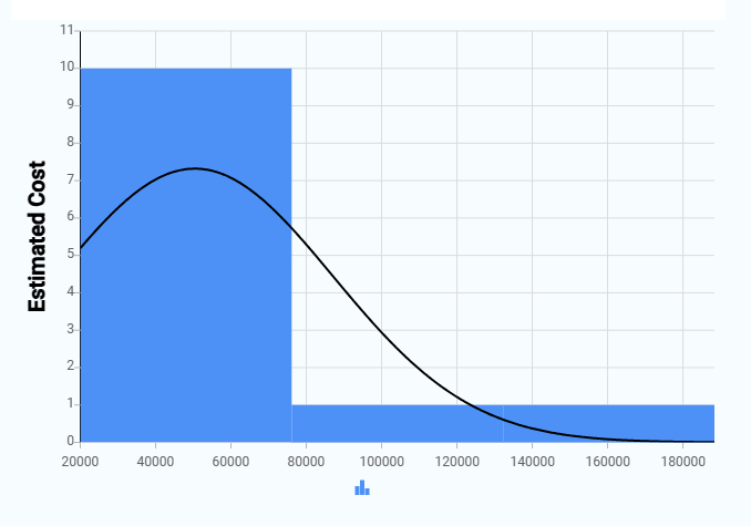
A Histogram displays the distribution of numeric data across value ranges. It groups records into system-generated intervals and shows the frequency of records in each range.
¶ 1. Key elements of a Histogram
- X-axis: Shows value ranges that are created automatically from the numeric field you select in the Y-Axis field. You do not select the X-axis manually.
- Y-axis: Shows the number of records in each value range. Higher bars mean more records fall into that range.
- Bars: Each bar represents how many records fall within a specific value range. All bars have equal width.
¶ 2. How to create a Histogram
After completing the initial setup for chart reports, configure the Histogram using the following steps from the Chart Configuration page:
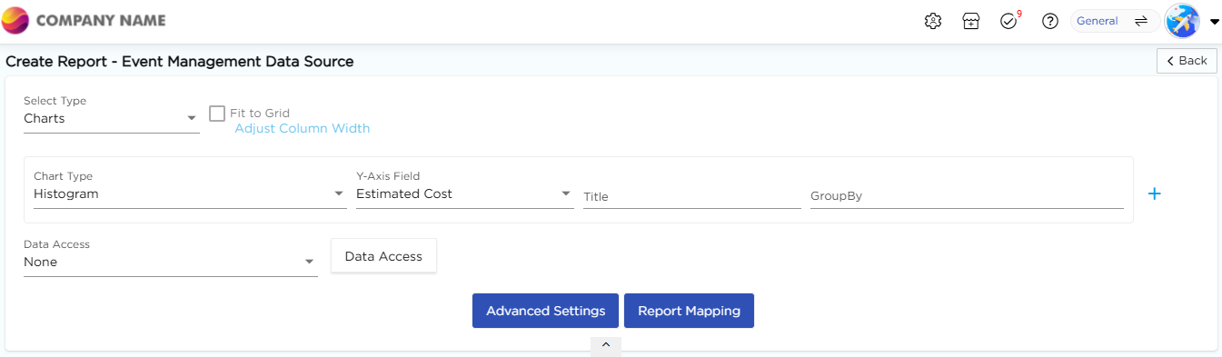
- In the Chart Type drop-down, select Histogram.
- In the Y-Axis Field drop-down, select the numeric field to analyze.
- In the Title column, enter the chart title.
- In the GroupBy column, select a field if grouping is required.
- Click Report Mapping if field mapping is required.
- Click Advanced Settings if additional configuration is required.
- Click Save to generate the Histogram Chart.
Note
For details on Advanced Settings, Report Mapping, and GroupBy configuration, refer to the Chart Configuration Overview article.