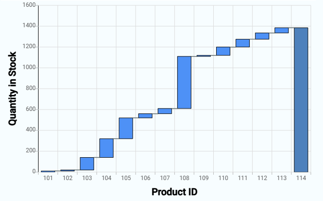
A waterfall chart, also known as a cascade chart or bridge chart, provides a visual representation of data that helps in tracking the increment and decrement of values. It starts with an initial value, followed by intermediate values that are added or subtracted, and ends with the final value. Each bar in the chart represents a value, and the bars are color-coded to distinguish between increases and decreases.
¶ 1. Key Components of a Waterfall Chart
- Initial Value: The starting point of the chart, often represented as the first bar.
- Intermediate Values: These are the changes (positive or negative) that occur sequentially, represented by floating bars.
- Final Value: The ending point of the chart, which is the cumulative result of the initial value and all intermediate changes.
¶ 2. How to create a Waterfall Chart
After completing the initial setup for chart reports, configure the Waterfall chart using the following steps from the Chart Configuration page:
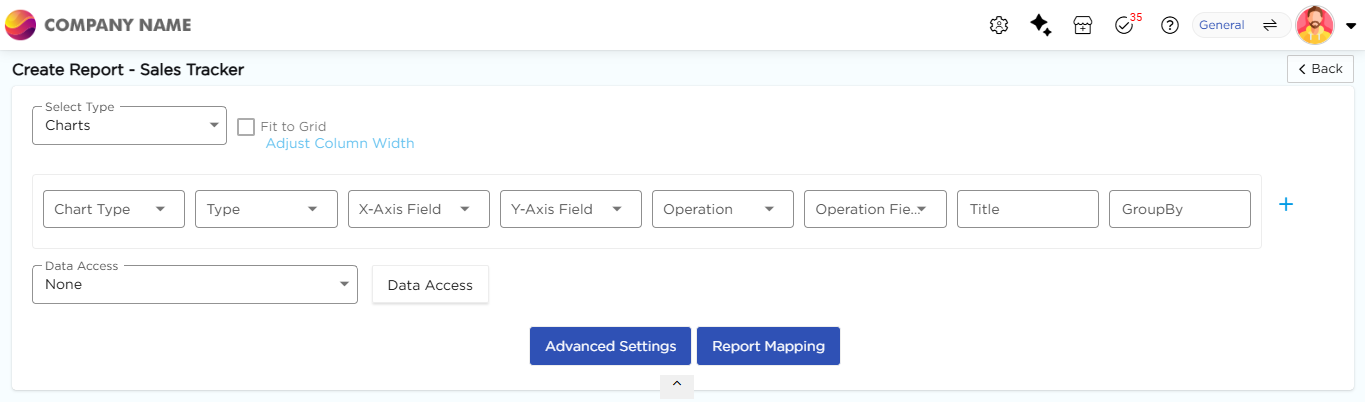
- In the Chart Type drop-down, select Waterfall.
- In the Type drop-down, select the sub-type for the selected chart type.
- In the X-Axis Field drop-down, select the category field.
- In the Y-Axis Field drop-down, select the numeric field.
- In the Operation drop-down, select the required operation such as Count, Sum, or Average.
- In the Operation Field drop-down, select the numeric field.
- In the Title column, enter the chart title.
- In the GroupBy column, select a field if grouping is required.
- Click Report Mapping if field mapping is required.
- Click Advanced Settings if additional configuration is required.
- Click Save to generate the Waterfall Chart.
Note
For details on Advanced Settings, Report Mapping, and GroupBy configuration, refer to the Chart Configuration Overview article.