A Multi-Series Chart displays more than one chart type in a single report. It allows multiple data series to be plotted together using different chart formats such as Line, Bar, Area, or Scatter. This helps compare related datasets in one view instead of creating separate charts.
For example, one series can be shown as a bar chart and another as a line chart on the same graph. This makes it easy to compare trends, values, and patterns across datasets.
¶ 1. How a Multi-Series Chart Works
- Each series represents a separate dataset.
- Each series can use a different chart type.
- All series share the same X-axis for easy comparison.
- Values are plotted together in one combined view.
This is useful when tracking multiple metrics across the same category or time period.
¶ 2. How to create Multi-Series Chart
After completing the initial setup for chart reports, configure the Multi-Series chart using the following steps from the Chart Configuration page:
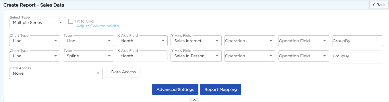
- In the Select Type drop-down, select Multiple Series.
- In the Chart Type drop-down, select Line.
- In the Type drop-down, select the required sub-type such as Line or Spline.
- In the X-Axis Field drop-down, select the required field.
- In the Y-Axis Field drop-down, select the required field.
- In the Operation drop-down, select the required operation such as Count, Sum, or Average.
- In the Operation Field drop-down, select the field for calculation if required.
- In the GroupBy field, select a field if grouping is needed.
- Click Report Mapping if field mapping is required.
- Click Advanced Settings if additional configuration is required.
- Repeat the above configuration to add multiple series.
- Click Save to generate the Multi-Series chart.
Note
For details on Advanced Settings, Report Mapping, and GroupBy configuration, refer to the Chart Configuration Overview article.
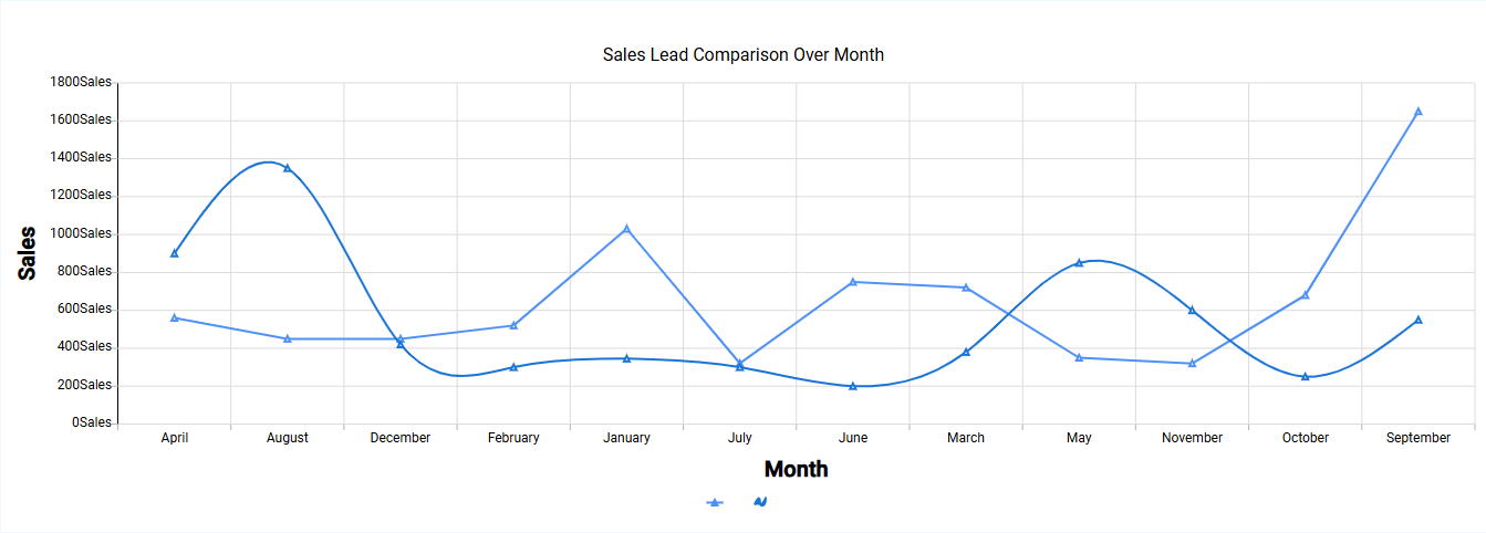
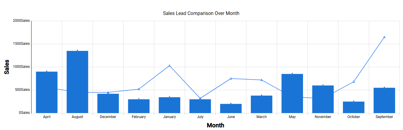
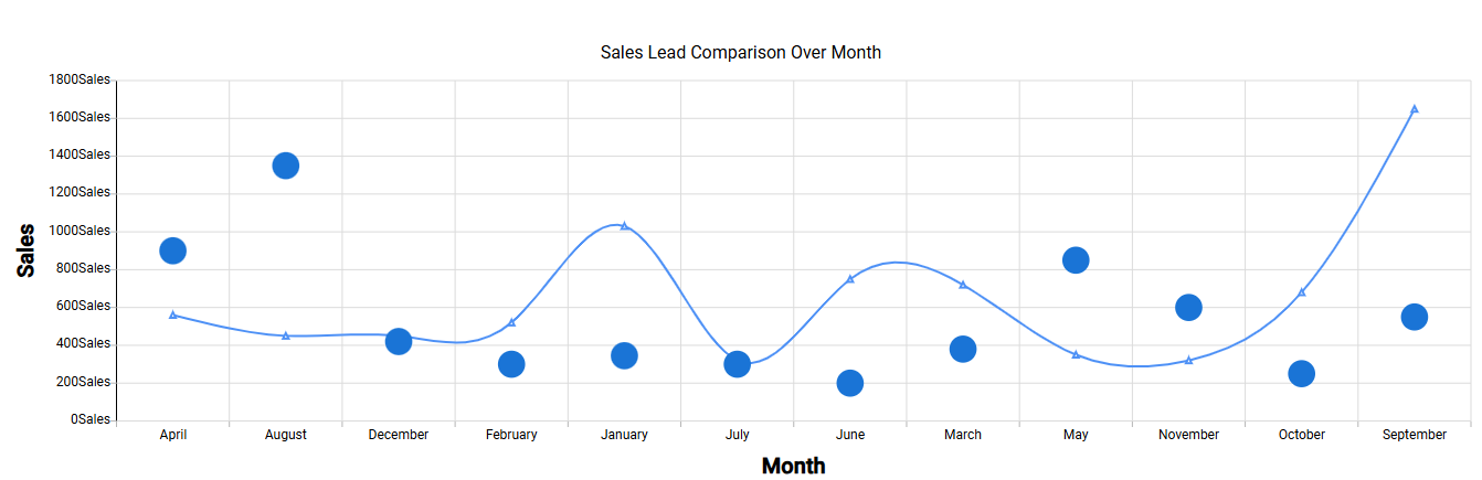
¶ 3. Supported Chart Combinations
In a Multi-Series Chart, you can combine different chart types to compare multiple datasets on the same axis. Common combinations include:
| Chart Combination | Image |
|---|---|
| Line + Bar |
 |
| Area + Line |
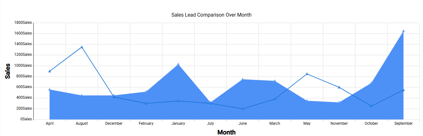 |
| Line + Scatter |
 |