Bar charts are one of the most commonly used types of charts for displaying comparisons between different types of data and variations of different values. A bar chart can be oriented horizontally or vertically and uses rectangular bars of varying lengths that are proportional to the value being visualized. Because the horizontal rectangles have enough space to fit textual information, you can display long data labels.
¶ 1. How to create Bar chart
After completing the initial setup for chart reports, configure the Bar chart using the following steps from the Chart Configuration page:
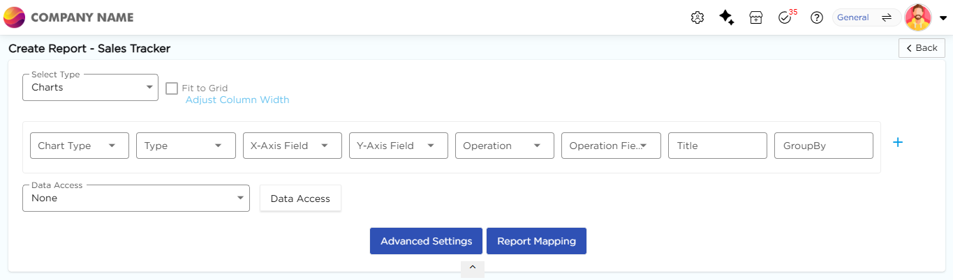
- In the Chart Type drop-down, select Bar.
- In the Type drop-down, select the sub-type for the selected chart type.
- In the X-Axis Field drop-down, select the category field.
- In the Y-Axis Field drop-down, select the numeric field.
- In the Operation drop-down, select the required operation such as Count, Sum, or Average.
- In the Operation Field drop-down, select the numeric field.
- In the Title column, enter the chart title.
- In the GroupBy column, select a field if grouping is required.
- Click Report Mapping if field mapping is required.
- Click Advanced Settings if additional configuration is required.
- Click Save to generate the Bar Chart.
Note
For details on Advanced Settings, Report Mapping, and GroupBy configuration, refer to the Chart Configuration Overview article.
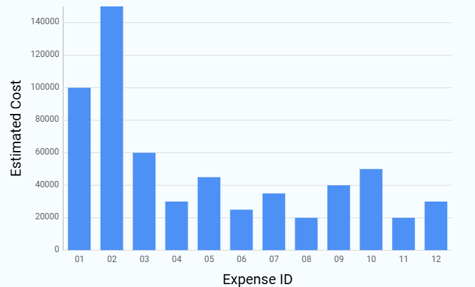
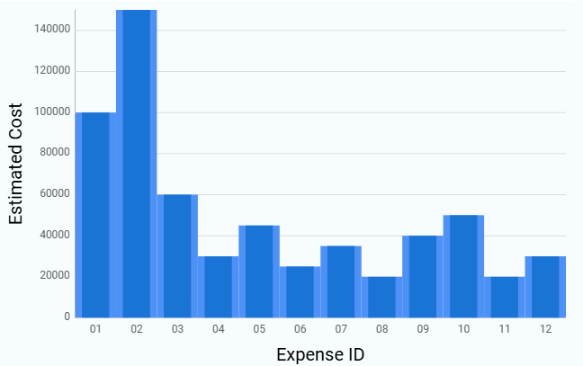
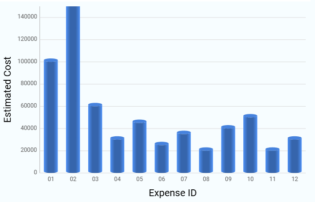
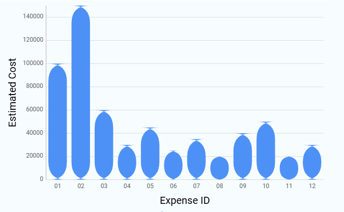
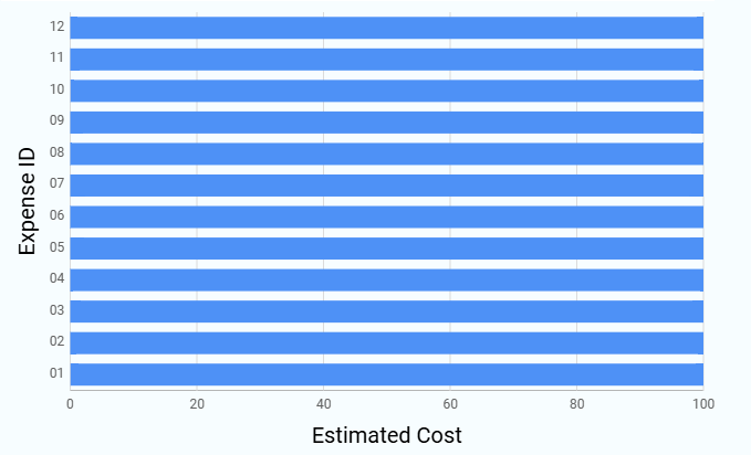
¶ 2. Bar Chart Types
The following subtypes are available under Bar Chart. All subtypes follow the same configuration flow, and only the visual representation differs. Sample visuals for each Bar chart subtype are shown below for reference.
| Chart Sub-Type | Image |
|---|---|
| Column |
 |
| Back to Back Column |
 |
| Cylindrical Column |
|
| Rounded Column |
|
| 100% Stacked Bar |
 |