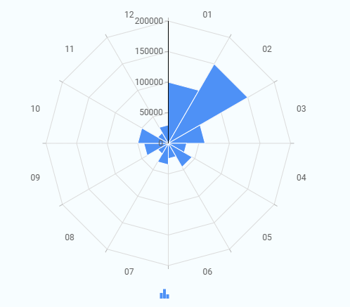
A Radar Chart displays values for different categories around a circular layout. Each category is shown as a line starting from the center, and the length of the line represents the value for that category. When these values are connected, they form a shape that makes it easy to compare multiple categories in a single view and quickly see which ones are higher or lower.
¶ 1. How a Radar Chart Works
- Each category is placed around the circle as an axis.
- Values are plotted outward from the center along each axis.
- The distance from the center represents the value.
- The connected points form a shape that shows variation across categories.
¶ 2. How to create a Radar Chart
After completing the initial setup for chart reports, configure the Radar chart using the following steps from the Chart Configuration page:
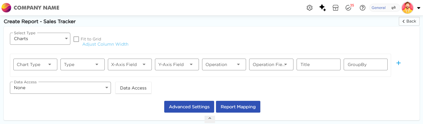
- In the Chart Type drop-down, select Radar.
- In the Type drop-down, select the sub-type for the selected chart type.
- In the X-Axis Field drop-down, select the category field.
- In the Y-Axis Field drop-down, select the numeric field.
- In the Operation drop-down, select the required operation such as Count, Sum, or Average.
- In the Title column, enter the chart title.
- In the GroupBy column, select a field if grouping is required.
- Click Report Mapping if field mapping is required.
- Click Advanced Settings if additional configuration is required.
- Click Save to generate the Polar Chart.
Note
For details on Advanced Settings, Report Mapping, and GroupBy configuration, refer to the Chart Configuration Overview article.