A Pie Chart displays data as slices of a circle, where each slice represents a category’s share of the total. Quixy provides multiple Pie Chart variants to support different visualization needs.
¶ 1. How to create a Pie Chart
After completing the initial setup for chart reports, configure the Pie chart using the following steps from the Chart Configuration page:
- In the Chart Type drop-down, select Pie.
- In the Type drop-down, select the sub-type for the selected chart type.
- In the X-Axis Field drop-down, select the category field.
- In the Y-Axis Field drop-down, select the numeric field.
- In the Operation drop-down, select the required operation such as Count, Sum, or Average.
- In the Title column, enter the chart title.
- In the GroupBy column, select a field if grouping is required.
- Click Report Mapping if field mapping is required.
- Click Advanced Settings if additional configuration is required.
- Click Save to generate the Pie Chart.
Note
For details on Advanced Settings, Report Mapping, and GroupBy configuration, refer to the Chart Configuration Overview article.
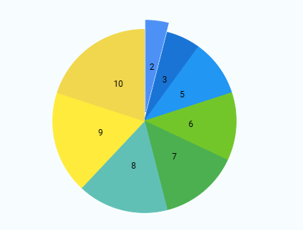
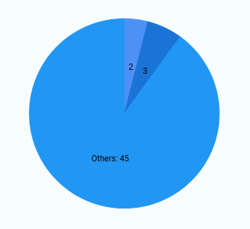
¶ 2. Pie Chart Types
The following sub-types are available under Pie Charts. All sub-types follow the same configuration flow, and only the visual representation differs. Sample visuals for each Line chart sub-type are shown below for reference.
| Chart Sub-Type | Image |
|---|---|
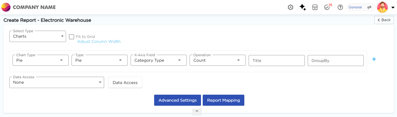
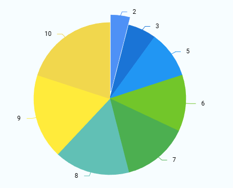
| Pie |
 |
| Pie with Legend |
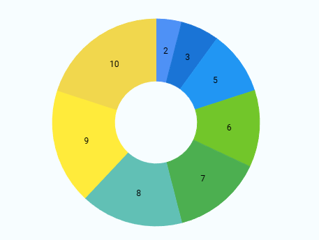 |
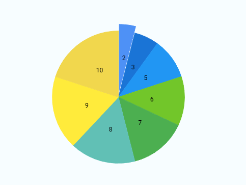
| Donut |
 |
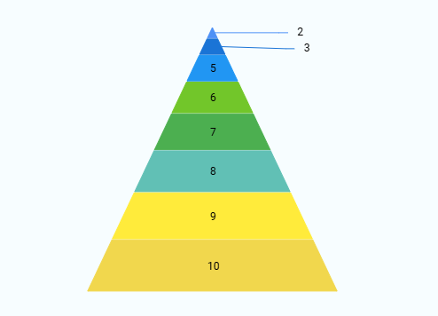
| Pyramid |
 |
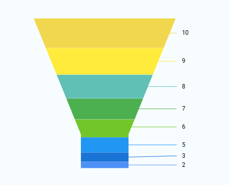
| Funnel |
 |
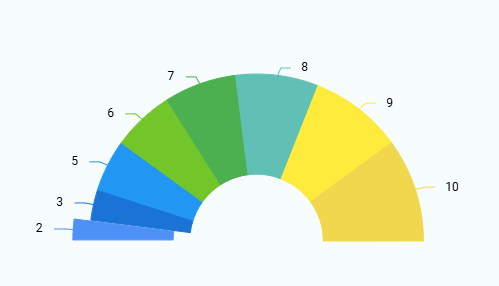
| Semi-Pie |
 |
| Smart Labels |
 |
| Drill-down |
 |
| Grouping |
 |