.png)
Release Notes v4.0, Dated: 02-Dec-2023
- 10 Minutes to read
-
Contributors

Release Notes v4.0, Dated: 02-Dec-2023
- 10 Minutes to read
-
Contributors
Article summary
Did you find this summary helpful?
Thank you for your feedback!
1. Introducing Sandbox: A Paradigm Shift in Quixy's Development and Deployment!
Unlocking Creativity, Ensuring Reliability
Prepare to revolutionize your Quixy experience with the introduction of Sandbox – a game-changing feature that redefines how you develop and deploy artifacts in the world of process automation. This meticulously crafted shift guarantees error-free solutions, high reliability, and minimal downsides for your end-users.
Secluded Spaces for Every Stage of Development
Sandbox creates designated spaces within the Quixy platform, each serving a unique purpose:
- Development (Dev): Your creative haven! Develop and automate solutions with confidence.
- Quality Assurance (QA): Test your creations with dummy data, ensuring they stand up to scrutiny.
- User Acceptance Testing (UAT): Real users, real data. Let the real users (End-users) test your solutions in an environment that mimics the real deal.
- Live: The grand stage! Roll out your solutions for actual usage, real transactions, and live interactions.
Empowering Citizen Developers Without Fear
Sandbox empowers citizen developers to unleash their creativity fearlessly. Worried about disrupting existing workflows, applications, or processes in the live environment? Fear not! Sandbox ensures a secure haven for creativity to thrive without any adverse effects on the live ecosystem.
Choose Your Playground: Basic or Advanced
Sandbox offers flexibility with two versions:
- Basic: Simplified yet powerful, featuring Dev and Live stages. Develop, test in Dev stage and seamlessly transition your solutions to real-time usage (Live Stage). Read the article.
- Advanced: Comprehensive and robust, featuring Dev, QA, UAT, and Live stages. Perfect for those who demand precision at every step of the SDLC journey.
Join us as we usher in a new era of development and deployment on Quixy. With Sandbox, the future of process automation is now in your hands!
NOTE
Basic Sandbox is a default version for everyone. However, organizations who need Comprehensive and robust development can opt for Advanced version. To opt Advanced version, Contact Sales.
2. Experience an enhanced and subtly transformed Form Builder!
Until now, our Form Builder focused on data fields, working with field properties, and capturing data. But now, we've taken it a step further. Introducing a special section placed to the right of the Form Builder, where you'll find individual options to open field properties and new features like Templates, From File, Reset, Preview modes, and Themes. While you'll have access to all these options in the next release, Themes is available right now.
Notably, the look and feel of the Form Builder undergoes a subtle yet appealing transformation. It's not a drastic change, but you'll notice a refreshed aesthetic.
The introduction of Themes will transform the way you envision forms. It's not just about fields and data anymore; it's about vibrant fields, background images, matching fonts, and more. Use Themes to beautify the entire form through the Themes option in the right pane or even at the section and field levels.
Moreover, break free from generic app names. Now, title your forms with meaningful names and images that instantly convey the form's essence and purpose. Adjust the title's position, make it auto adjustable, or fix it to hold its place even when scrolling through the form. Get ready to elevate your form-building experience!
3. Customize Notifications & Tasks icon visibility for improved user interaction
Catering to the needs of our citizen developers, particularly driven by their feedback, we have unveiled a fresh feature, 'Manage Icons Visibility,' accessible via the Admin Menu -> Preferences -> Branding Options. This feature empowers organization administrators to decide whether to display the Notifications and Tasks icons in the top panel continuously or only when there are pending notifications or tasks, delivering a customized user experience. While our citizen developers inspired this enhancement, it maintains a constant icon presence for administrators, workspace admins, and managers.
4. Enhanced user convenience: Access Participated Tasks with ease!
We have listened to your feedback and made a key improvement to the Tasks page. Previously, finding tasks you participated in required navigating through multiple menus, causing unnecessary hassle.
Now, we have placed the Participated Tasks option exactly where it belongs: in the Tasks page drop-down menu. This change streamlines your task management eliminating the need for time-consuming searches. You can now download, print, and review comments on your participation effortlessly. Enjoy the enhanced task management experience with seamless access to your participated tasks!
BEFORE
%20GIF.gif)
NOW
%20GIF.gif)
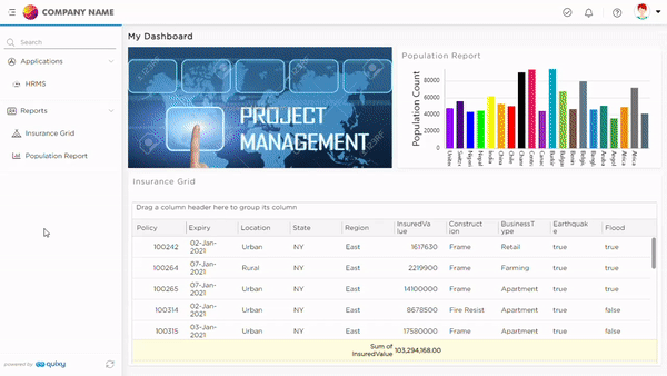
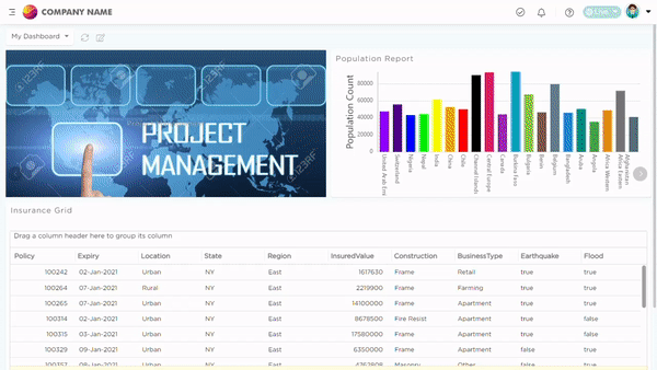
5. Improved Charts Report Layout
When viewing or exporting the Charts Report in PDF or sharing it through various media, as well as when opened in a pop-up or added to a dashboard, the display layout will be optimized. Now, the platform will intelligently arrange the individual chart reports, presenting only two reports per row. This ensures a better user experience, prevents reports from getting cut off, and enhances the overall readability and usability of the Charts Reports.
BEFORE
.png)
NOW
.png)
6. Introducing Cascading Input Fields in Data source References
We have upgraded our platform with cascading input fields in Data source references, similar to our Data table function, Get. Previously, input fields worked independently in an application, but now they seamlessly interact, enhancing data output.
7. Tracking Timelines: Introducing TAT Reports in applications
We are excited to introduce a valuable addition to our platform: TAT (Turnaround Time) Reports for applications. In our dedicated workflows, each step is entrusted to a specific individual, ensuring efficient progress. Now, to provide a clear understanding of TAT at every step, we are launching TAT Reports in the app reports section.
These reports come in two essential types:
- Step-wise TAT Reports: The Step-wise TAT Reports provide a complete view of overall transactions in each workflow step. It carefully tracks time at every stage, showing how efficient each step is. This helps find delays and make improvements where needed. Whether it's speeding up approvals or understanding processing times, these reports help enhance the workflow's efficiency.
- Transaction-wise TAT Reports: For a more detailed perspective, the Transaction-wise TAT Reports offer a granular analysis of individual transactions. They precisely outline each step's duration, allowing you to identify specific bottlenecks and ensure smooth transactional processes. These reports empower you to address unique challenges, ensuring each transaction is seamless and efficient.
With these TAT Reports, you gain comprehensive visibility, enabling better decision-making and streamlined workflows. Stay tuned for enhanced efficiency and data-driven insights!
8. Simplified Settings: Introducing Implicit Filters and Centralized Controls in List View
Similar to our grid reports, you are now going to get implicit filters & a few additional settings options in the list view. Implicit filters will enhance data visualization and analysis, allowing users to focus on relevant information without manually specifying filters each time. You will also find that all the settings that were earlier placed individually are now centralized on to a single page making it easier to manage the preferences and configurations in list view.
The newly introduced options are as follows:
S.no | Listscreen Options | Description |
1 | Hide Filter Icon
| Admins can utilize this option to hide the filter icon within a list view which limits the user's ability to filter the data displayed in the view. |
2 | Load View by Default
| The 'Load View By Default' option works in conjunction with the Quick Filters feature and allows you to have more control over how data is displayed in your list view. Enabling this option will automatically show quick filtered data to end-users when they open the view, while disabling it will hide the data and require end-users to adjust the quick filters to their desired values and click on the search button to display the intended data. With this option, you can ensure that end-users only see the most relevant data. |
3 | Hide Column Name in Grouping
| Admins can utilize this option to hide the column name that is used for grouping and structuring the data. |
4 | Hide Record Count in Grouping | Admins can utilize this option to hide the total records specification available against the group name. |
.gif)
9. Usability Enhancements across the platform
1. We are introducing customized refresh options to certain data actions in our list views. Previously, users had auto-refresh and manual options but no option to automatically refresh the list view soon after an action is performed which was delaying the data auto-synchronization or needed manual intervention to refresh the list view. Now, you have more control.
With this enhancement, when specific data actions like Open Add Record and Submit Add Record are performed specifically in a pop-up, below are the customized refresh options available to the citizen developers:
- Not Refresh: Keeps the list view as it is until the next auto-refresh or manual refresh.
- Refresh Specific Record: Updates only the selected record on which the data action is performed.
- Refresh Entire List Screen: Updates the entire list view for complete data sync.
This flexibility ensures a seamless and efficient user experience. Enjoy enhanced control over your data actions!
2. In response to client requests, we've updated the Gender specification type 'Others' in My Profile to be optional. Organizational Admins now have the flexibility to enable or disable the 'Others' option in the Admin Menu -> Preferences -> General.
3. We have introduced an enhancement where mobile device tracking is now optional, with the default setting turned off in the Admin Menu -> Preferences, unlike before. Organizational admins have the flexibility to enable or disable mobile device tracking based on their organization's needs.
BEFORE
.png)
NOW
%20GIF.gif)
4. We have enhanced our platform by displaying grid report names at the top of the reports, resolving the previous gray area where names were not visible. Now, the names are bold and larger, ensuring clear identification when exporting to Excel, PDF, or sharing via Email or WhatsApp.
5. Now it is even more convenient for users who use Advanced BI reports, as we have introduced a feature allowing these reports to be placed not only on the dashboard but also in the User menu of our platform, ensuring easy access to vital insights.
6. Using business rules, you can now explicitly set values to Link fields and transfer values from other fields (Set Field Value) such as Text and Calculate (String) to the Link field in our application. This enhancement enables the Link field to have dynamic hyperlinks, overriding default static hyperlink.
7. We are introducing Aggregates to our application’s Grid! With the 'Show Aggregates' property, citizen developers can now configure calculations (Sum, Count, Average, Minimum, Maximum) for each field in the grid and tailor data analysis precisely. Choose specific calculations or opt for 'None' where needed. Familiarity awaits, as this mirrors our trusted Grid Report’s aggregates functionality. Enjoy a more personalized and streamlined grid experience now in applications as well!
.png)
8. In our app's reference grids, we've introduced a new feature called 'Hide Delete.' Previously, if you wanted to prevent users from deleting individual records, you could disable the delete button, but it remained visible in read-only mode. Now, with the 'Hide Delete' property, you can make the delete option entirely invisible, catering to different needs and situations in the app's reference grids.
9. Ensuring the integrity of user profile information, including Name, Contact Number, DOB, and more, is vital for organizations. Now, Organization Admins have the option to prevent frequent modifications that could compromise data integrity. By accessing Admin Menu -> Preferences -> General -> Restrict User Profile Edit, admins can make user profile fields non-editable, enhancing data security and consistency.
10. In the list view, you can now customize the name for applied aggregates, moving beyond the default labels like Sum, Count, Average, Minimum, and Maximum. These personalized names add clarity, making the calculations in the list view more meaningful and tailored to your needs.
BEFORE
(1).png)
NOW
.png)
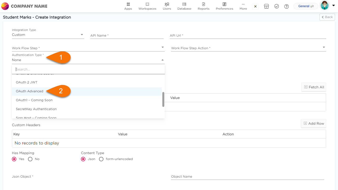
11. App External Integrations will now have an additional authentication type, I.e., OAuth Advanced. It will provide secure, user-friendly integrations, safeguarding sensitive data, simplifying user experiences, and enabling seamless interactions across platforms.
12. Good news! Themes applied for the organization will now reflect in the Guest & Embed Apps.
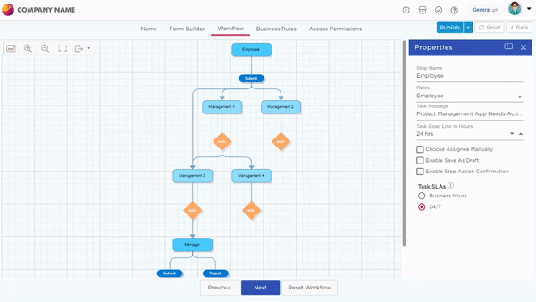
13. Introducing an effective workflow enhancement! Now, effortlessly export workflows to create tangible versions, facilitating easy comparisons and efficient change management. This feature empowers users to maintain snapshots of their processes, providing a valuable tool for understanding process evolution. Enhance your workflow management experience with this new capability.
14. We are now introducing a new enhancement that goes beyond securing records submission. Now, users will be required to perform OTP validation even before accessing the application, ensuring an added layer of security and user authentication. This not only safeguards sensitive transactions but also fortifies overall platform security, mitigates unauthorized access, and enhances trust in the user experience.
15. We're excited to introduce a significant enhancement to Quixy's platform. The Low Code System Function, once exclusively in the back-end, is now available on the front-end, granting Organization Admins the power to write custom codes without any limitations. You can find this Lowcode function option in the Admin Menu under 'More Options.' Notably, there is no change in the function's capabilities; the only change is its accessibility, now empowering admins to take full control of their applications' customization.
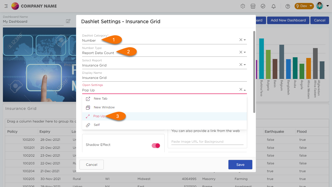
16. You can now open Dashboard’s Number dashlet in a pop-up. This is applicable only for Reports Data Count and List view options.
Was this article helpful?
