The Configuration section defines how data is visualized, interacted with, and controlled. It includes chart configuration options, advanced settings, report mapping, and data access controls.
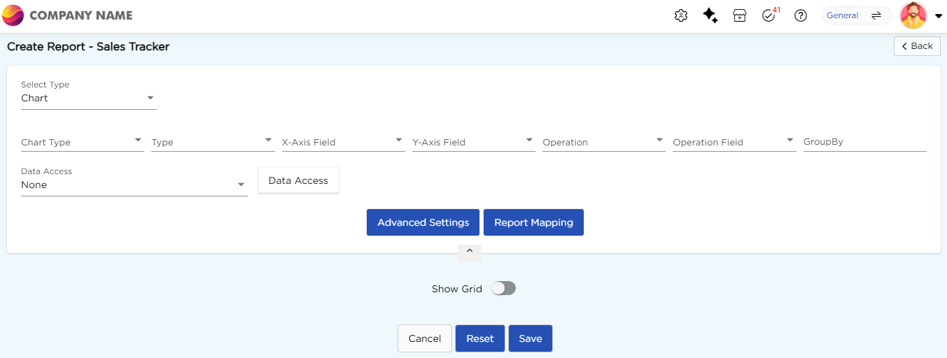
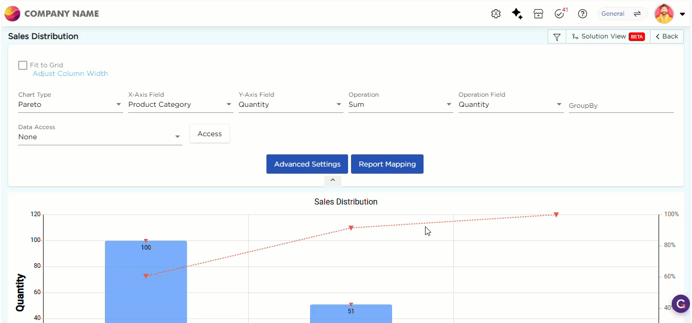
¶ 1. Chart Configuration Options
Use these options to select chart type, assign data fields, and apply calculations to display data in the chart.
| Configuration Option | Description |
| Chart Type | Select the chart format used to display data Available options include Line, Bar, Area, Pie etc. |
| Type | Select a sub-type based on the selected chart type. |
| X-Axis and Y-Axis Fields | Select fields from the data source to plot values on the horizontal (X) and vertical (Y) axes. |
| Operation | This drop-down menu displays operations such as Count, Percentage, Average, and others. Use it to set the calculation for the report. |
| Operation Field | Specify the field on which the selected operation should be applied. |
| Group By | This option allows you to group data based on the selected field and display it in the same report for comparison. |
| Advanced Settings | This option is used to customize the chart appearance and behavior based on requirements. |
| Report Mapping | This option connects two reports using common data fields, allowing navigation to another report by clicking a chart segment. |
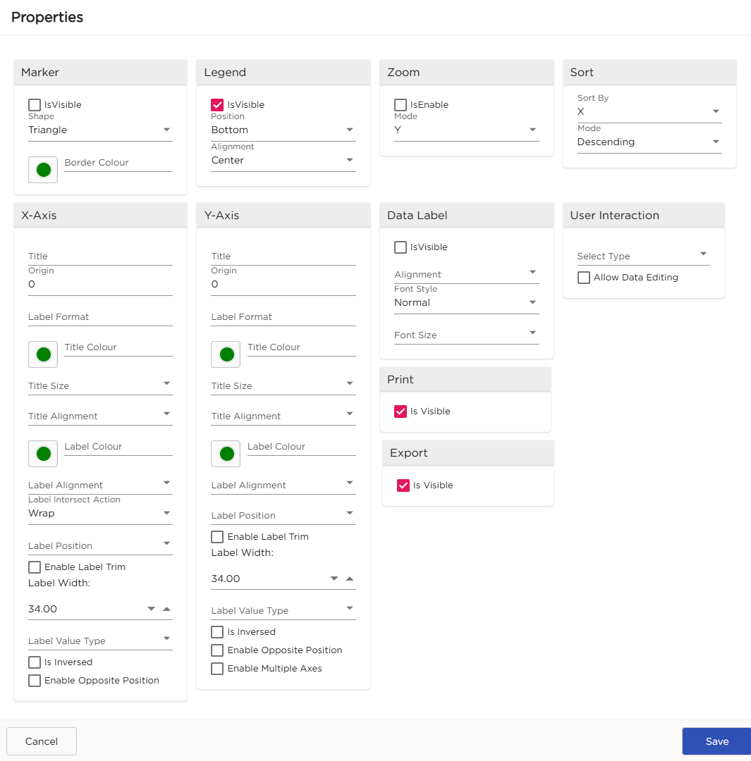
¶ 2. Advanced Settings
Advanced Settings are used to control the chart appearance and user interaction. It includes options such as Marker, Legend, Zoom, Sort, X-Axis, Y-Axis, Data Label, User Interaction, Print, and Export.
| Configuration | Description | Preview |
|---|---|---|
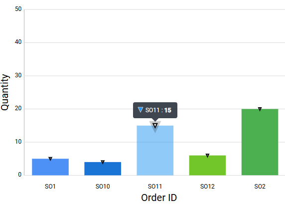
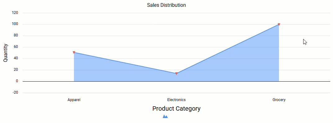
| Marker | Shows data points on the chart using shapes. Enable it by selecting the Is Visible checkbox. Each marker represents a value. Select the shape of marker from the dropdown. You can also change the marker color to easily identify values on the chart. |
 |
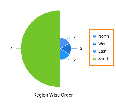
| Legend | Legend describes the data shown in the chart. It displays text for each part of the chart to help understand the data. You can set the position of the legend from the dropdown (Top, Left, Bottom, Center). You can also choose the alignment (Near, Center, Far) to control the distance between the legend and the chart. |
 |
| Zoom | Zoom changes the scale of the chart axis. It expands or shrinks the horizontal or vertical axis. Enable it by selecting the Is Enable checkbox. Select the axis mode to apply zoom (X-Axis, Y-Axis, or both). For horizontal charts, zoom applies to the X-Axis. For vertical charts, it applies to the Y-Axis. For charts without a fixed direction, zoom applies to both axes. |
 |
| Sort | Sort changes the order of data in the chart. It arranges values in ascending or descending order. Select the axis from the Sort By dropdown (X-Axis or Y-Axis). Apply sorting to organize the data points based on the selected axis. |
 |
| X-Axis | Configures the horizontal axis of the chart. Enter a title for the axis. Set the label format to display data clearly. You can change the title color, size, and alignment. You can also set the label color and alignment. Additional options include label wrapping, trimming, width, value type, and positioning. | |
| Y-Axis | Configures the vertical axis of the chart. It includes the same options as the X-Axis. Refer to the X-Axis section for field details and functionalities. | |
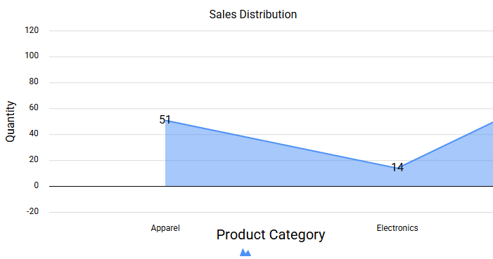
| Data Label | Displays values directly on the chart. Enable or disable data labels using the Is Visible checkbox. Select the alignment, font style, and font size. You can also enable Show Decimal and set the decimal precision. |
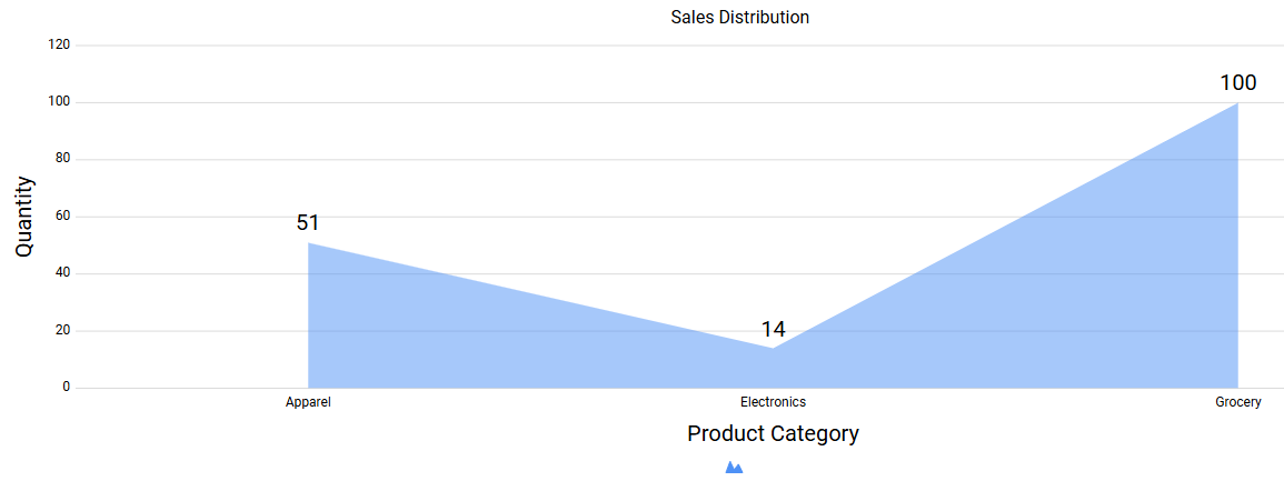
|
| User Interaction | Controls how users interact with the chart. You can define the interaction behavior and enable options like data editing and multi-selection. | |
| Allow users to print the chart by enabling the Print option. | ||
| Export | Allow users to export the chart by enabling the Export option. |
¶ 3. Report Mapping
Report Mapping allows you to link the current chart to another report using common data fields. This enables contextual navigation from summary data to detailed records. Use this option when you want users to drill down from a chart into a related report. Follow the steps below to map:
- Select the target report from the list.
- Map fields from the current chart to fields in the selected report.
- Save the mapping.
Once configured, clicking a chart segment opens the mapped report with data filtered based on the selected segment.
¶ 4. Data Access
Data Access controls which record users can view in the chart. Use this option to restrict data visibility based on user profile information. You can apply data access based on the following profile fields:
- Company Name
- Employee Code
- Employee Email
- None if no data restriction is required.
¶ 4.1. Data Access Control Filters
Data Access Control Filters allow you to define column-level data restrictions. For each column in the report, you can choose one of the following options:
| No Restrict | Allows users to view all records for the selected column. |
| Restrict As Per Data | Restricts records based on the selected user profile field. Users will see only data that matches their own profile information. |
Use this configuration to ensure users access only relevant and authorized data.