¶ What is a List View?
A List View is a flexible and dynamic way to visualize data. It displays information from a Data source in a table-like format, resembling a grid report, and allows you to apply background colors to data columns for easier identification of patterns and trends. Additionally, it serves as an actionable report, enabling you to perform various tasks directly on individual records, such as printing, editing, or launching an app to advance a related workflow.
Use case
Example 1: Sales Pipeline Management
Managing leads and opportunities efficiently is critical for businesses aiming to improve their sales performance. With the List View in Quixy, sales teams can organize and track pipeline data effectively, enabling:
- Filtering leads based on stages (e.g., New, Contacted, Customer etc.)
- Sorting by revenue potential or source to focus on high-priority opportunities.
- Highlighting next steps with color-coded statuses to ensure timely follow-ups.
- This structured approach helps teams streamline their sales process, close deals faster, and maintain a clear overview of their pipeline.
Example 2: Employee on-boarding Process
For companies like Tech Solutions on-boarding new hires, ensuring timely completion of tasks is essential. The List View in Quixy provides HR teams with a centralized and interactive way to track:
- Employee details such as names, departments, and roles.
- Training progress and task completion.
- Issued equipment and required documentation.
- By simplifying the on-boarding process, organizations can ensure new employees are fully prepared and ready to contribute from day one.
¶ Configuring List view
With Example 1 as our focus, let’s explore how the List View simplifies sales pipeline management. By leveraging its intuitive features, raw sales data can be transformed into meaningful insights, enabling smarter decisions and seamless sales operations. Here's how it works in practice:
Pre-requisites:
Before you begin to create a List View, ensure the following pre-requisites are ready:
- Data Table: Set up a data table with the necessary fields. For instance, in a sales pipeline scenario, fields might include:
- Lead ID
- Lead Name
- Client POC Name
- POC Email
- POC Contact Number
- Source (e.g., Referral, Event, Web Form)
- Stage (e.g., New, Contacted, Customer)
- Revenue Potential
- Data Source: Use the data table to create a Data Source that serves as the foundation for your List View. Save the data source after its creation.
- Add-ons: Add-ons are extended part of data sources that allow you to add smart columns (static column with static data), rules and actions. The rules within add-ons allow to logically manipulate data and present the data based on business requirements. Data actions in add-ons are primarily used in views like List View, Kanban View, and upcoming views such as Calendar and Map. When these add-ons with data actions are plugged into views, they act as an additional engine, extending the functionality of the views and turning them into actionable reports. Know more about Add-on.
¶ Creating a List View can be done in two different ways:
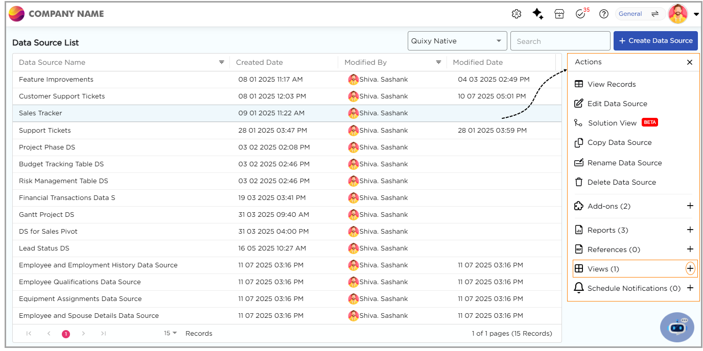
¶ 1. From the Data Source List Page
- Navigate to the data source list page where you will find the list of data sources created.
- Click on a Data Source to open the Actions panel on the right.
- Click the "+" icon corresponding to the Views option in the Actions panel to start creating a new view.
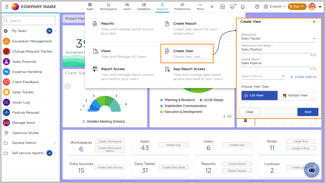
¶ 2. From Admin Menu
- Go to Admin Menu → Reports → Create View.
- The platform opens a create view pop-up.
- Select a data source from the dropdown.
- Enter a name for the view and provide a suitable display name that will be visible for the end-users.
- Choose or create an Add-on if required.
- Select List View under Choose View Type and click Next.
- You will land on the List View configuring page, on this page you will notice three segments:
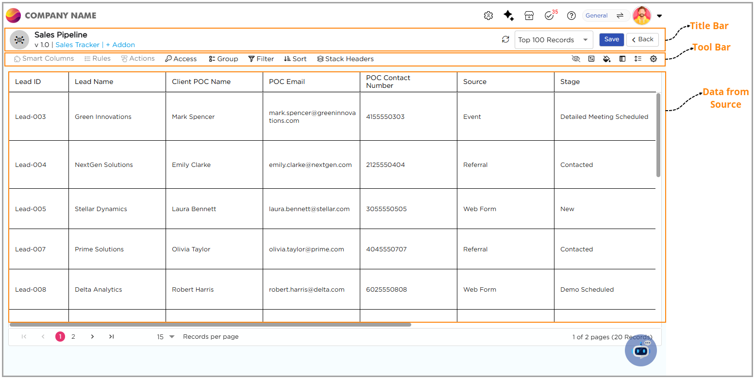
¶ Title Bar
On the title bard towards the left side, you will see the List View name, the list version, the data source name, and options to plug-in Add-ons. Towards the right side, you will find the Refresh button, a dropdown to adjust the number of records displayed, the Save button to apply changes, and the Back button to navigate to the previous page.
¶ Tool Bar
On the tool bar towards the left side, you will find Smart Columns, Rules, and Actions, which are in view-only mode and gets activated when the Add-on is plugged. You also have options like Access, Group, Filter, Sort, and Stack Headers. On the right side, you have options such as Hide Columns, Field Properties, Color, Freeze Columns, Row Height, and Additional Settings.
¶ Data
Displays data from the associated data source.
Now, let’s explore how each option can help you manage your List View more efficiently and customize it to suit your needs:
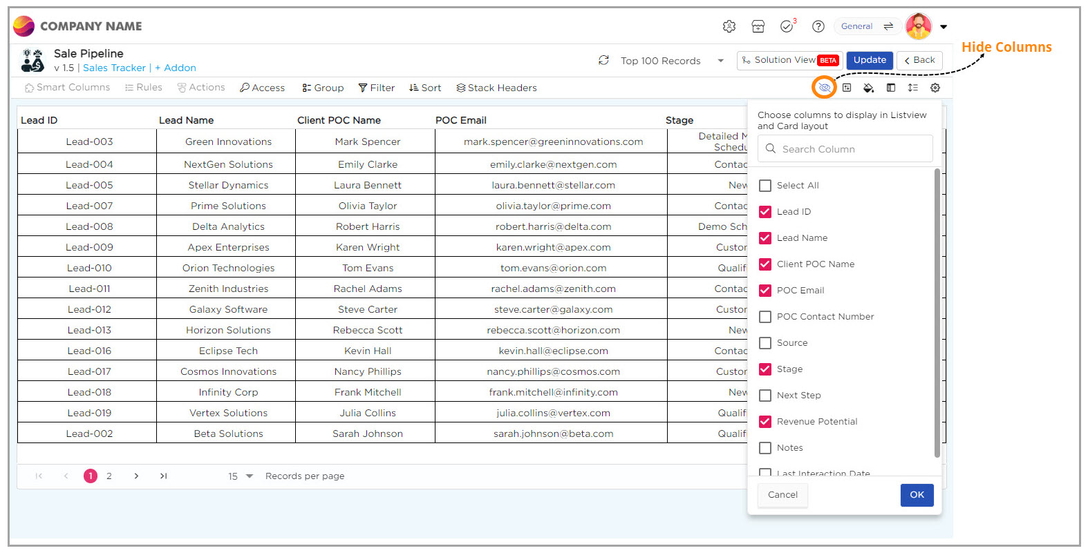
¶ Hide Column
Imagine you're navigating through the list view, filled with multiple columns of information. You only need to see a few specific columns at the moment. With the Hide Columns option, you can quickly choose which columns to display and which ones to hide.
¶ Conditional Colors
In the sales pipeline list view, we can visually highlight each lead’s value potential by applying colors to different revenue ranges. This helps us to easily spot high-value opportunities and prioritize them. There are two color coding options to choose from:
- Row-Level Color: This option applies color to the entire row based on revenue criteria, making high-value leads stand out instantly in the List View.
- Field-Level Color: This option applies color only to the revenue field, highlighting the individual value without affecting the whole row, allowing us to focus on specific revenue amounts.
To assign colors, we create rules based on the lead’s Estimated Revenue:
- If a lead’s Estimated Revenue exceeds $50,000, we assign green to highlight it as a high-value opportunity.
- If a lead’s Estimated Revenue is between $20,000 and $50,000, we assign yellow to mark it as a moderate-value opportunity.
- If a lead’s Estimated Revenue is below $20,000, we assign red to show it's a low-value opportunity.
These color options help us to quickly assess and prioritize leads based on their revenue potential.
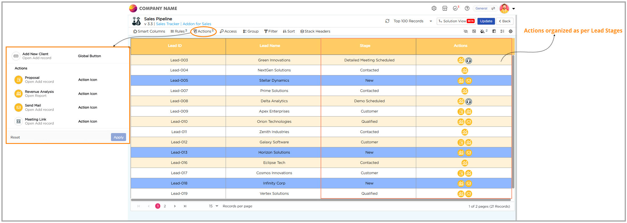
¶ Add Ons
Add-ons extend the functionality of the List View by enabling actions, automation, and logical data handling. They include Smart Columns, Rules, and Actions, which turn static data into actionable insights. In List View, Add-ons make reports interactive by allowing users to perform operations directly on records. Know more about how to configure Data Actions.
Let’s take a sales pipeline setup as an example. Managing leads effectively is key to business success. Add-ons help define stage-based actions that keep leads moving through the pipeline smoothly and ensure timely follow-ups.
Here’s how the actions work based on lead stages:
- When the stage is New or Qualified, use Send Mail to reach out to the client.
- When the stage is Demo Scheduled or Detailed Meeting Scheduled, use Meeting Link to arrange and track meetings.
- When the stage is Customer, use Proposal to share the final offer.
Other Add-ons like Add New Client and Revenue Analysis help expand client data and track performance through chart reports. Know more about how to configure Chart reports.
By combining these Add-ons, the List View becomes a complete lead management hub. It helps teams act quickly, maintain accuracy, and guide every lead toward conversion.
¶ Freeze Columns, Filters, and Grouping
After setting up different Actions for the view, you can explore options like Freeze Columns, Filters, and Grouping to the List View:
- When you’re working with a massive dataset, it can be tough to keep track of the most important columns. That’s where the Freeze Columns option steps in. It lets you lock the essential columns in place, so as you scroll through records, the key information stays in view. This makes it much easier to navigate through the data and stay focused on what matters.
- Imagine you're staring at a long list of leads, trying to figure out which ones actually need your attention today. Scrolling endlessly isn’t going to help. That’s where filters come in. You open the Filter panel and set a condition—maybe you want to see only the leads in the New stage. Instantly, your list shortens. You’re now looking at just the ones that matter. Simple, right? But it gets even better. As soon as you apply a filter, you’ll see an Edit toggle. Turn this on, and it unlocks something powerful: the Quick Filter toggle.
💡 Note
You can’t enable Quick Filters unless the Edit toggle is switched on first. Think of it as the key that unlocks the shortcut feature. Turning on Quick Filters creates a shortcut bar that you can use to instantly find what you need—without having to mess with filter settings.
¶ So, What's Different About Quick Filters?
Quick Filters help you narrow down your list quickly without having to set rules each time.
Here’s the difference:
- Filters: You have to choose specific rules each time (like "Stage is New" or "Status is Qualified") to narrow things down.
- Quick Filters: These are ready-to-use. The columns you already see in the list (like Stage, Client Name, etc.) are pre-set. All you have to do is click on them to instantly filter the data.
In short: Quick Filters let you filter the data instantly by clicking on the columns already in the list. Filters require you to set the rules manually every time. Quick Filters save you time and effort!
How to Set Up a Quick Filter:
- Apply a filter first. Once the Edit toggle appears, turn it on—only then can you enable the Quick Filter.
- In Additional Settings, turn on the “Generate Reports with Quick Filters” option to ensure your filters show up in reports.
- In the Access tab, assign the appropriate workspace and user roles, then grant column access to make the Quick Filter visible in the actions view.
- As you dive deeper into the pipeline, you begin monitoring how leads progress through different stages. With the Group option, you can easily organize records by their current stage, such as grouping leads into categories like Demo Scheduled or Customer. This gives you a clear overview of where each lead stands, allowing you to focus on those that require immediate attention.
- The Row Height option helps make your data easier to read. You can select from three views—Compact for a more compressed look, Default for the standard layout, or Expanded for a spacious, detailed view.
- When you want to focus on the leads with the highest revenue potential, the Sort option helps you organize them quickly. By sorting leads based on revenue potential, you can easily spot high-value opportunities and stay focused on the leads that matter most.
- When you need to organize your data, the Stack Headers option helps group related fields together. For example, you can combine fields like POC Name and POC Email under a 'Point of Contact' section, or group Stage and Revenue Potential under 'Lead Details.' This makes your data easier to analyze and navigate, giving you a clearer view of important information.
¶ Field Properties
In the Field properties you can personalize the UI of your List View for both desktop and mobile.
¶ Below is how you can tailor the List View for the desktop experience (Web UI):
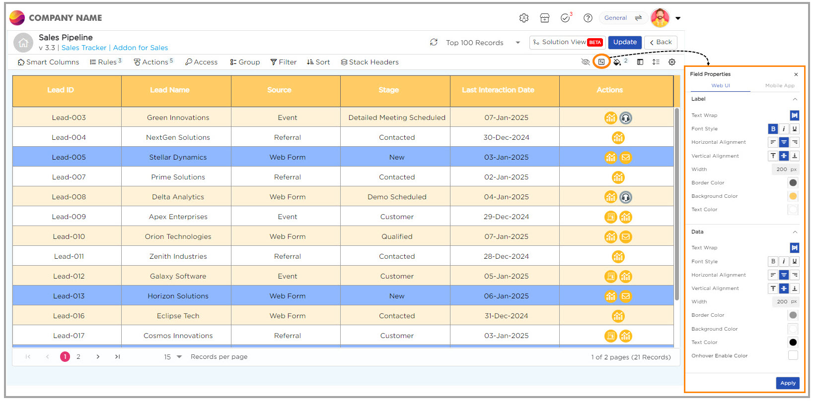
¶ 1. Label Customization:
- Text Wrap: Enables text to wrap within the container to stay visible.
- Font Style: Choose font styles between bold, italic, or underline.
- Alignment: Adjust horizontal and vertical alignments for Label.
- Width: Set a fixed column width (e.g., 200px).
- Border/Background Color: Choose the Labels background and border colors to enhance visual appeal.
¶ 2. Data Customization:
- Text Wrap: Enables data to wrap within the container to stay visible.
- Font Style: Choose font styles between bold, italic, or underline.
- Alignment: Adjust horizontal and vertical alignments for Data.
- Width: Set a fixed column width (e.g., 200px).
- Border/Background Color: Choose the data cells background and border colors to enhance visual appeal.
- On-hover Effects: Change rows background and text color when hovered.
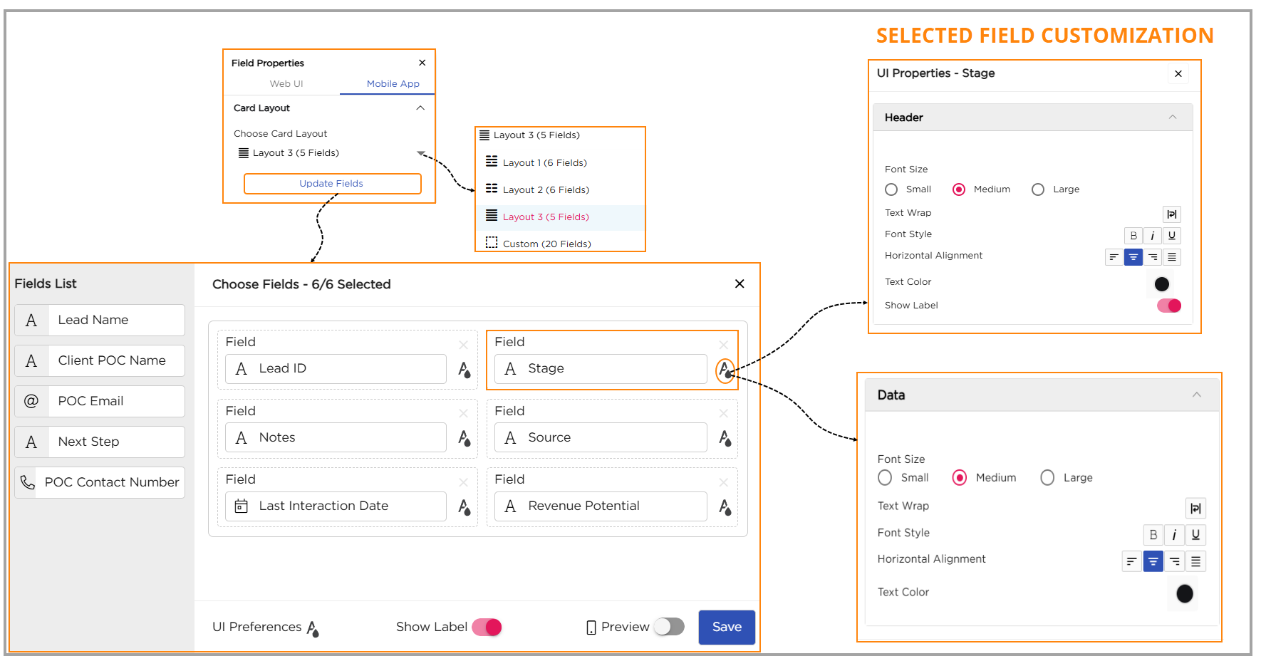
¶ Below is how you can customize the Card Layout for List View to enhance the mobile experience (Mobile App):
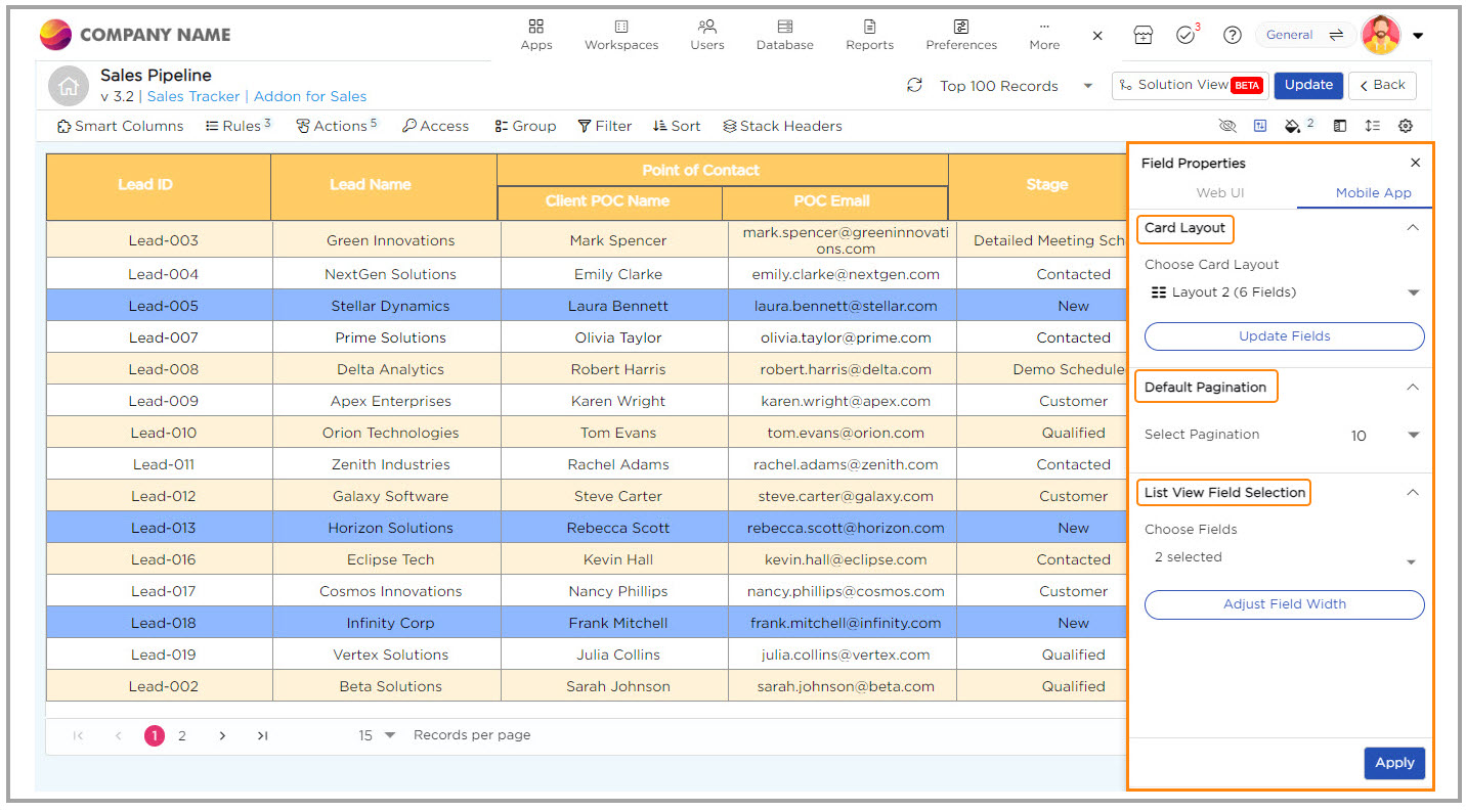
¶ 1. Choose Card Layout
From the dropdown, select one of the following card layouts:
- Layout 1 (6 Fields)
- Layout 2 (6 Fields)
- Layout 3 (5 Fields)
- Custom Layout (up to 20 Fields)
- Layouts 1, 2, and 3 come with a fixed structure, where you can add or remove fields, but you can't change the order or size of the fields. If you delete a column, simply replace it with another, keeping the original structure intact.
- If you need more flexibility, select Custom Layout, which lets you add up to 20 fields. You can arrange and resize the columns to suit your needs.
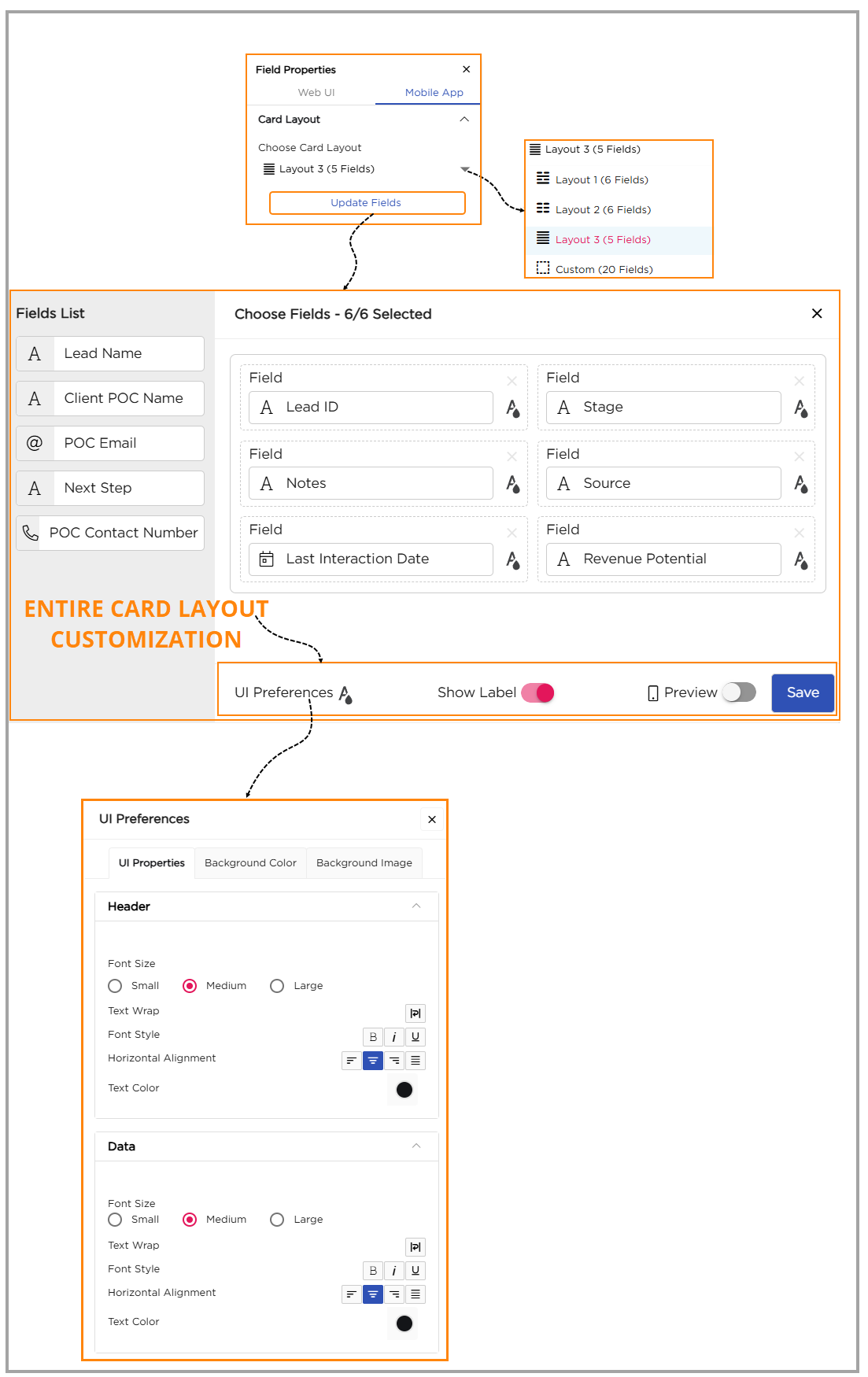
Once the layout is selected, click Update Fields to open the customization panel and start adjusting the card layout appearance.
¶ 1.1. Entire Card Layout Customization
At the bottom of the customization panel, you can fine-tune the overall look and behavior of the entire card layout. These options apply to all fields within the card.
¶ 1.1.1. UI Preferences:
The UI preferences provide customization settings for Label and Data for the entire card layout. The properties include:
- Font Size: Choose from small, medium, or large font sizes.
- Text Wrap: Enables text to wrap within the container to stay visible.
- Font Style: Choose font styles between bold, italic, or underline for labels and data.
- Horizontal Alignment: Align text to the left, center, or right.
- Text Color: Adjust the text color for both labels and data.
- Background Color: Select a background color for the card layout.
- Background Image: Add an image as the background for the card layout.
¶ 1.1.2. Show Label Toggle:
Turn this on or off to show or hide column names in the list view.
¶ 1.1.3. Preview Toggle:
Toggle on to preview how the Card Layout looks on a mobile device.
¶ 1.2. Field-Level Customization
Each selected field in the card layout can be individually customized for its Label (Header) and Data sections. This allows you to give key fields — such as Stage, Lead Name, or Revenue Potential — unique styling while keeping others simple.
For Labels:
- Font Size: Choose from small, medium, or large.
- Text Wrap: Turn on this option to make the label text wrap within the container, ensuring it's fully visible.
- Font Style: Pick from bold, italic, or underline for a distinct look.
- Horizontal Alignment: Align the label text to the left, center, or right.
- Text Color: Pick a color to make the label stand out.
Show Label Toggle: Turn this on or off to display or hide the label in your list view.
For Data:
- Font Size: Choose the size of the text (small, medium, or large).
- Text Wrap: Enable text wrapping for the data to stay visible within its box.
- Font Style: Choose from bold, italic, or underline.
- Horizontal Alignment: Align the data text to the left, center, or right.
- Text Color: Pick a color for the data for better visibility.
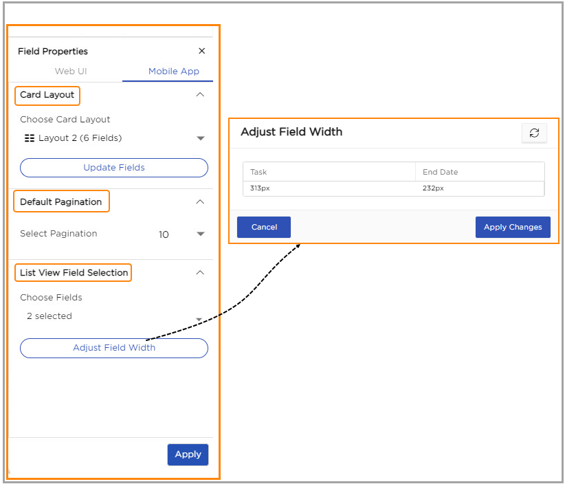
¶ 2. Default Pagination
Set how many records you want to display on each page in the mobile list view.
From the dropdown, choose a number (for example, 10) to control how many items appear before moving to the next page.
¶ 3. Choose Fields
Choose the fields you want to display in your mobile list view. This helps you highlight the most important details at a glance.
You can choose up to a maximum of three fields. If needed, click Adjust Field Width to set the column width for each field.
Enter the desired width (in pixels) and click Apply Changes to save.
Once done, click Apply to update your list view.
¶ Access Control: Define access levels for users.
Access Control allows you to define and manage the level of access each user has within your workspace. You can control who can view, edit, or manage specific data, ensuring a secure and organized environment.
¶ Manage Roles
This is where you set basic permissions — think of it as giving users the right access in each workspace.
Follow the steps below to set it up:
Select a workspace from the dropdown (for example, General Admin, Sales Management, or Project Management).
Select one or more roles from the role's dropdown (for example, Employee or Manager).
Click + Add Access to assign roles for another workspace, if needed.
Click Next to move to the next step.
Tip: You can assign multiple roles to a user across different workspaces using the Add Access option.
Columns & Filter Access:
- Think of the columns as sections in your notebook. You decide who can look at them or make changes.
- Hide: If you want to keep a column secret, just hide it. No one else will see it.
- Enable: Want others to see and update it? Enable the column for them.
- Disable: Let them see the column but not make any changes.
- Now, let’s talk about the rows in your table. You can control how much data people can work with:
- Restrict: Give them access to only certain rows.
- Allow: Let them see all the rows without restrictions.
Data Access:
- Control what users can access based on specific details about them. For example:
- Logged in User Company Name: Allow access only to data tied to the user’s company name.
- Logged in User Email: Restrict or grant access based on their email address.
- Logged in User Employee Code: Use employee codes to specify what information someone can view or edit.
- None: No restrictions are applied; users can access all data.
- Finally, click Save to apply the settings.
This approach ensures that each person has appropriate access to the data they need, making role and access management seamless and secure.
¶ Additional Settings
Once the List View is set up, it can be further customized using Additional Settings to make the List View more organized and easier to read.
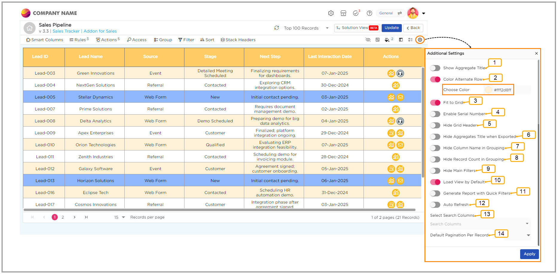
| S.No | Option | Description |
| 1 | Show Aggregate Title | Need to track totals? Turn on this option to display titles like 'Sum' or 'Average' for your summarized columns, helping you see the big picture at a glance. |
| 2 | Color Alternate Row | If you find it hard to differentiate between records, simply enable alternating row colors. It makes each record pop, so you can spot what you need right away. |
| 3 | Fit to Grid | Working with many columns? Use this option, and your columns will adjust automatically to fit perfectly in the grid, so everything looks neat without any extra effort. |
| 4 | Serial Number | Want an easy way to keep track of your records? Turn on serial numbering, and you’ll get a number assigned to each record, making it easier to reference them. |
| 5 | Hide Grid Header | If you prefer a cleaner view, turn off the column headers to declutter your screen. It’s all about keeping things simple. |
| 6 | Hide Aggregates Title When Exported | When you’re exporting data, sometimes you don’t need the summed-up titles like 'Sum' or 'Average.' This option hides those from your exported file, keeping it tidy. |
| 7 | Hide Column Name in Grouping | If you’re grouping your data, but don’t want column names to show up, you can hide them with this option to keep things clean and focused. |
| 8 | Hide Record Count in Grouping | When you're grouping records, this option helps reduce the clutter by hiding the count of records, so you can focus on the important details. |
| 9 | Hide Main Filters | Don’t want the filter icon in the List View? You can hide it to keep your screen less crowded, limiting filter access when needed. |
| 10 | Load View by Default | Want to always see the most relevant data when you open a view? Enable this option, and the system will load your data based on pre-set Quick Filters, so you’re ready to go without adjusting anything. |
| 11 | Generate Report with Quick Filters | When generating reports, this option keeps your data organized by hiding the column names used for grouping, so the focus stays on the key information. |
| 12 | Auto Refresh | Hate manually refreshing your view? Let this option automatically update your List View at set intervals, ensuring you always have the latest data without lifting a finger. |
| 13 | Search Columns | Looking for something specific? Speed up your search by selecting only the columns you want to search through, making it quicker to find exactly what you need. |
| 14 | Default Pagination per Record | Tired of scrolling through too many records? Set how many records show per page and make managing large datasets much more manageable. |