This section explains how to configure Actions within an Add-On.
¶ 1. Configure Actions
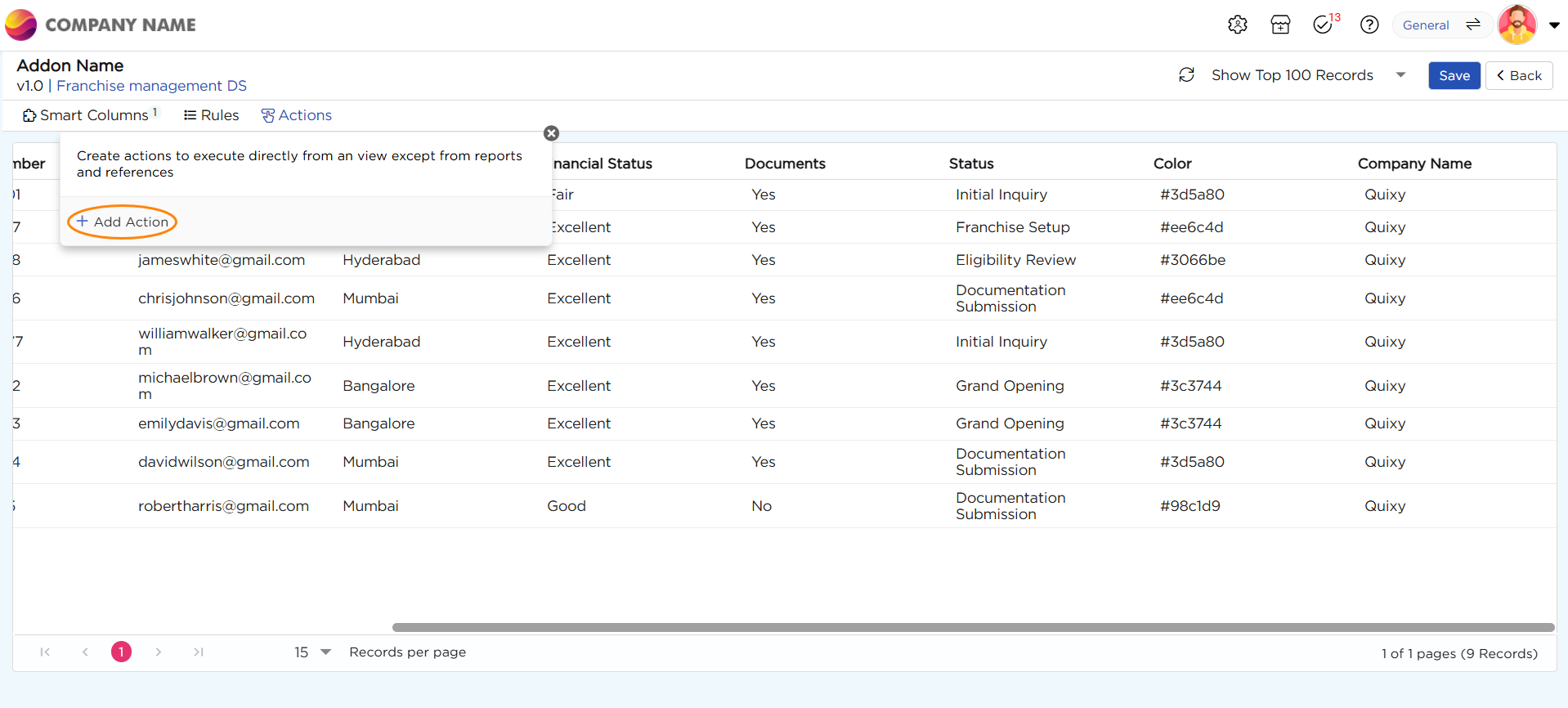
1. Navigate to Actions → Add Action.
2. When you click on “Add Action,” a pop-up appears with 8 types of data actions, which are:

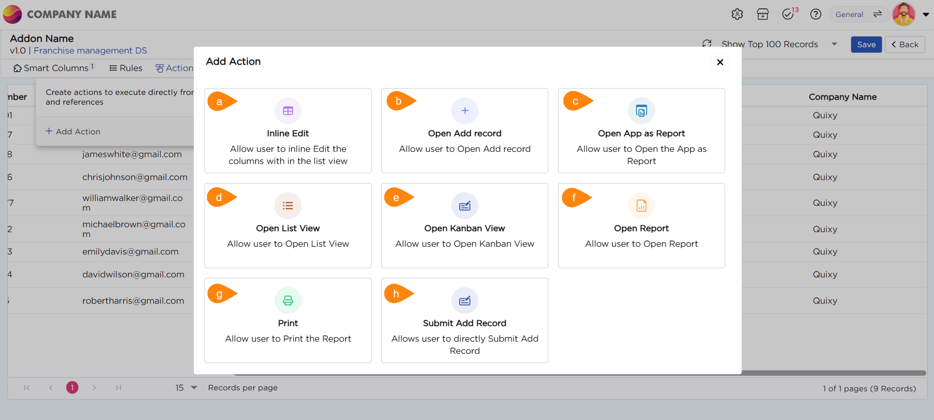
| S.No. | Action | Description |
|---|---|---|
| a | Inline Edit | Allow users to edit column data directly within the view, with the changes reflected in the corresponding tables |
| b | Open Add Record | Allow users to open an app in add record mode and perform transactions |
| c | Open App as Report | Allow users to open the App as Report |
| d | Open List View | Allow users to view the desired List view |
| e | Open Kanban View | Allow users to view the desired Kanban view |
| f | Open Report | Allow users to view the report (All Report Types) that is related to a record to make instant informed decisions |
| g | Allow users to print the Report | |
| h | Submit Add Record | Allow users to Submit Add Record directly from the list view |
| i | Link Tasks | Allows users to access and complete workflow tasks directly from List View records |
3. Let’s use “Open Add Record” as an example to understand how to configure a data action.
4. Upon selecting “Open Add Record,” there appears a pop-up which consists of Action Details and Mapping.
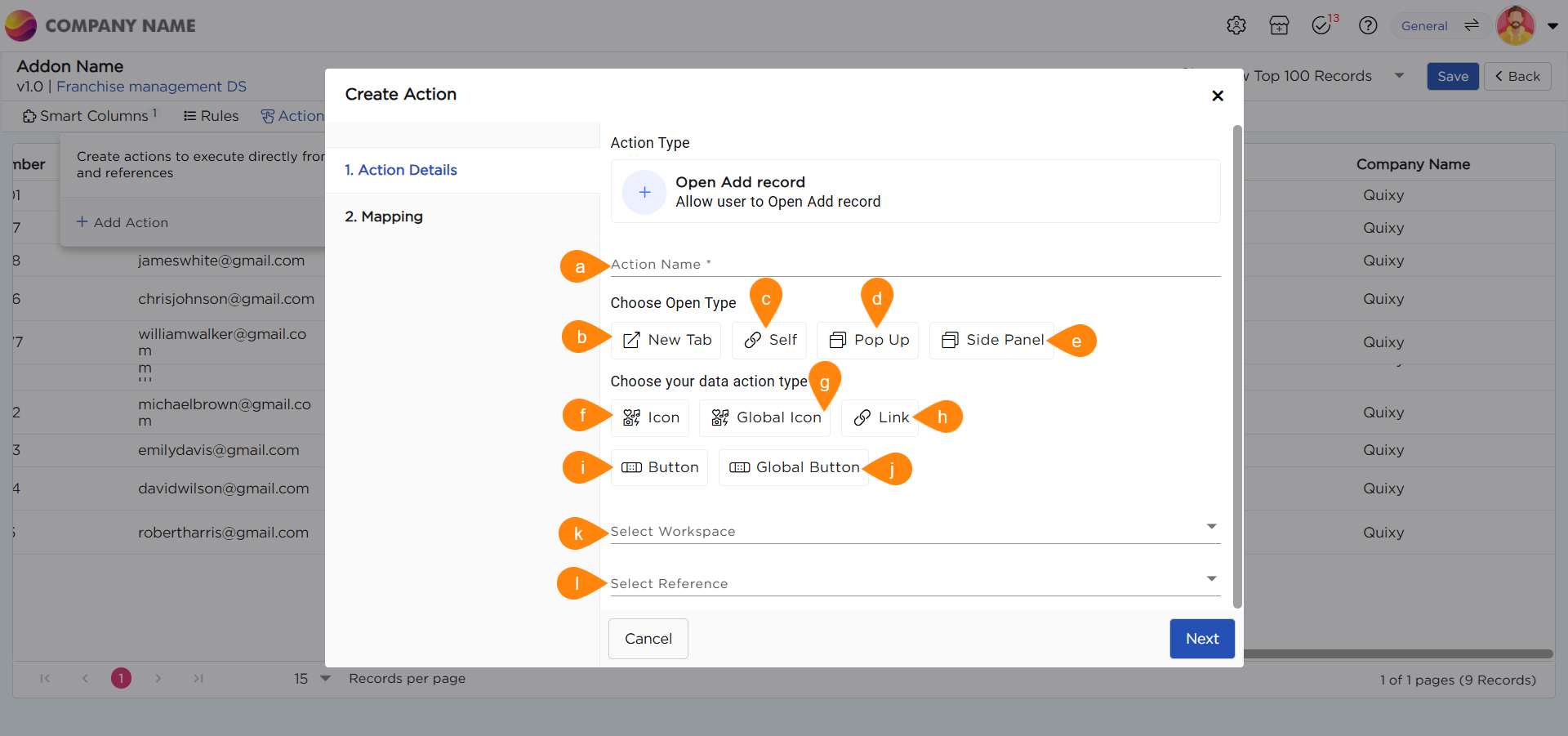
| S.No. | Action Type | Description |
|---|---|---|
| a | Action Name | Provide a name for the action being created |
| b | New Tab | Opens the linked artifact or action in a new browser tab |
| c | Self | Opens the linked artifact or action in the current tab, replacing the existing view |
| d | Pop-up | Displays the linked artifact or action in a pop-up window within the same screen |
| e | Side Panel | Opens the linked artifact or action in a side panel, allowing users to view it alongside the current content |
| f | Icon | Select an icon to visually represent the data action type for easier identification |
| g | Global Icon | Choose an icon that is accessible and visible throughout the entire view |
| h | Link | Allows the name of the action or artifact to be linked, enabling easy navigation |
| i | Button | Displays the action in the form of a button for better visual emphasis and interactivity |
| j | Global Button | A button that is accessible and functional across the entire view |
| k | Select Workspace | Choose the workspace containing the artifact you want to open when the action is executed |
| l | Select Reference |
Select the specific artifact that should open when the action is clicked
|