Once access is configured, you can control how data is grouped, displayed, and styled in the Kanban View.
¶ 1. Data Organization Options
Use these options to control how records are arranged and displayed on the board.
- Group: Set grouping preferences to organize records based on a selected field.
- Filter: Add filters to narrow down records and show only relevant data.
- Sort: Control the order of records within each column.
- Hide Columns: Hide unnecessary fields to keep the board clean.
.gif)
¶ 2. Visual Styling Options
Use these options to improve readability and highlight important data.
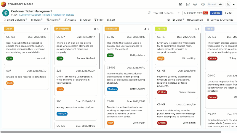
- Color Rules:
- Apply colors to fields or entire rows based on conditions.
- Useful for highlighting priority, status, or risk.
- Customize Settings: Personalize the overall look and behavior of the Kanban View.
¶ 3. Board Behavior Settings
These options control how the Kanban board behaves.
- Column Wise Count: Displays the number of records in each column.
- Toggle Column: Show or hide specific columns in the board.
- Incremental Flow: Force cards to move step by step through stages.
- Choose Global Search Fields: Select which fields are searchable across the Kanban.
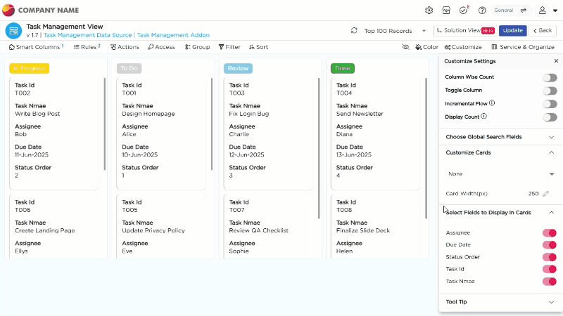
¶ 4. Card Customization Options
Use this section to control how each card looks and what it displays.
¶ 4.1 Choose Card Layout
Select a layout from the dropdown:
- Layout 1 – 6 fields, fixed layout
- Layout 2 – 6 fields, fixed layout
- Layout 3 – 5 fields, fixed layout
- Custom Layout – up to 20 fields, fully flexible
Notes:
Layouts 1–3 have fixed structure. You can replace fields, but you cannot change size or order.
Custom Layout allows you to add, remove, resize, and reorder fields.
After selecting a layout, click Update Fields to open the customization panel.
¶ 4.2 Field-Level Customization
Use this to style individual labels and data values.
For Labels
- Font Size
- Text Wrap
- Font Style
- Horizontal Alignment
- Text Color
- Show Label Toggle
For Data
- Font Size
- Text Wrap
- Font Style
- Horizontal Alignment
- Text Color
¶ 4.3 UI Preferences
Use UI Preferences to apply styles to the entire card layout.
You can configure:
- Font Size
- Text Wrap
- Font Style
- Horizontal Alignment
- Text Color
- Background Color
- Background Image
- Show Label Toggle
- Preview Toggle for mobile view
¶ 4.4 Card Display Settings
Control how cards behave in the Kanban view.
- Select Fields to Display in Cards: Choose specific fields to show on each card for quick reference.
- Tool Tip Template: Define the format and information shown in the tooltip when hovering over a card. By enabling this feature, you can select fields to display their associated data. When users hover over a card, a tooltip will appear, providing a concise summary of the selected information.
- Expand Card on Click: Opens a detailed view of the card when clicked for more comprehensive information.