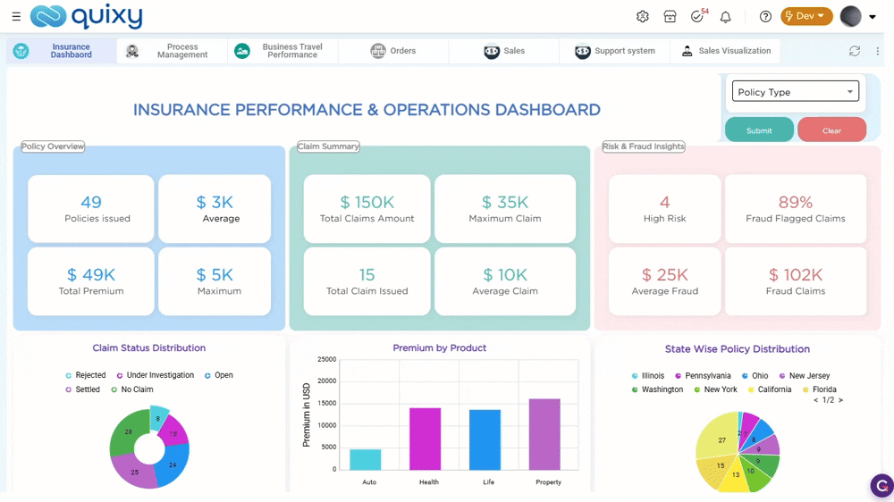
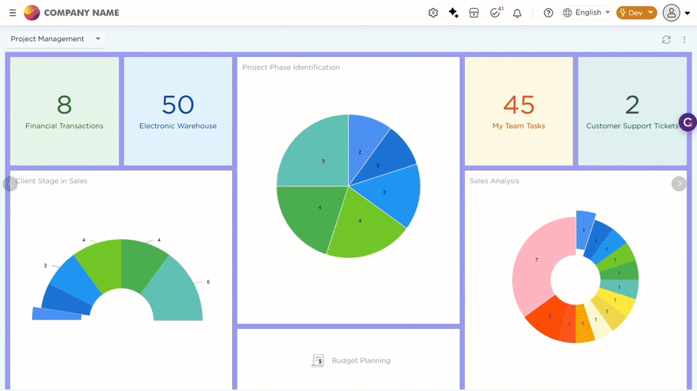
¶ 1. Dashboards Reimagined: Greater Control, Better Clarity
Dashboards are now redesigned to improve how users develop and view insights. They provide a true WYSIWYG experience that removes guesswork and shows the dashboard exactly as it will appear when published. Users can tailor layouts for desktop, tablet, and mobile, ensuring a clean and consistent presentation.
.jpg)
- Flexible Dashlet Layouts: Dashlets now offer more display options, letting you arrange text, icons, and cards to improve readability and highlight key information. Cards present data in a clean, structured format, while separators help organize content into clear sections.
- Device-Specific Views: Users can control how each device view appears by choosing which dashlets remain visible across desktop, tablet, and mobile, keeping every screen focused and uncluttered.
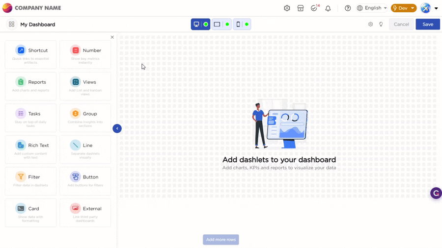
- Grouping: Grouping allows you to bring related data points together, so they appear in a single, structured section instead of scattered elements. This makes it easier to view metrics side by side, compare values, and understand relationships without jumping across the dashboard.
- Global Filters: Global Filters simplify how you narrow down data across dashboards. You can apply a filter within a dashboard, where a single selection updates all related insights instantly. This removes repeated actions and helps you analyze data faster. For broader analysis, the same filter can be applied across multiple dashboards. A single selection updates all connected dashboards, ensuring a consistent view when comparing data across reports.
The overall experience is now more structured, easier to design, and better aligned with how users work and interact with business data.
To configure each dashlet type in detail, see dashlet configuration.
¶ 2. Access Tasks from List View
Processes in Quixy often follow both a data-centric or workflow-centric approach, and sometimes a blend of both. To support users who primarily operate in data-centric environments but also need workflow capabilities like tasks, reminders, escalations, and SLAs, we’ve introduced a new enhancement that connects Tasks with List Views.
Now, end users can take direct action on workflow tasks right from their List View. Task step buttons can appear within each record row, allowing end users to complete or update tasks instantly where data is available. Alternatively, tasks can appear as a single action button with badges indicating the number of pending tasks for each record, providing clear visibility and easy access without leaving the view.
This integration brings data and workflow automation together, helping end users manage both from a single interface.
¶ 3. Capturing Monetary Values Made Simple
Managing financial data is now more consistent and easier to control. A dedicated Currency field is now available in Form Builder and Data Tables to capture monetary values with an associated currency type, ensuring uniform storage and display across applications and related records.
In Data Tables, you can also define a Base Currency for Currency columns. Values entered in any currency are automatically converted to the selected base currency using system exchange rates. The converted value is reflected based on the current day’s exchange rate, enabling standardized reporting and aggregation across regions.

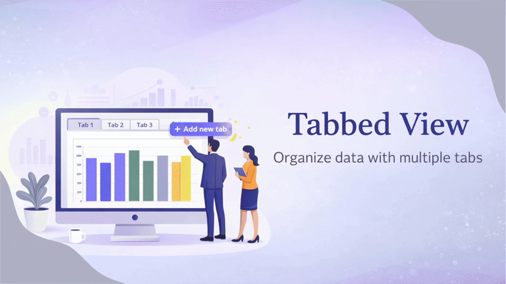
¶ 4. One Screen, Multiple Views: Introducing Tabbed Access
Reports and views can now be arranged in a tabbed layout on a single screen, allowing users to access multiple artifacts side by side. While previously each report or view opened individually, the new tabbed view streamlines navigation and makes it effortless to switch between artifacts with a single click, making it faster and easier to compare information and work more efficiently.
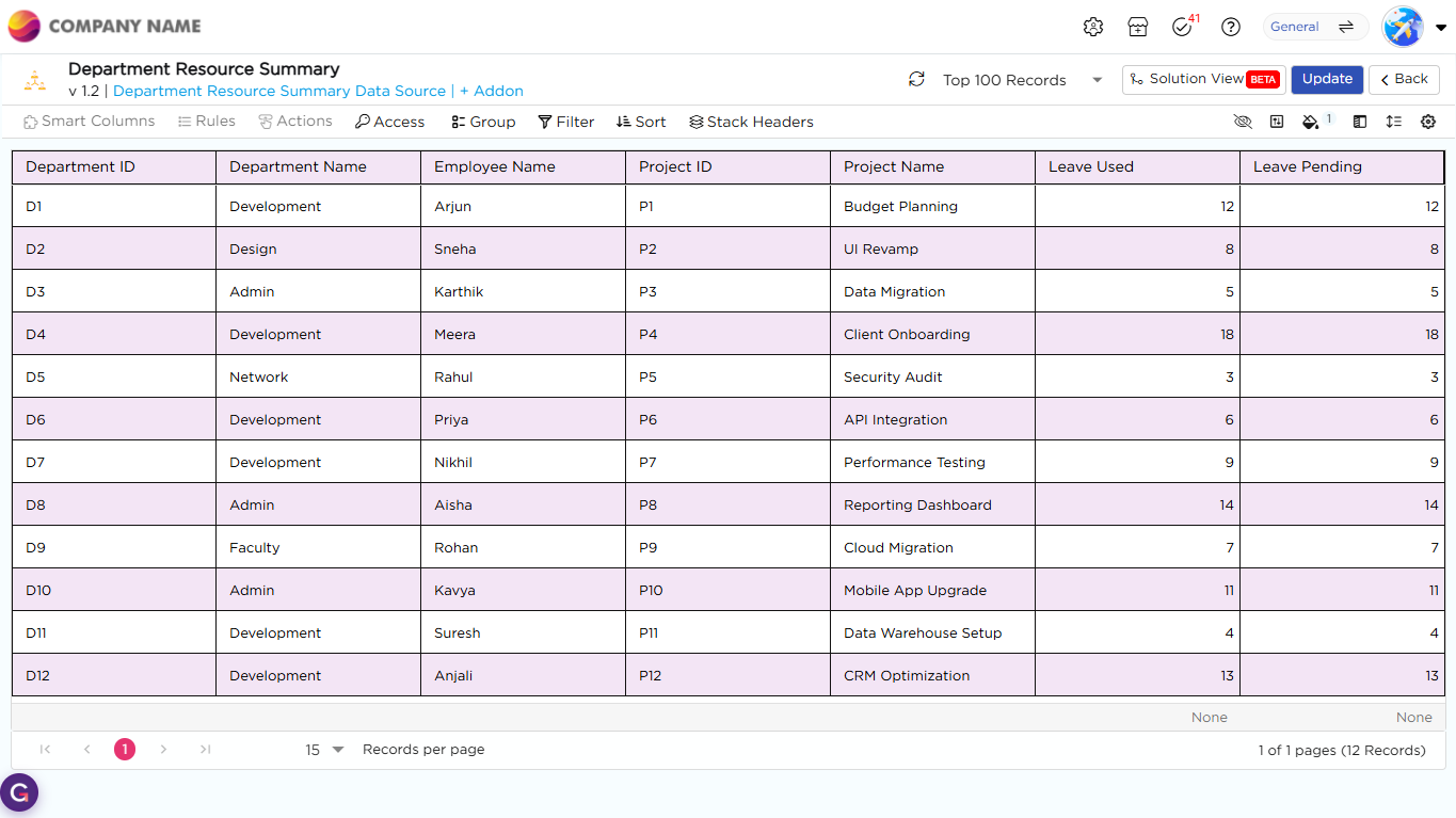
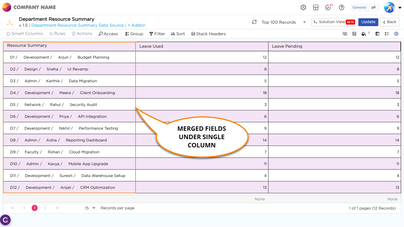
¶ 5. Merge Multiple Fields into a Single Column
List Views now allows you to merge multiple fields into a single column, so related information appears together in one place and reduces the need to scan across multiple columns. You can combine field values using separators such as comma, dot, slash, pipe, or dash. By default, values are separated by a space. You can also control how the data appears by adjusting alignment, font style, size, text wrapping, and field value placement, either beside or below the label. This improves readability and helps you quickly find the information you need.
Before:
After:
¶ 6. Store and Access Files from Google Drive
Quixy now allows organizations to use Google Drive alongside SharePoint as a storage option, giving teams the flexibility to store and access their files directly from their preferred repositories. This new addition makes it easier for organizations to maintain their existing file management practices while still leveraging Quixy applications, ensuring seamless access to documents within the workflow they’re already comfortable with.
¶ 7. AI-Assisted Query Optimization for Data Sources
Data sources may sometimes take time to load or not return results as expected. Earlier, identifying this issue involved multiple teams and manual analysis.
With the new Monitoring and Maintenance option under Admin Menu → Database, admins can now review and optimize data source queries directly using AI.
Admins can select a data source and review how the query is executed through a clear summary and detailed execution plan. The system also provides recommended indexes and optimized query suggestions, with changes highlighted for easy understanding.
If improvements are required, the system clearly indicates what needs attention. If no issues are found, it confirms that everything is working as expected. Suggestions are shown only when relevant.
This helps admins quickly identify and resolve query-related issues without relying on multiple teams.
¶ 8. Usability Enhancements
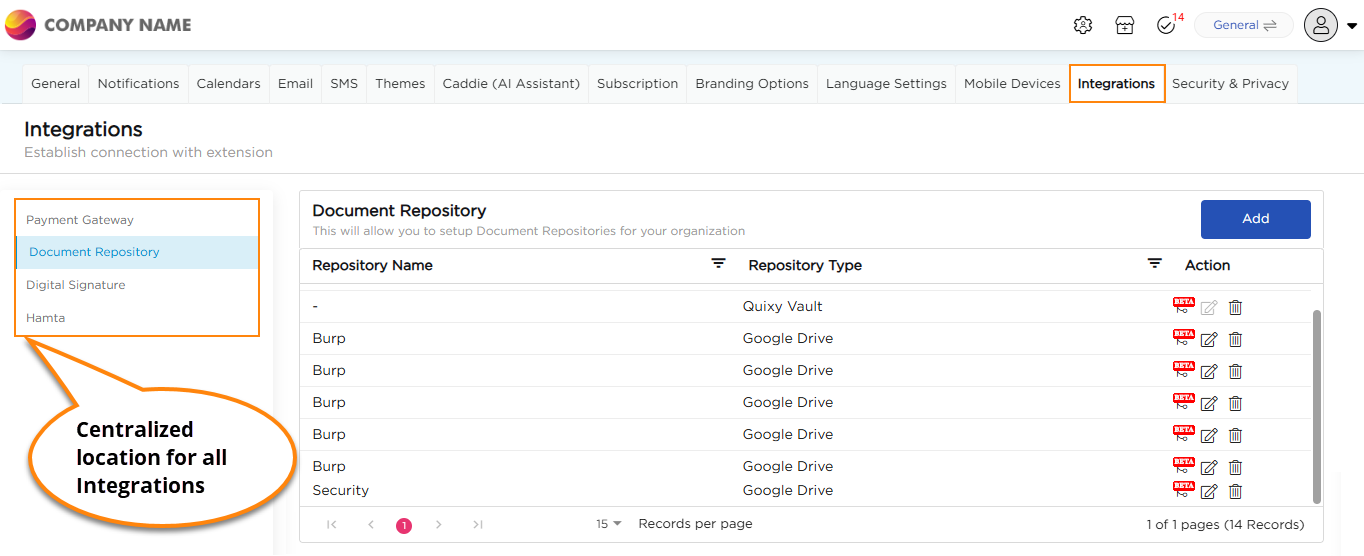
¶ 8.1. Centralized Integration Management
Key integrations are now centralized under Admin Menu → Preferences → Integrations, including Payment Gateways, Digital Signature, Hamta Integration, and Document Repositories such as SharePoint and Google Drive. Administrators can configure these once and use them across applications, reducing setup effort and simplifying integration management.
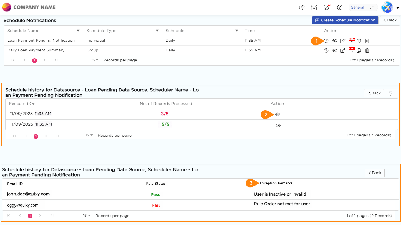
¶ 8.2. Improved Scheduler Audit Logs
Audit logs for data source scheduler notifications now provide clear reasons (RCA) whenever a notification fails, making it faster and easier for admins to understand the cause and take corrective action, ensuring smoother and more reliable scheduling operations.
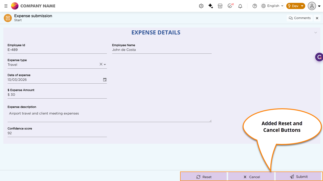
¶ 8.3. Flexible Action Buttons
Step-action buttons now support flexible placement and styling. You can adjust alignment, color, size, corner radius, and add icons to match your UI. Buttons can be placed at the left, center, or bottom-right of the screen. Also, two new static action buttons Reset and Cancel are also available and CDs can add these to buttons to the applications as needed. Reset clears all entered data, while Cancel lets users exit the form without saving, giving them better control during data entry.
Before:
After:
¶ 9. Performance & Tech Upgrade
You will witness a delightfully great experience across the board in terms of performance and overall journey on the platform. Below are the updates:
- Performance and Efficiency: We have taken a significant step with massive backend upgrades that will deliver great outcomes for you when dealing with Dashboards & Chart Reports.
- We have upgraded the tech stack from .Net 9 to .Net 10.