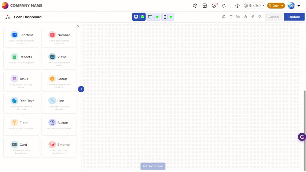
Once you drag and drop the dashlet onto the canvas and click the dashlet, a blue line appears surrounding the dashlet border, and a settings icon shows on the right side of the dashlet. When you click the settings icon, the properties panel opens on the right. The properties panel is divided into two sections, General and Display.
Note
The Filter dashlet works only with the Button dashlet. You must add a Button dashlet on the dashboard for the filter to function.
¶ 1. General Settings
The General settings define how the filter works on the dashboard and where the filter values come from.
Key Behavior
The configuration options vary based on the selected Filter Value Origin. When a value origin is selected, only the relevant settings are displayed.
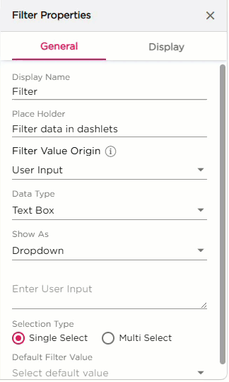
¶ 1.1 Basic Settings
| S.No | Setting | Description |
|---|---|---|
| 1 | Display Name | Enter the name that should appear on the Filter dashlet |
| 2 | Placeholder | Enter placeholder text that appears inside the filter input field |
| 3 | Filter Value Origin |
Select how the filter values should be generated:
|
¶ 1.2 Filter Configuration
Based on the selected Filter Value Origin, refer to the corresponding sections below.
¶ 1.2.1 User Input
When User Input is selected, refer to the below table for configuration details.
| S.No | Setting | Description |
|---|---|---|
| 1 | Data Type | Select the input type: Text Box, Number, Date, Date Time, or Time |
| 2 | Show As | Choose how the filter appears: Dropdown or Textbox |
| 3 | Enter User Input | Enter the list of values users must choose from. This field appears only when the selected Show As type requires user-defined values. |
| 4 | Selection Type |
Select how many values the user is allowed to pick:
|
| 5 | Default Filter Value | Pick a default value from the entered list. This value loads automatically when the dashboard opens. |
¶ 1.2.2 Database Driven
When Database Driven is selected, refer to the below table for configuration details.
| S.No | Setting | Description |
|---|---|---|
| 1 | Reference Type |
Select where the filter values come from.
|
| 2 | Data Table / Data Source Reference |
This field appears based on the selected Reference Type.
|
| 3 | Function | Select the function linked to the selected Data Table or Data Source. This loads the records used to populate filter values. |
| 4 | Source Field | Select the column that provides the filter values |
| 5 | Data Type | Defines the type of data in the selected Source Field. Options include Text Box, Number, Date, Date Time, or Time |
| 6 | Show As | Choose how the filter appears in the dashboard: Dropdown or Textbox |
| 7 | Selection Type |
Define how users pick values:
|
| 8 | Default Filter Value | Set a default value for the filter if needed. |
The GIF below shows the configuration of Filter and Button dashlets:
Refer to the GIF below to understand how the Filter dashlet works:

¶ 2. Display Settings
The Display settings control the appearance of the Filter dashlet. It includes two groups of settings, Text and Dashlet.
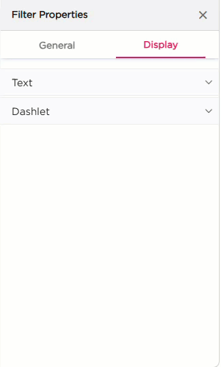
| Section | Settings | Description |
|---|---|---|
| Text | Text Color | Set the filter label text color. |
| Hover Text Color | Set the text color when hovering over the filter. | |
| Text Size | Adjust the size of the filter label text. | |
| Formats | Apply Bold or Italic styling. | |
| Show Clear Button | Toggle to show or hide a clear button inside the filter. | |
| Enable Floating Label | Toggle to enable a floating label inside the input field. | |
| Dashlet | Dashlet Background (Color, Image, Both) | Choose the background style for the dashlet. |
| Background Color | Set the solid background color. | |
| Hover Background Color | Set the background color on hover. | |
| Show Border | Turn the dashlet border on or off. | |
| Shadow Effect | Add a shadow around the dashlet. | |
| Hover Shadow Effect | Add a shadow when hovering. | |
| Border Radius | Set rounded corners for the dashlet. | |
| Spacing | Add padding inside the dashlet. |