Once you drag and drop the dashlet onto the canvas and click the dashlet, a blue line appears surrounding the dashlet border, and a settings icon shows on the right side of the dashlet. When you click the settings icon, the properties panel opens on the right. The properties panel is divided into two sections, General and Display.
¶ 1. General Settings
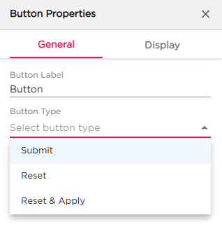
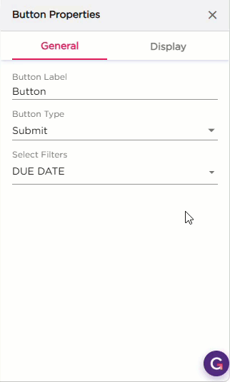
The General settings control what the button does on the dashboard.
| S.No | Setting | Description |
|---|---|---|
| 1 | Button Label | Enter the name that should appear on the button |
| 2 | Button Type |
Select how the button should work:
|
| 3 | Select Filters | After selecting the Button Type, this option appears. Use it to choose one or more filters the button should control |
Note
The Button dashlet works only with the Filter dashlet. You must add a Filter dashlet on the dashboard for the button to function. The configuration and final behavior are explained in the Filter dashlet article.
¶ 2. Display Settings
The Display settings control the appearance of the Button dashlet. All settings are grouped under Text and Dashlet.
| Section | Setting | Description |
|---|---|---|
| Text | Text Color | Set the button text color. |
| Hover Text Color | Set the text color when the user hovers over the button. | |
| Text Size | Adjust the size of the text. | |
| Font Style | Apply Bold, Italic, or Underline. | |
| Dashlet | Dashlet Background (Color, Image, Both) | Choose the background style for the button. |
| Background Color | Set the background color. | |
| Hover Background Color | Set the background color when hovered. | |
| Show Border | Show or hide the border. | |
| Shadow Effect | Add a shadow to the button. | |
| Hover Shadow Effect | Add a shadow on hover. | |
| Border Radius | Set how rounded the corners of the button should be. | |
| Spacing | Add padding inside the button. |