.png)
Multi-series Report
- 1 Minute to read
- Contributors

Multi-series Report
- 1 Minute to read
- Contributors
Article summary
Did you find this summary helpful?
Thank you for your feedback!
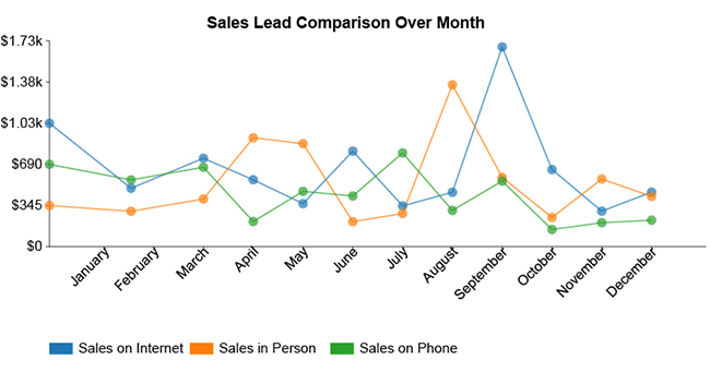
Multi-series reports are a type of data visualization where multiple datasets are represented simultaneously within a single chart. Each dataset is depicted as a distinct series, often differentiated by color or pattern, enabling users to compare and analyze multiple variables at once. This format is particularly useful for identifying trends, correlations, and patterns across different data series.
Benefits of Multi-Series Reports
Enhanced Comparisons: By displaying multiple datasets side by side, multi-series reports make it easier to compare different variables. For instance, comparing sales data across different regions or time periods becomes straightforward.
Comprehensive Insights: These reports provide a holistic view of the data, revealing relationships and interactions between different variables that might not be apparent in single-series reports.
Better Decision-Making: With a clearer picture of how different factors interplay, decision-makers can make more informed choices, backed by data-driven insights.
Improved Communication: Multi-series reports are an effective way to communicate complex information to stakeholders, as they can quickly grasp the key points without delving into raw data.
NOTE
To understand the Advanced Settings, Report Mapping, and other functionalities, it is recommended that you first read the Chart Reports parent article. To maintain the continuity of this feature, a few references from the parent article will be used in this article.
How to create Multi-series Report in Quixy?
Click on Admin Menu → Reports → Create Report.

Select the data source that you need to use to generate reports.

Select the report type as Multi-series and give the report a name.

Choose the Chart type (Area, Pie, Line, and Bar) from the drop-down menu for the both Charts.

Select the data fields in Group by column to see a visual representation of a consolidated data segmentation/data drill-down for the selected data field in the same selected sequential order.
Click on Save.
Was this article helpful?
