.png)
Divider
- 1 Minute to read
- Contributors


Divider
- 1 Minute to read
- Contributors
Article summary
Did you find this summary helpful?
Thank you for your feedback!
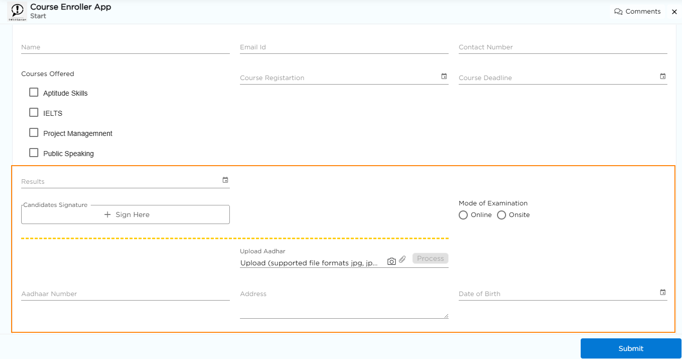
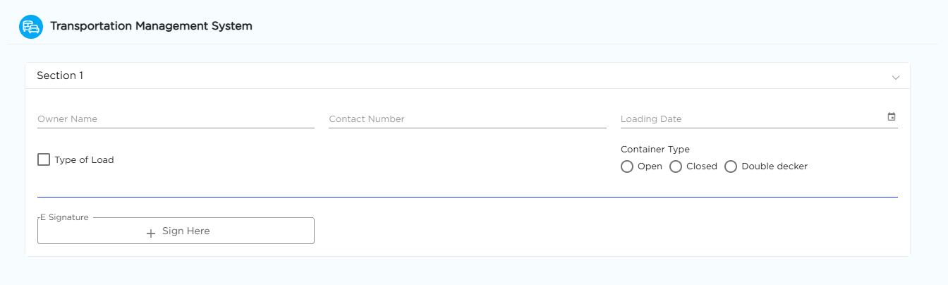
Divider is used to add a line or divider on the application form. It can be placed between two sections to visually separate them and improve the overall appearance of the form.

When you use the Divider in your application, it displays a horizontal line between the elements you have placed within the Divider element field as shown in the image below. This line visually separates the elements and helps to improve the layout and organization of your application's interface.
 Divider - Properties
 Divider - Properties
Field Name: Provide a unique name for the field which is visible for CDs while building application.
Type: The Divider can be presented in 3 types, they are:
Dashed: In this type, the divider line appears as a series of short dashes.

Dotted: In the dotted type, the divider line is made up of a series of small dots.

Solid: The solid type presents the divider line as a continuous, unbroken line.
 Field Themes
 Field Themes
Font Properties
Divider Color: Choose or modify the color of the divider.
Divider Size: Select the size of the divider based on your requirement.
Was this article helpful?
