.png)
Bar Chart
- 1 Minute to read
- Contributors


Bar Chart
- 1 Minute to read
- Contributors
Article summary
Did you find this summary helpful?
Thank you for your feedback!
Bar charts are one of the most commonly used types of charts for displaying comparisons between different types of data and variations of different values. A bar chart can be oriented horizontally or vertically and uses rectangular bars of varying lengths that are proportional to the value being visualized. Because the horizontal rectangles have enough space to fit textual information, you can display long data labels.
There are various types of bar charts in Quixy, which you will learn about as you read this article.
NOTE
To understand the Advanced Settings, Report Mapping, and other functionalities, it is recommended that you first read the Chart Reports parent article. To maintain the continuity of this feature, a few references from the parent article will be used in this article.
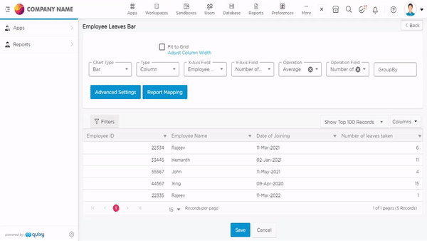
- On the data source list page, select the data source for which you want to create a chart report, and click on to create a report.

- You will land on the report configuration page, as shown below.

- The Select Type drop-down will provide the list of report types like grid, pivot, individual, charts, and multiple charts available in Quixy.

- Select the report type as Chart, and select the chart type as Bar.

NOTE
The Bar Chart species has 10 sub-species, such as Column, Back-to-back Column, Range Column, Inversed Range Column, Bar, Stacked Column, 100% stacked column, Stacked Bar, and 100% stacked bar, and Negative Stack. The configuration is same for all the charts. However, the visual characteristics will differ for each sub-species.
- Select the sub-species of Bar Chart from the Type drop-down as required. Provide the rest of the details like X-Axis, Y-Axis, Operation, and Operation Field, refer to GIF below. (Refer to Chart Reports article to understand the use/purpose of the X-Axis, Y-Axis, Operation, and Operation Field)

- Select the data fields in Group by column to see a visual representation of a consolidated data segmentation/data drill-down for the selected data field in the same selected sequential order.
- Save and View the Bar Chart Report, as shown in the GIF below. Refer to the GIF below.
NOTE
For your convenience, sample mockups for various types of line chart reports are provided below.
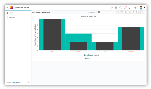
Sub-Type: Back-to-Back Column
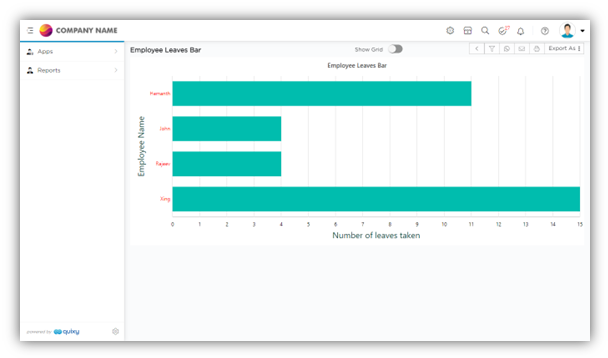
Sub-Type: Bar
Sub-Type: Back-to-Back Column

Sub-Type: Bar
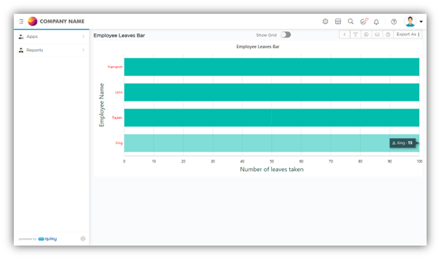
Sub-Type: 100% Stacked Bar


Was this article helpful?
