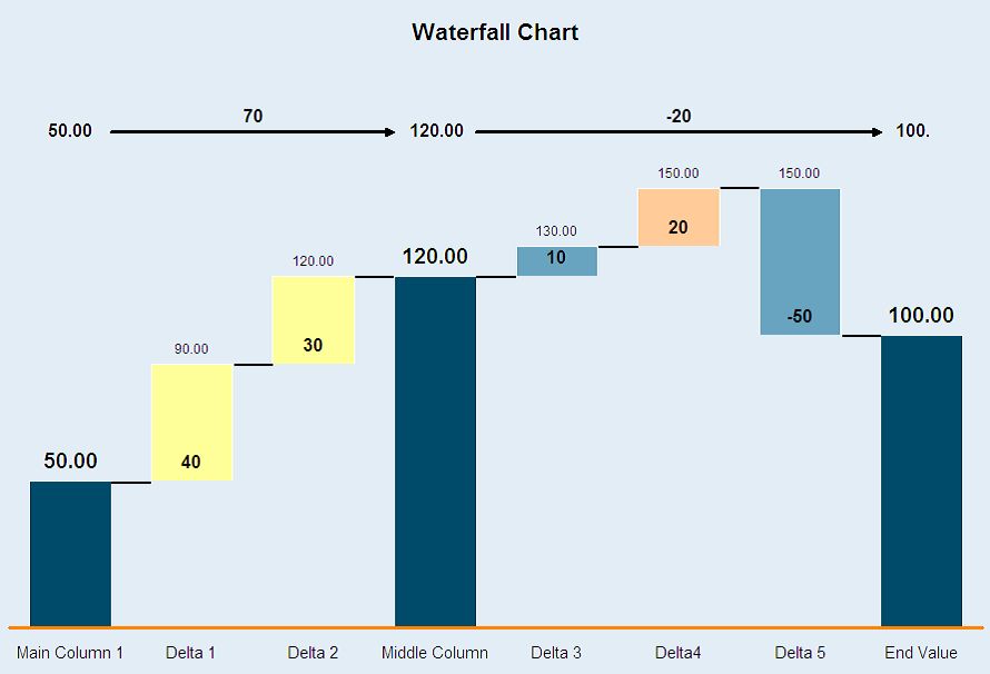
A waterfall chart, also known as a cascade chart or bridge chart, provides a visual representation of data that helps in tracking the increment and decrement of values. It starts with an initial value, followed by intermediate values that are added or subtracted, and ends with the final value. Each bar in the chart represents a value, and the bars are color-coded to distinguish between increases and decreases.
Key Components of a Waterfall Chart:
Initial Value: The starting point of the chart, often represented as the first bar.
Intermediate Values: These are the changes (positive or negative) that occur sequentially, represented by floating bars.
Final Value: The ending point of the chart, which is the cumulative result of the initial value and all intermediate changes.
NOTE
To understand the Advanced Settings, Report Mapping, and other functionalities, it is recommended that you first read the Chart Reports parent article. To maintain the continuity of this feature, a few references from the parent article will be used in this article.
How to create a Waterfall Chart in Quixy?
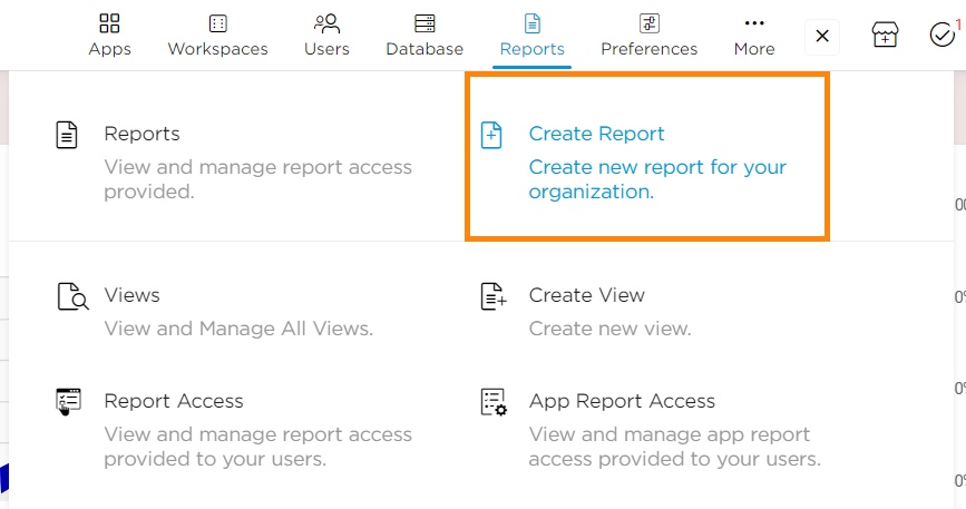
Click on Admin Menu → Reports → Create Report.
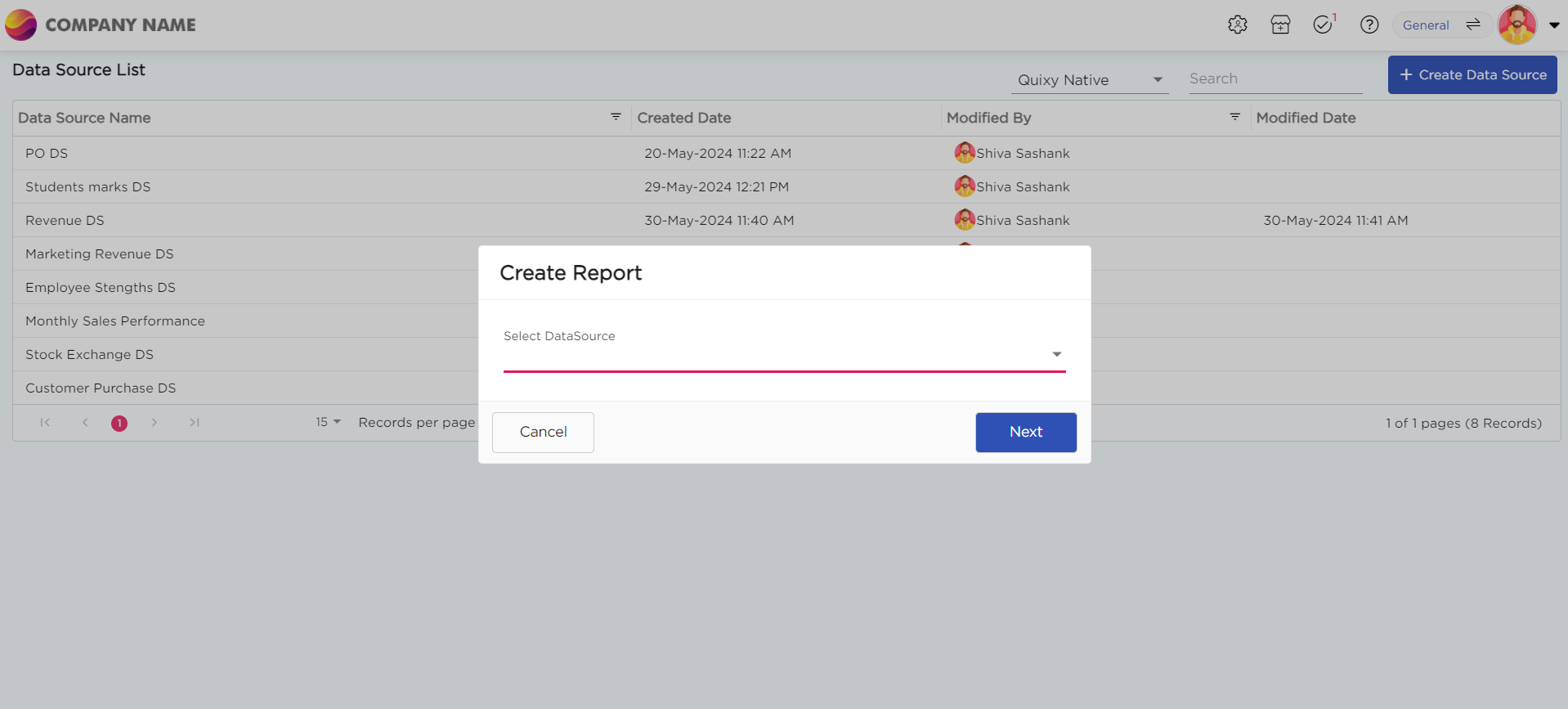
Select the data source that you need to use to generate reports.
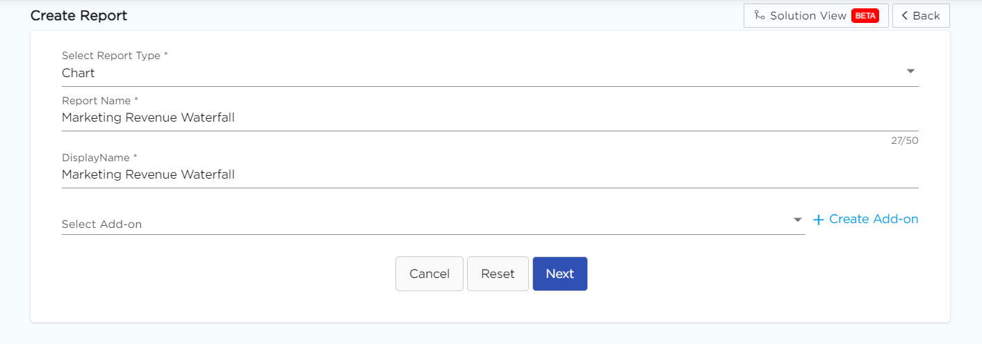
Select the report type as Chart and give the report a name.
Choose Waterfall from the Chart type drop-down menu.
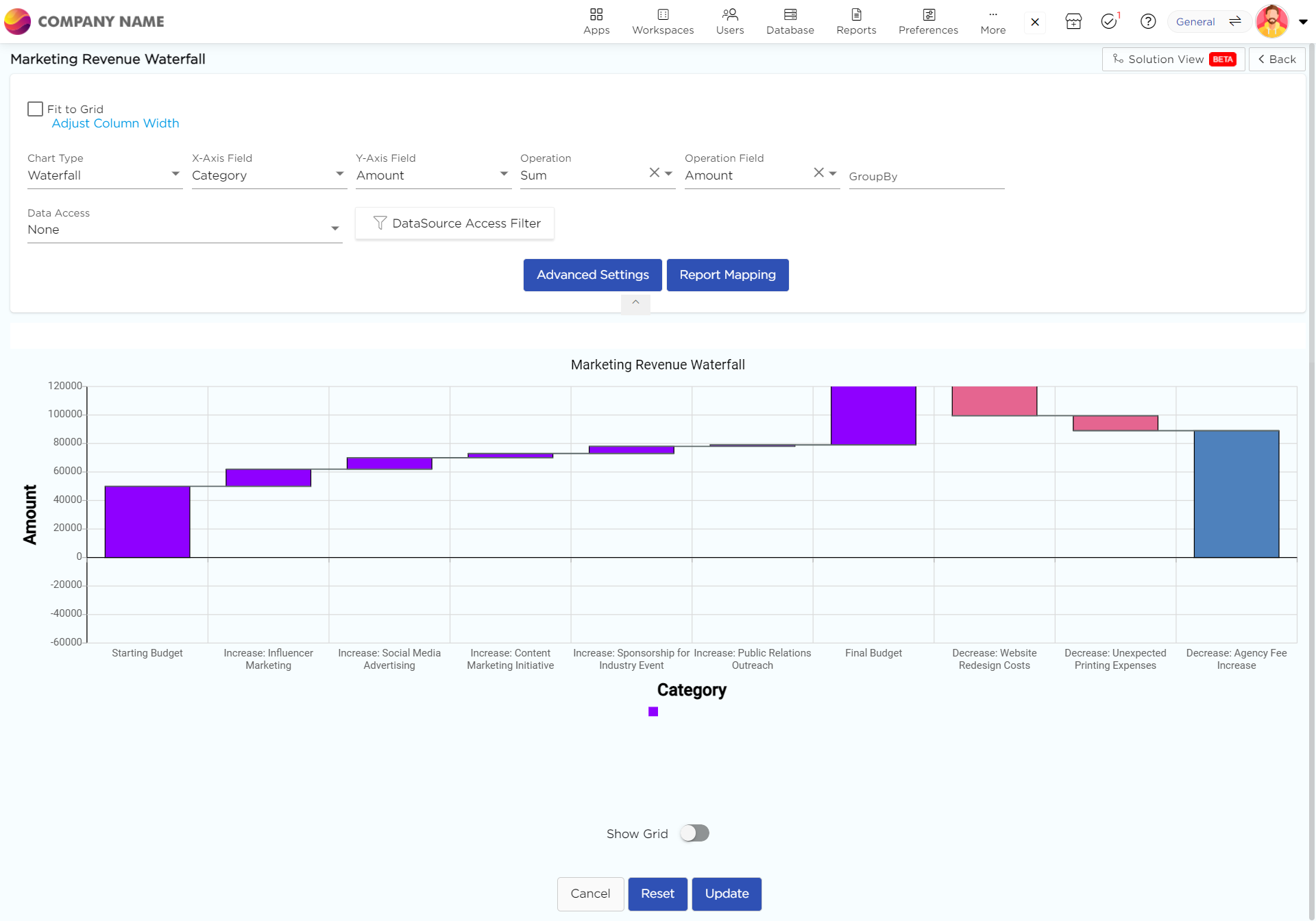
Select the data fields in Group by column to see a visual representation of a consolidated data segmentation/data drill-down for the selected data field in the same selected sequential order.
Click on Save.
.png)


