.png)
Stock Chart
- 1 Minute to read
- Contributors

Stock Chart
- 1 Minute to read
- Contributors
Article summary
Did you find this summary helpful?
Thank you for your feedback!
A stock chart is a type of financial chart used to visualize the performance of stocks over time. It provides a graphical representation of a stock's price movements, trading volume, and other relevant financial data. Stock charts are commonly used by traders and investors to analyze market trends, identify patterns, and make informed trading decisions.
Key components of a stock chart include:
Price Data: Shows the opening, closing, high, and low prices of a stock for a specific period (e.g., daily, weekly, monthly).
Volume Data: Displays the number of shares traded during a specific period, indicating the level of activity in the stock.
Time Axis: Represents the time period over which the data is plotted (e.g., days, months, years).
Price Axis: Represents the stock price values.

NOTE
To understand the Advanced Settings, Report Mapping, and other functionalities, it is recommended that you first read the Chart Reports parent article. To maintain the continuity of this feature, a few references from the parent article will be used in this article.
How to create a Stock Chart in Quixy?
Click on Admin Menu → Reports → Create Report.

Choose the data source that you need to use to generate reports.

Select the report type as Chart and give the report a name.
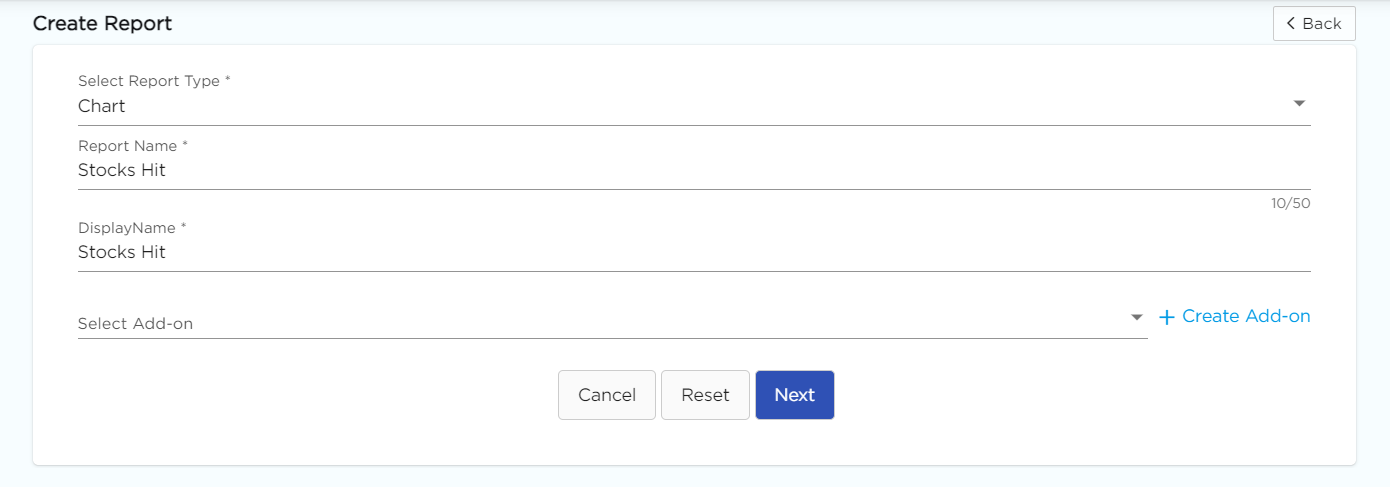
Choose Stock from the Chart type drop-down menu.

Select the data fields in Group by column to see a visual representation of a consolidated data segmentation/data drill-down for the selected data field in the same selected sequential order.
Click on Save.
Was this article helpful?
