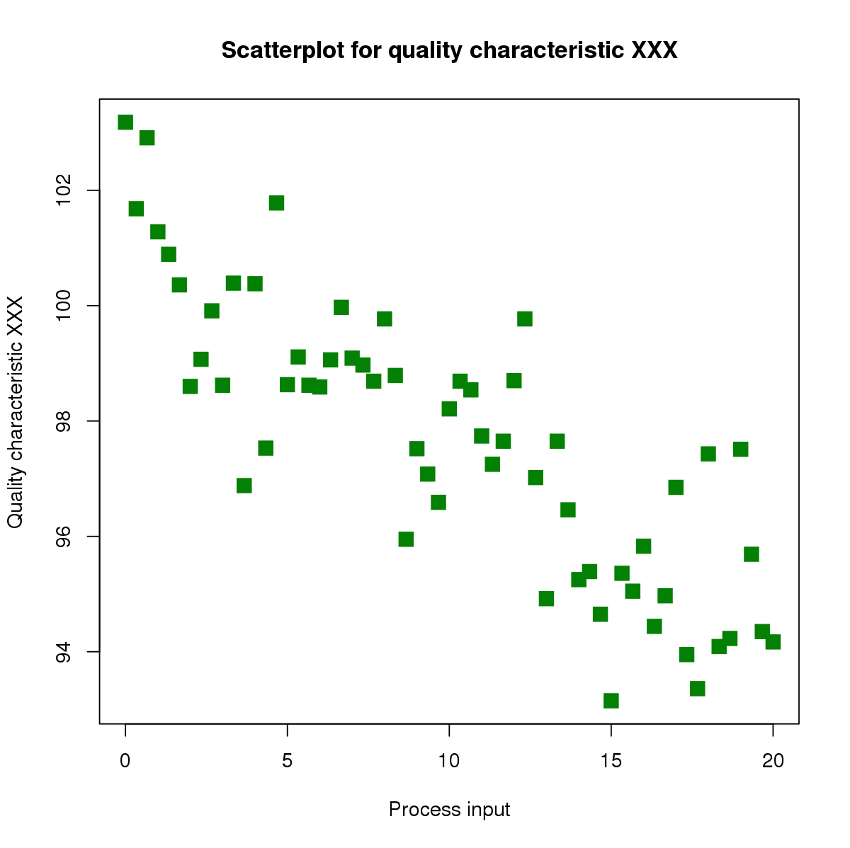
A Scatter Chart, also known as a scatter plot, is a type of data visualization that displays values for two variables for a set of data. The data is displayed as a collection of points, each representing the values of the two variables. The position of each point on the horizontal and vertical axis indicates the values of the two variables. This makes it easy to see how one variable is affected by another, revealing correlations or patterns.
Key Features of Scatter Charts
Correlation Identification: Scatter charts are excellent for identifying the type and strength of relationships between variables. For example, a positive correlation is indicated when points slope upwards from left to right, while a negative correlation is shown by a downward slope.
Trend Lines: Adding a trend line can help in understanding the overall direction of the data points. This is particularly useful for predictive analysis.
Outlier Detection: Scatter charts make it easy to spot outliers, which are data points that deviate significantly from the rest of the data.
When to Use Scatter Charts
Scatter charts are ideal when you want to:
Explore relationships between two numerical variables.
Identify patterns or trends in data.
Detect outliers or anomalies.
Perform regression analysis to predict future values.
Bubble Charts
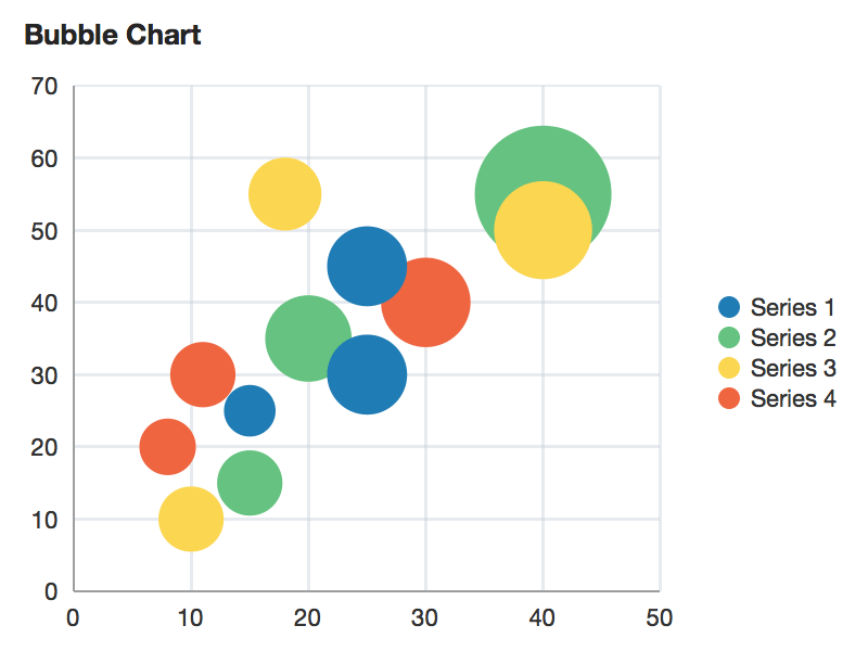
A Bubble Chart is an extension(sub-type) of the scatter chart. In addition to the two variables represented on the X and Y axes, a bubble chart adds a third dimension through the size of the bubbles. This third variable is often used to represent the magnitude or importance of the data points.
Key Features of Bubble Charts
Multivariate Analysis: Bubble charts allow for the visualization of three variables in a single plot, making them valuable for more complex data analysis.
Size Dimension: The size of each bubble can represent an additional variable, such as population, sales volume, or any other quantitative measure, providing deeper insights into the data.
Color Coding: Bubbles can also be color-coded to represent a fourth variable, adding another layer of information to the chart.
When to Use Bubble Charts
Bubble charts are particularly useful when you need to:
Compare three dimensions of data simultaneously.
Visualize data with an additional magnitude element.
Highlight the importance or size of data points relative to each other.
Add another layer of information with color coding for a fourth variable.
NOTE
To understand the Advanced Settings, Report Mapping, and other functionalities, it is recommended that you first read the Chart Reports parent article. To maintain the continuity of this feature, a few references from the parent article will be used in this article.
How to create Scatter and Bubble Charts in Quixy?
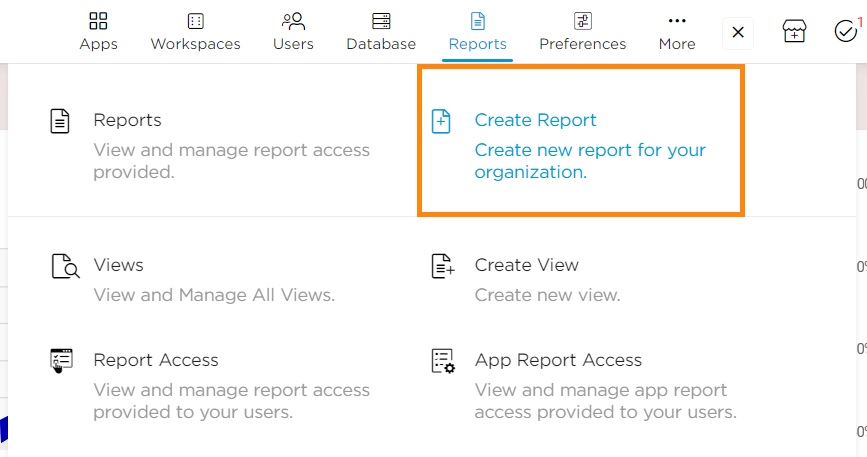
Click on Admin Menu → Reports → Create Report.
Select the data source that you need to use to generate reports.
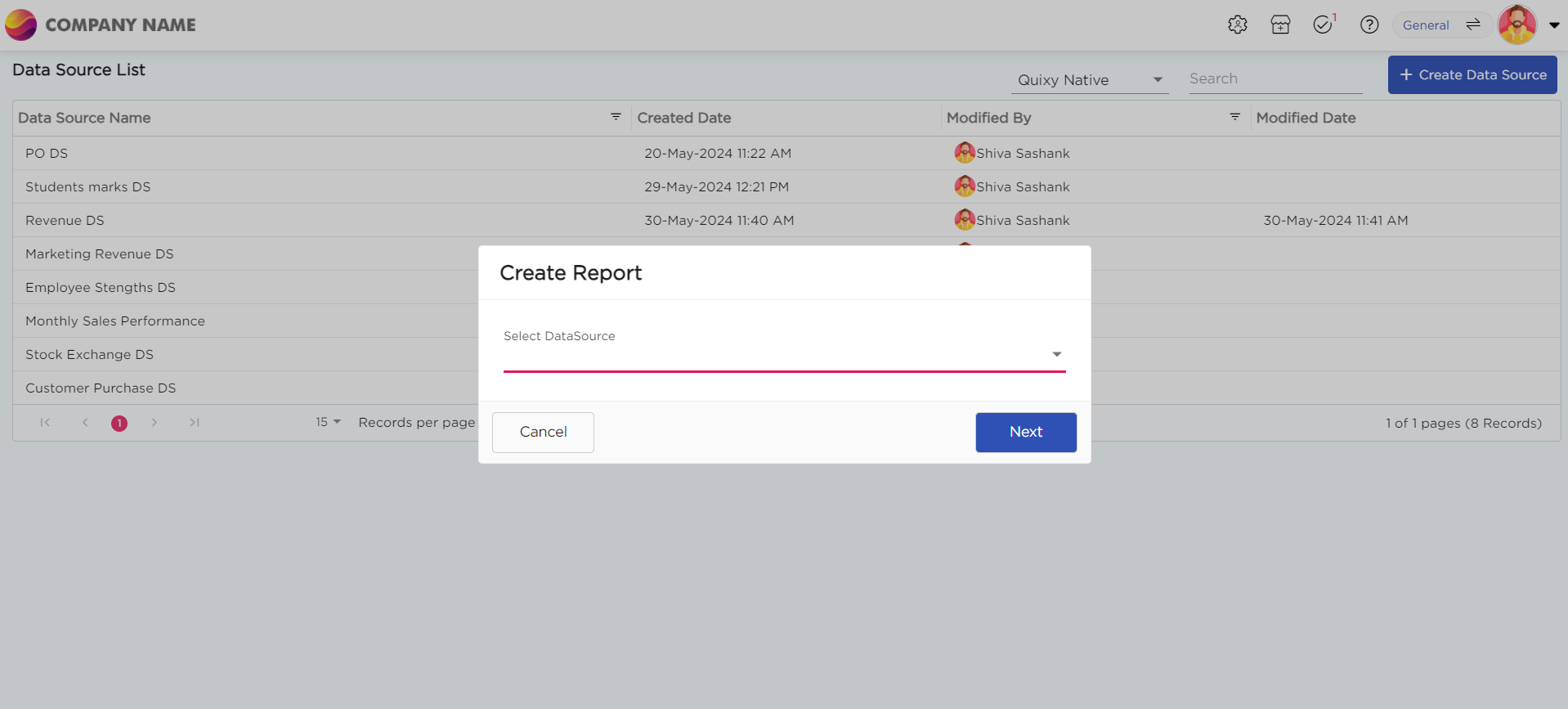
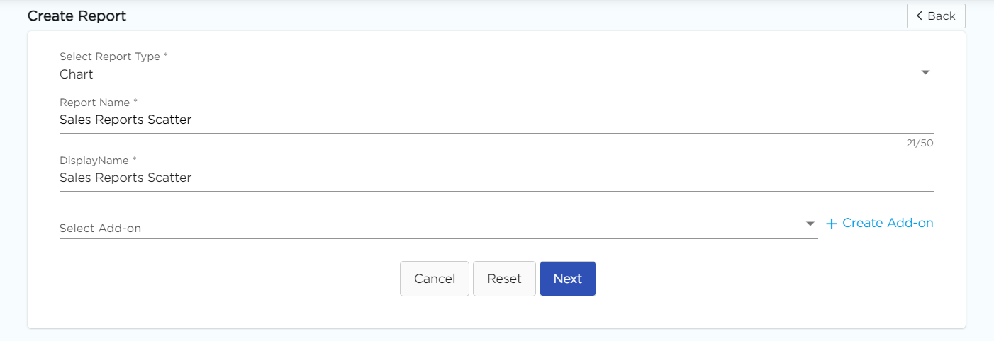
Select the report type as Chart and give the report a name.
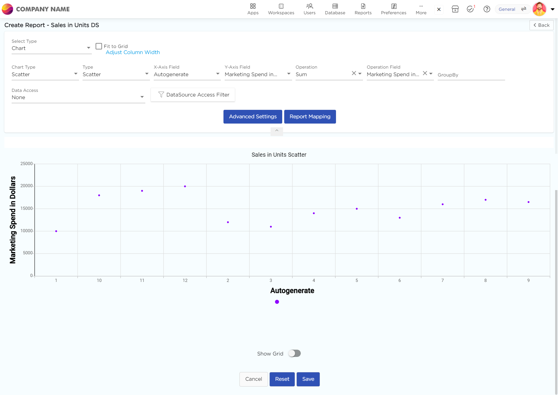
Choose Scatter from the Chart type drop-down menu.
Choose the types as bubble to view the report in bubble view, which displays the data in bubble view.
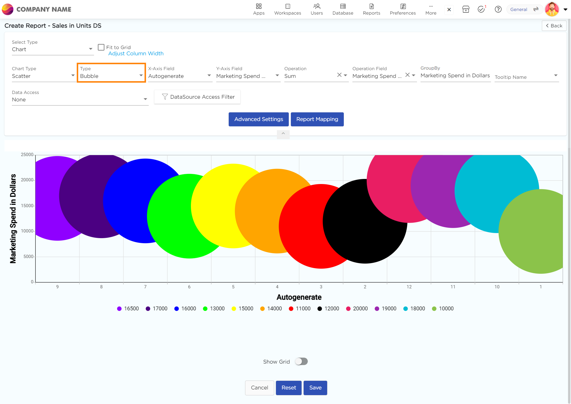
Select the data fields in Group by column to see a visual representation of a consolidated data segmentation/data drill-down for the selected data field in the same selected sequential order.
Click on Save.
.png)


