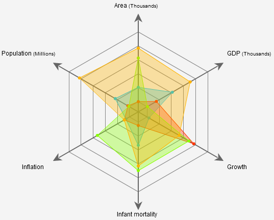
Radar charts, sometimes referred to as spider charts or web charts, are similar to polar charts but focus on comparing multiple variables. They consist of a central point with several axes radiating outwards, each representing a different variable. Data points are plotted along these axes and connected to form a polygonal shape. Radar charts are ideal for visualizing performance metrics, comparing different entities, or showcasing multi-dimensional data.
Use cases for Radar Chart
Market Research: Polar charts are effective in market research for visualizing consumer preferences and behaviors over time. For instance, a polar chart can depict seasonal sales patterns, highlighting peak periods and off-seasons.
Product Comparison: When comparing multiple products or services, radar charts provide a clear visual representation of their features and performance across several dimensions, aiding in decision-making.
Weather Data Visualization: Polar charts are useful for representing meteorological data, such as wind speed and direction, temperature variations, and precipitation levels, over a specific period.
NOTE
To understand the Advanced Settings, Report Mapping, and other functionalities, it is recommended that you first read the Chart Reports parent article. To maintain the continuity of this feature, a few references from the parent article will be used in this article.
How to create Radar Chart in Quixy?
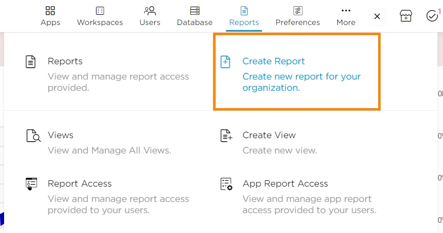
Click on Admin Menu → Reports → Create Report.
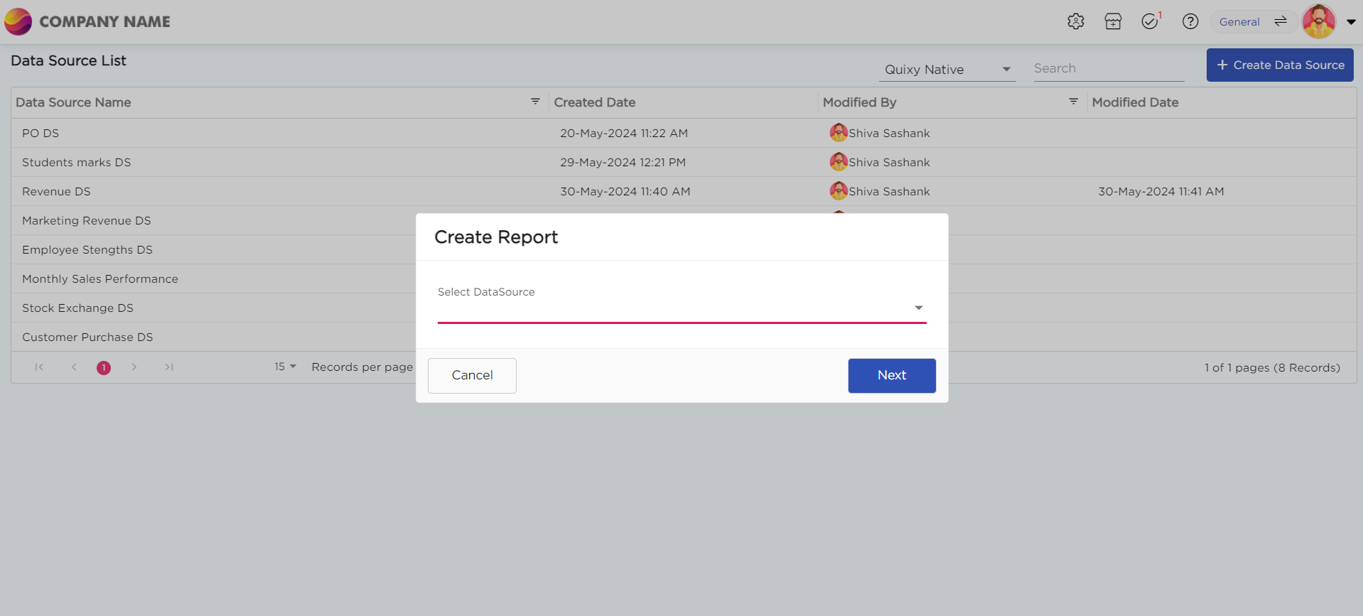
Select the data source that you need to use to generate reports.
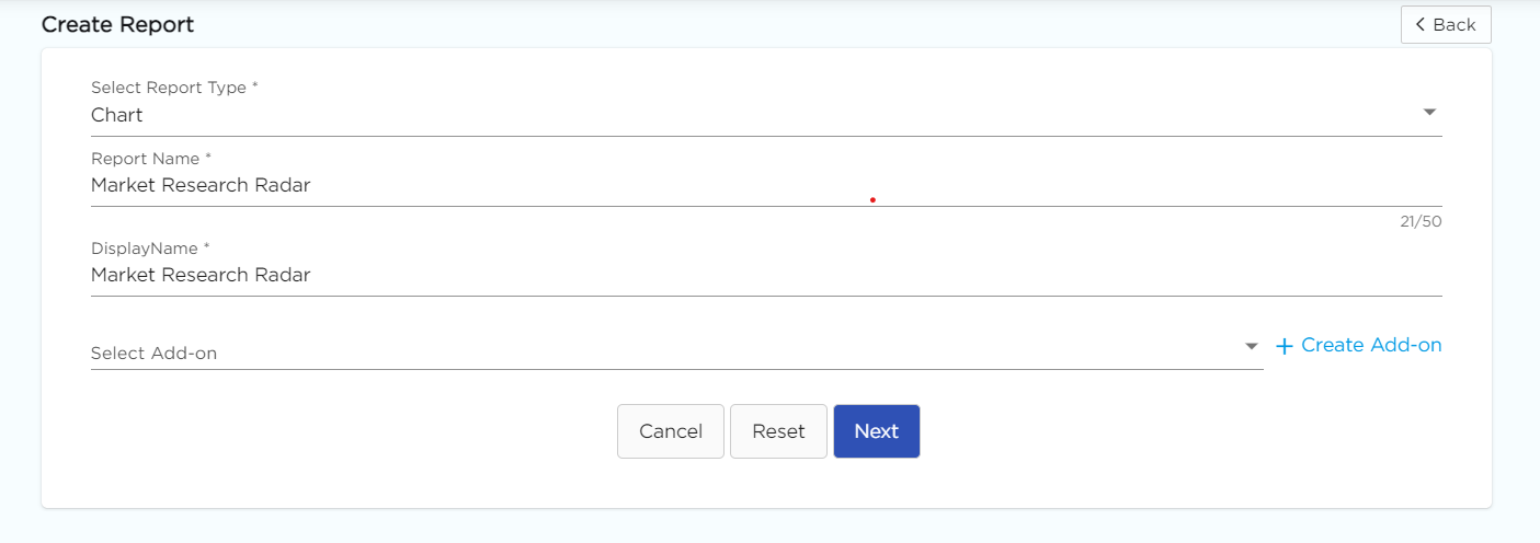
Select the report type as Chart and give the report a name.
Choose Radar from the Chart type drop-down menu.
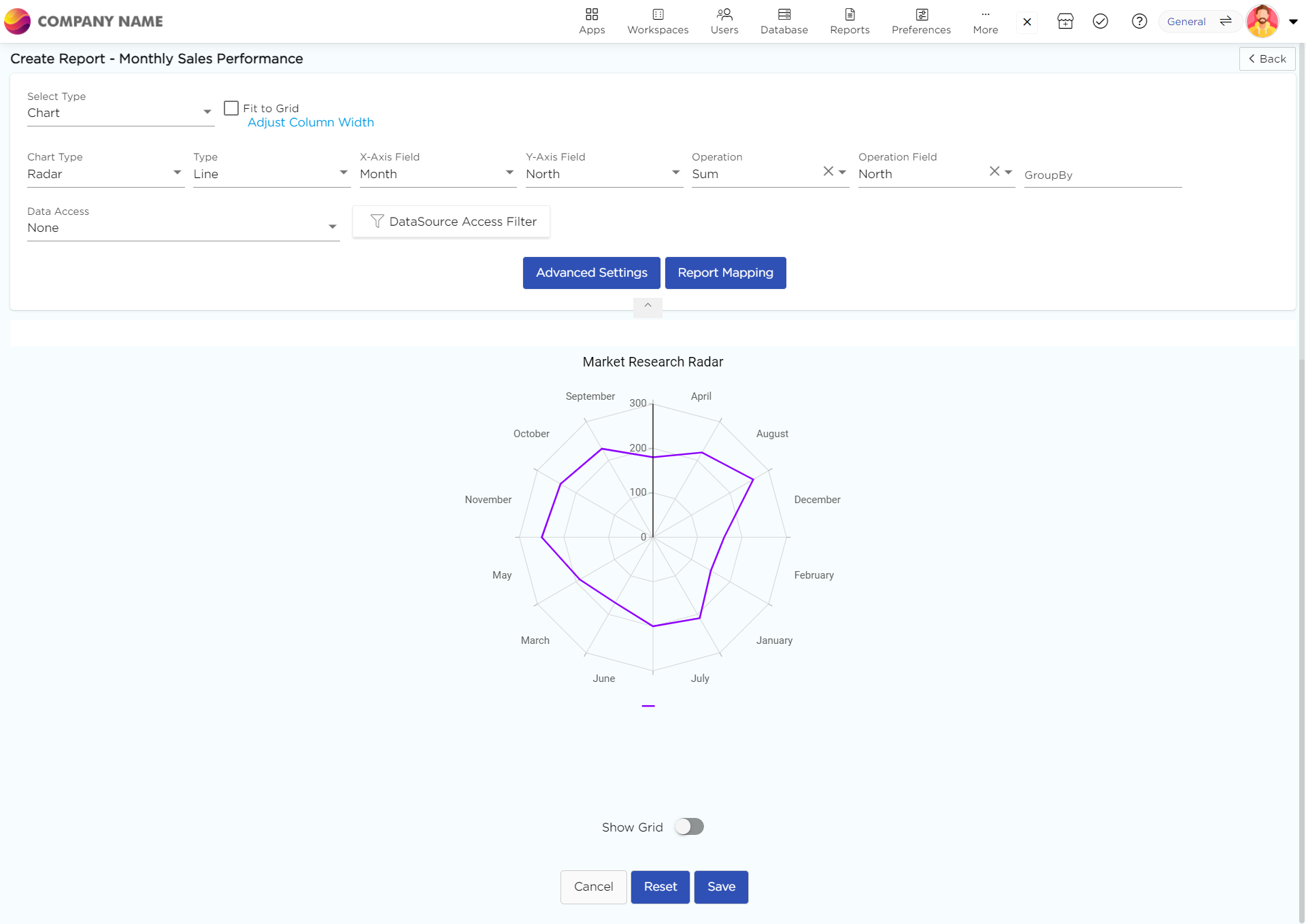
Select the data fields in Group by column to see a visual representation of a consolidated data segmentation/data drill-down for the selected data field in the same selected sequential order.
Click on Save.
.png)


