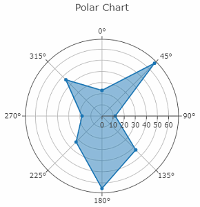
Polar reports are graphical representations where multiple variables are plotted along a radial axis. Each variable has its own axis, which starts from the center of the chart and extends outward. The data points for each variable are connected by lines, forming a shape that visually represents the data set.
Key Features of Polar Reports
Multi-dimensional Display: Polar reports are perfect for comparing multiple variables at once. Each axis represents a different variable, allowing for a comprehensive view of data relationships.
Pattern Recognition: The shapes formed by connecting data points help in identifying patterns and trends. Similar shapes indicate similar data profiles, making it easy to compare multiple entities.
Clear Comparison: When comparing different data sets, Polar reports provide a clear visual comparison. The overlapping shapes highlight the differences and similarities across variables.
NOTE
To understand the Advanced Settings, Report Mapping, and other functionalities, it is recommended that you first read the Chart Reports parent article. To maintain the continuity of this feature, a few references from the parent article will be used in this article.
Advantages of Polar Reports
Multi-Dimensional Comparison: Simultaneous comparison of multiple variables. Each variable is represented along its own axis radiating from the center, enabling a holistic view of the data set. This is particularly useful when analyzing complex data with several dimensions.
Pattern Recognition: The shapes formed by connecting data points across the various axes make it easy to recognize patterns and trends. Similar shapes indicate similar data profiles, helping to quickly identify outliers or commonalities among different data sets.
Intuitive Visualization: It provide a visually intuitive way to display data. The radial layout is easy to understand, even for those who may not be familiar with more complex chart types. This makes it an excellent tool for presentations and reports aimed at a broad audience.
How to create a Polar Chart in Quixy?
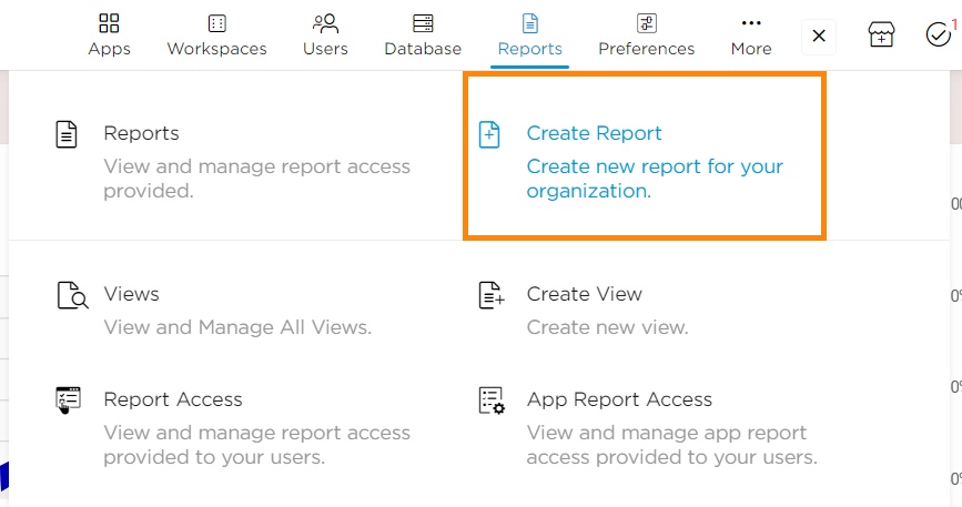
Click on Admin Menu → Reports → Create Report.
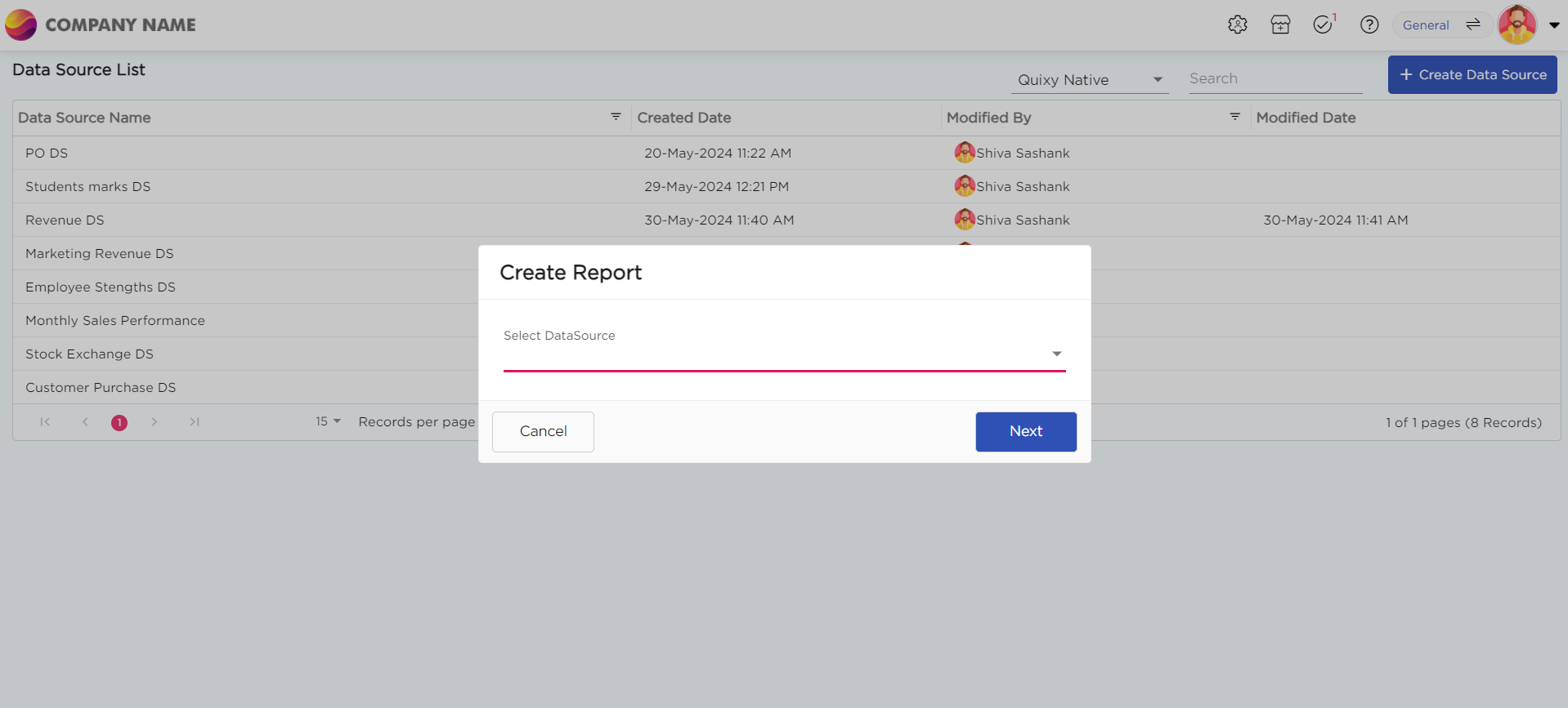
Select the data source that you need to use to generate reports.
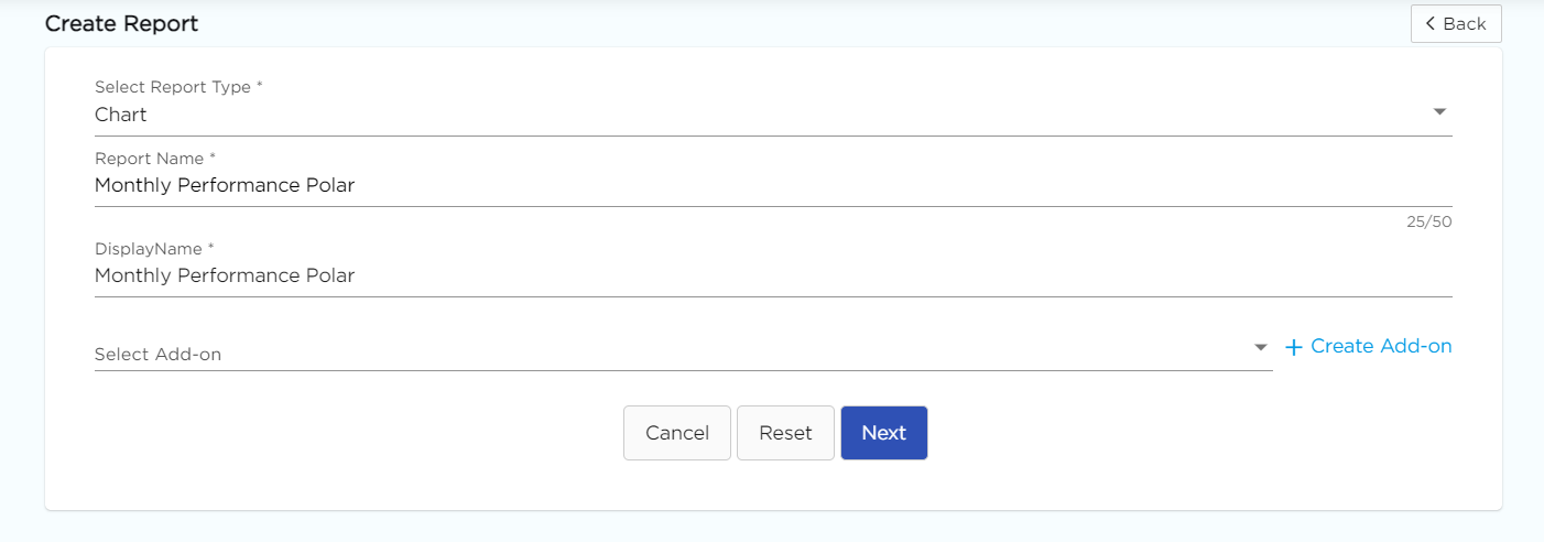
Select the report type as Chart and give the report a name.
Choose Polar from the Chart type drop-down menu.
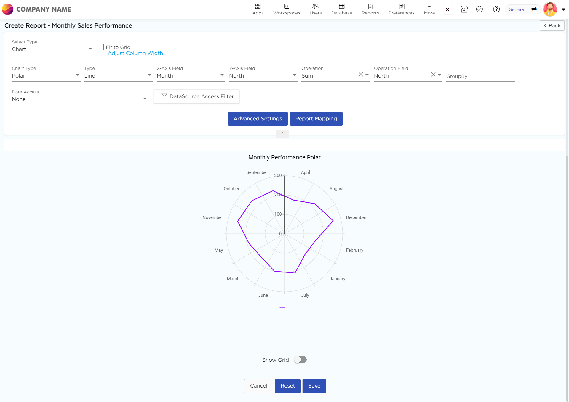
Select the data fields in Group by column to see a visual representation of a consolidated data segmentation/data drill-down for the selected data field in the same selected sequential order.
Click on Save.
.png)


