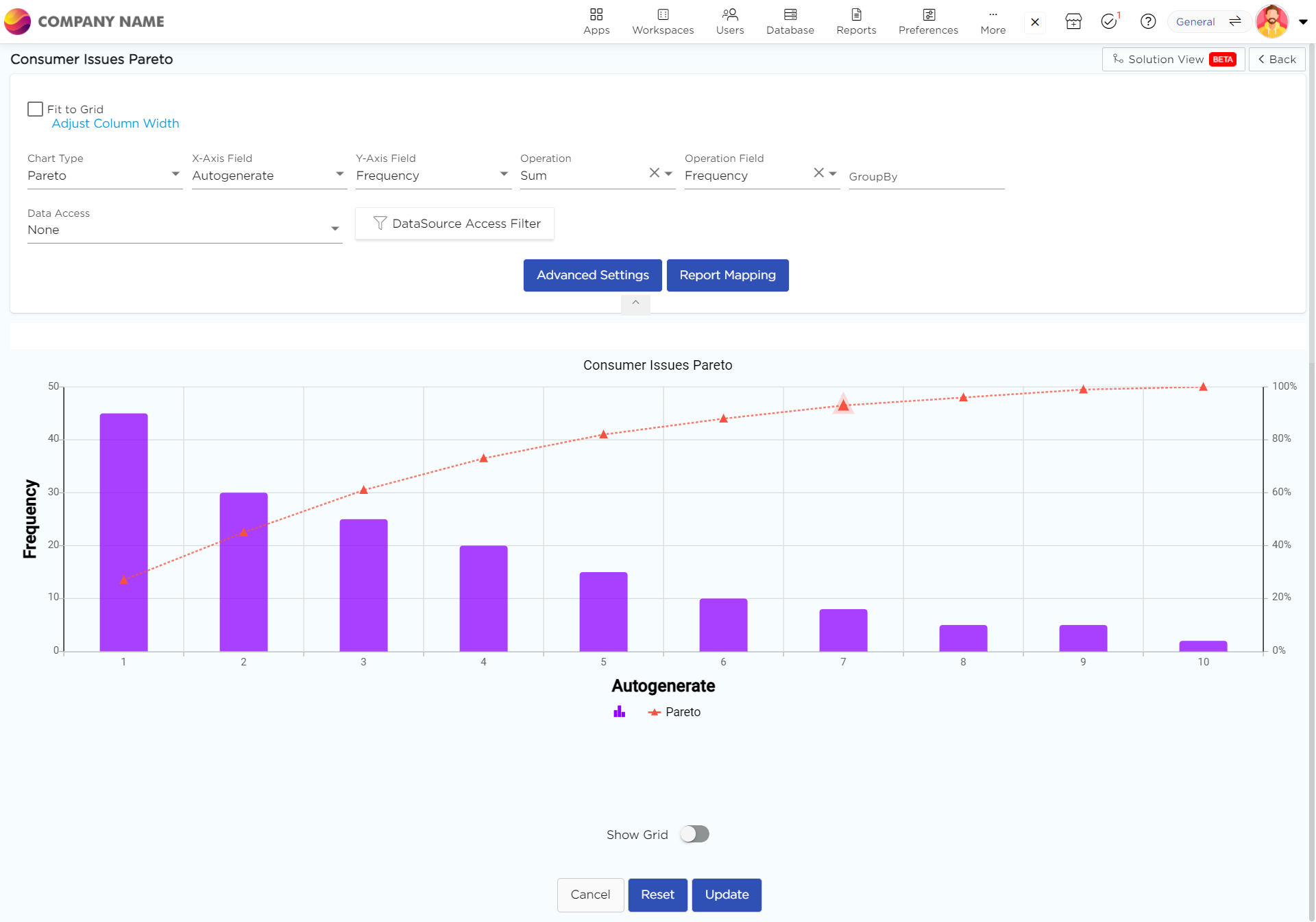
Imagine a bar graph where the bars are not arranged alphabetically or chronologically, but rather according to their size. The longest bar stands on the left, representing the most frequent cause, and the bars decrease in length as we move to the right. This showcases the distribution of factors, with the most impactful ones immediately grabbing your attention.
But Pareto charts go beyond simple bars. They incorporate a line graph overlaid on the bars, depicting the cumulative percentage of the total effect. This line steadily rises as we move from left to right, highlighting the overall contribution of each cause.
Here’s how it works:
Bars: Each bar represents a category of data. The height of the bar indicates the frequency or impact of that category.
Line: The line graph shows the cumulative percentage of the total number of occurrences, moving from left to right.

NOTE
To understand the Advanced Settings, Report Mapping, and other functionalities, it is recommended that you first read the Chart Reports parent article. To maintain the continuity of this feature, a few references from the parent article will be used in this article.
How to create a Pareto in Quixy?
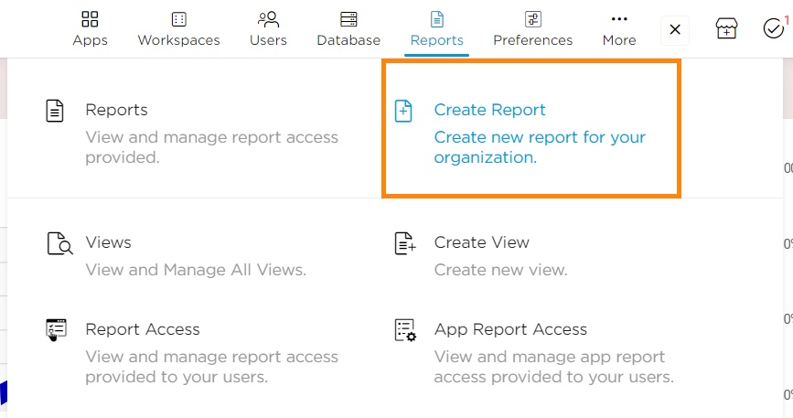
Click on Admin Menu → Reports → Create Report.

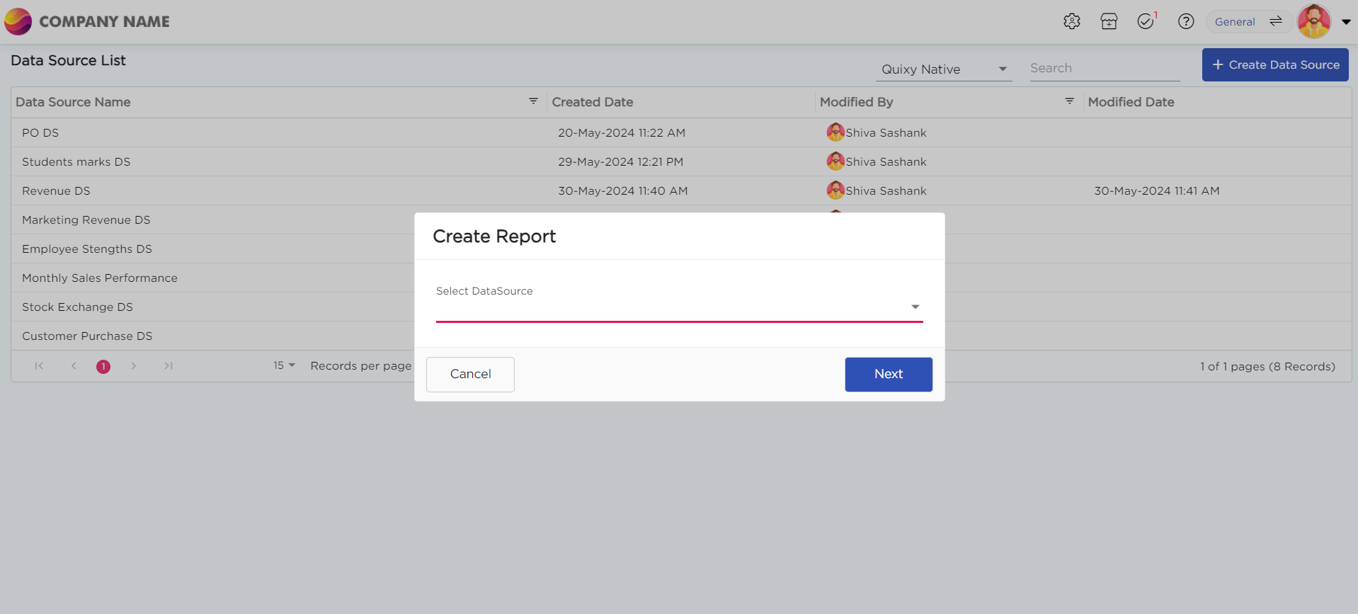
Select the data source that you need to use to generate reports.

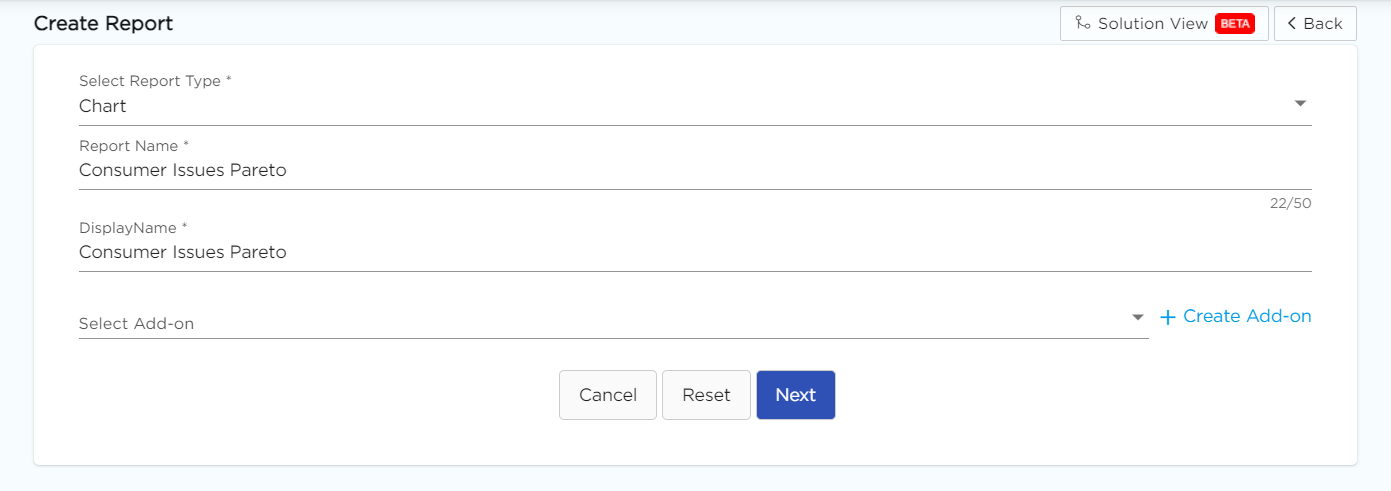
Select the report types and give the report a name.

Choose Pareto from the Chart type drop-down menu.

Select the data fields in Group by column to see a visual representation of a consolidated data segmentation/data drill-down for the selected data field in the same selected sequential order.
Click on Save.
.png)


