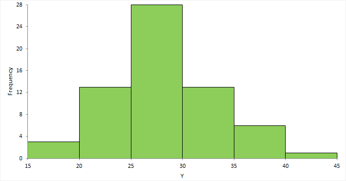
A Histogram is a bar graph that show case the distribution of a continuous data set. Imagine a collection of exam scores. A Histogram wouldn't show each individual score, but rather group them into ranges, like 90-100, 80-89, and so on. The height of each bar then represents how many scores fall within that specific range.
Here's a breakdown of the key elements of a histogram:
X-axis (horizontal): This axis represents the ranges, or "bins," into which the data is grouped.
Y-axis (vertical): This axis shows the frequency or count of data points that fall within each bin. The higher the bar, the more data points are present in that range.
Bars: Bars are the fundamental units of a histogram. On the chart, they are represented by the vertical rectangles. A category or group is represented by each bar on the X-axis, and the height of each bar shows the frequency of an event inside that category. Hence, longer bars represent fewer occurrences whereas higher bars represent more occurrences. The bar's width doesn't change, but the X-axis represents the range that each category covers. The categories are all of the same size if all of the bars have the same width.
NOTE
To understand the Advanced Settings, Report Mapping, and other functionalities, it is recommended that you first read the Chart Reports parent article. To maintain the continuity of this feature, a few references from the parent article will be used in this article.
How to create a Histogram in Quixy?
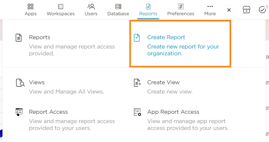
Click on Admin Menu → Reports → Create Report.
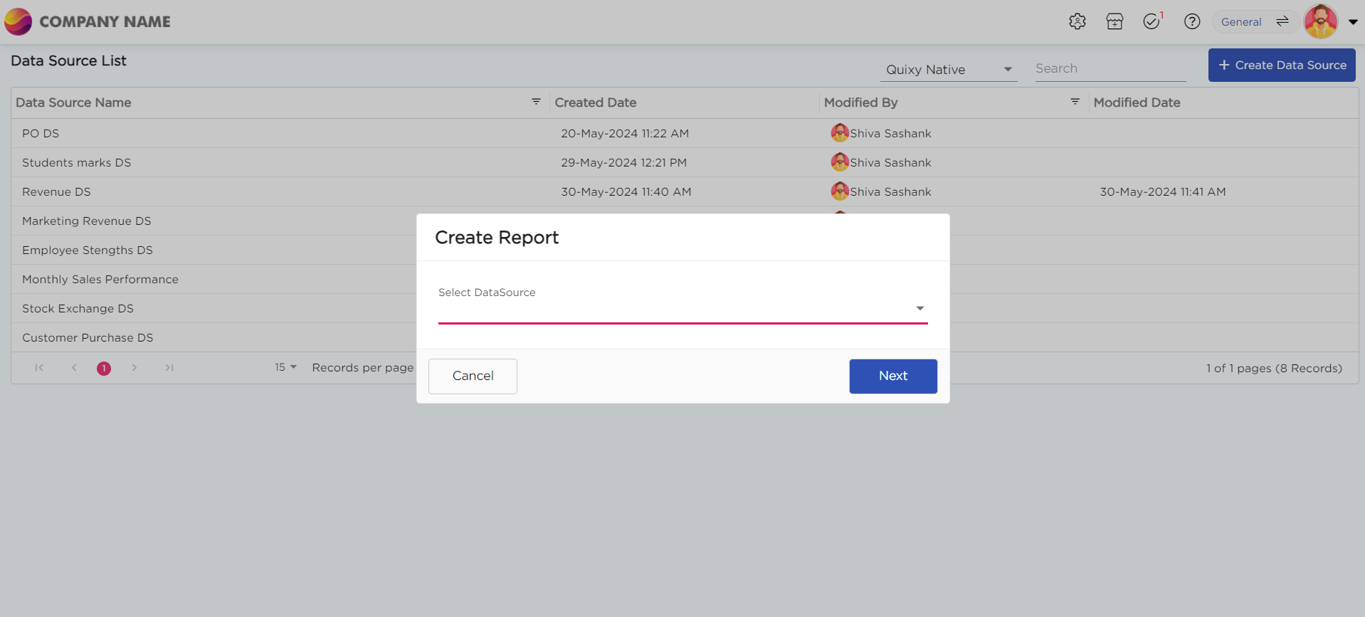
Select the data source that you need to use to generate reports.
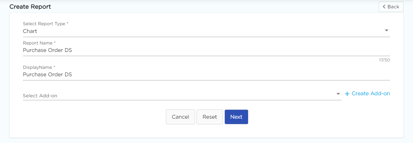
Select the report type as Chart and give the report a name.
Choose Histogram from the Chart type drop-down menu.
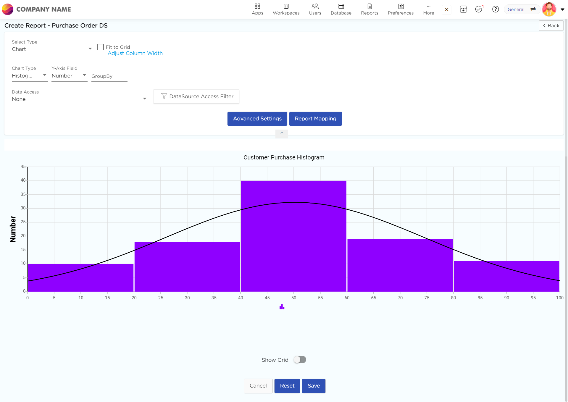
Select the data fields in Group by column to see a visual representation of a consolidated data segmentation/data drill-down for the selected data field in the same selected sequential order.
Click on Save.
.png)


