.png)
Grid
- 8 Minutes to read
- Contributors


Grid
- 8 Minutes to read
- Contributors
Article summary
Did you find this summary helpful?
Thank you for your feedback!
A grid in an application serves as a dynamic component for capturing and displaying data in a structured, table-like format. By organizing information into rows and columns, much like a spreadsheet, it enables users to efficiently input, edit, view, and manage data. After data is added or updated in the grid, it is typically displayed in a list view within the application.
.png)
How to Configure the Grid?
Navigate to the form builder, under Basic Elements category drag and drop the Grid element into the application. Once added, a panel will appear on the right side showing the Grid Properties. These properties are organized into five sections:
Field Configurations
Grid Options
Advanced Grid Options
Mobile Settings
UI Settings
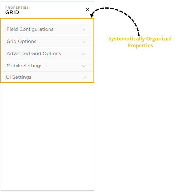
Let’s explore each section in detail, one by one.
Field Configurations

In this section, you can perform the following actions:
Field Name: Provide a unique name for the field which is visible for CDs while building application.
Label Name: Provide a unique name for the field which will be visible for the end-users.
Add Grid Elements: Use this option to add columns to the Grid.
Grid Options

In this section CDs can configure the usability options of the grid for the end-users.
Don't Show Grid: Enabling this option will temporarily hide the grid from the application and it is not visible to the end-users.

Don't Allow to Add Record: Enabling this option will disable the + Add Record button of the grid, preventing users from adding new records. The image below illustrates how the grid appears before and after this option is enabled.


Don't Allow to Add Records Using Excel: Enabling this will completely remove the upload excel option which will not allow the end-users to upload records from excel files inside the grid.

Don't Allow to Download Records to Excel: Enabling this will completely remove the download excel option which will not allow the end-users to download records of the Grid into Excel files.

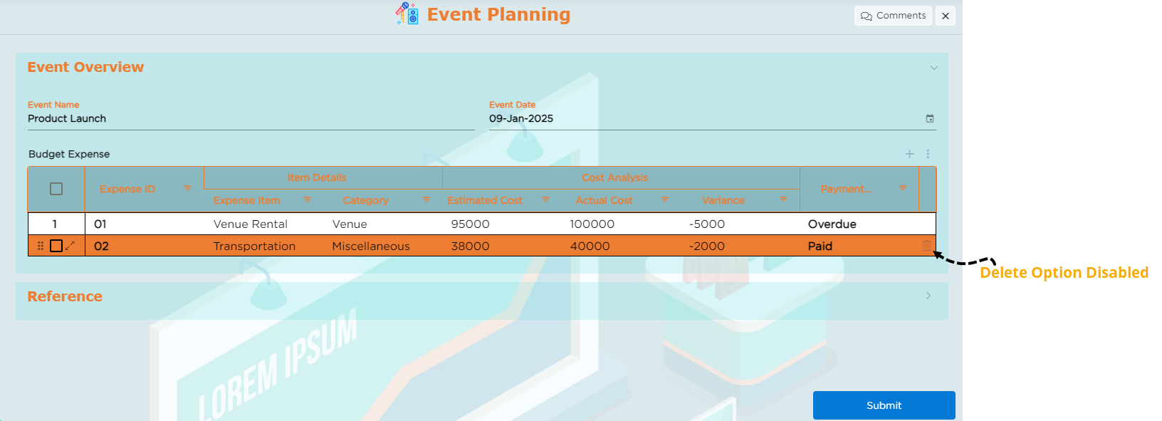
Delete options: This option deletes the records available in the grid, to manage deletion there are different provisions such as Enable, Hide, Disable.
Enable: This option allows CDs to include a delete icon for every record in the grid. End users can use this icon to delete records from the grid.
.jpg)
Hide: This option allows CDs to remove the delete icon temporarily from the grid and it will not be visible to the end users.
.jpg)
Disable: This option allows CDs to keep the delete icon visible in the grid while disabling its functionality. End users can still see the delete icon, but it will be in a view-only mode.
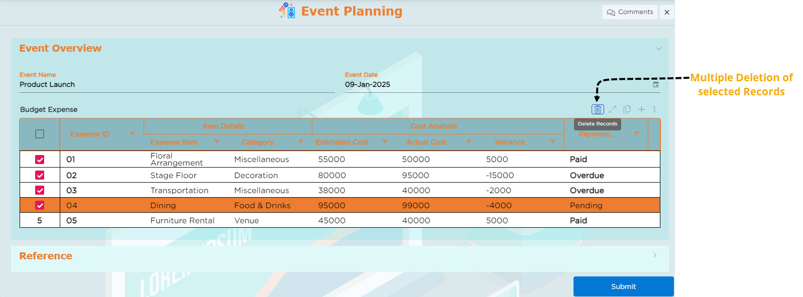
Multi-select Records to Delete: Enabling this allows users to select multiple records at once and delete them.
.jpg)
.jpg)

Add Record: This property is to define the preferred record-adding modes for end-users. There are three modes as given below:
Inline: This option allows end users to add records directly within the grid.
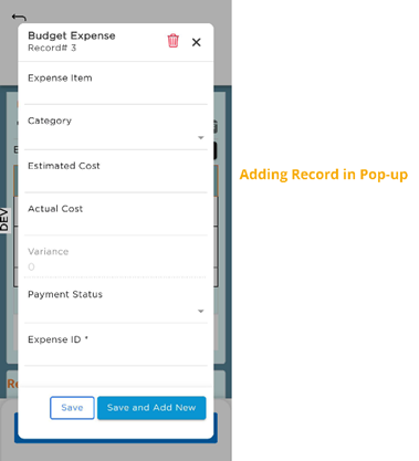
Pop-up: This option allows end users to add records through a pop-up. When a record is added in a pop-up and saved, the data will be reflected in the respective row.
Side-Panel: This option allows end users to add records in a side panel. When a record is added in a side panel and saved, the data will be reflected in the respective row.
Edit Record: This property is to define the preferred record-editing modes for end-users. There are five modes as given below:
Inline: This option allows end users to edit records directly within the grid.
Pop-up: This option allows end users to edit records through a pop-up. When a record is edited in a pop-up and saved, the updated data will be reflected in the respective row.
Side-Panel: This option allows end users to edit records in a side panel. When a record is edited in a side panel and saved, the updated data will be reflected in the respective row.
Inline and Pop-up: This option allows end users to edit records directly within the grid or through a pop-up. Whether users edit the record inline or in the pop-up, the changes are saved, and the updated data will be reflected in the respective row.
Inline and Side Panel: This option allows end users to edit records directly within the grid or in a side panel. Whether users edit the record inline or in the side panel, the changes are saved, and the updated data will be reflected in the respective row.
Advanced Grid Options
.jpg)
This section allows CDs to customize the grid by adjusting its dimensions, such as length and width, modifying row heights, and enabling or disabling aggregates.
Enable Aggregates: This option allows CDs to apply aggregates such as Sum, Average, Count, Maximum, and Minimum in the numeric columns.
In the App-Grid Form Builder, select the columns that have numeric values. When a numeric column is selected, the Number Field Properties panel appears on the right.
In this panel:
Use the Select Aggregate dropdown to choose an option like Sum, Average, Count, Maximum, or Minimum.
Enter a prefix name to provide a unique to the aggregate.
Choose Row Height: This option allows CDs to choose the grid's row height from Compact, Default, or Expanded. Selecting Compact displays columns in a compressed format, Default provides standard spacing, and Expanded offers a more spacious layout.
Stack Headers: This option allows CDs to stack grid headers up to three levels, offering a more organized and user-friendly way to display data. Group related headers and present information in a hierarchical structure.
Mobile Settings (Mobile-Only)
The mobile setting provides a user-friendly interface for accessing the app grid on mobile phones, allowing end users to add and edit records directly within the app grid. There are two types of layouts available for the mobile screen:
List Layout
Card Layout
List Layout

.jpg)
The List Layout displays data in a rows and columns on mobile screens. For this layout, the following actions are available:
Add Record: This option allows end users to add records through a pop-up. When a record is added in a pop-up and saved, the data will be reflected in the respective row.
Edit Record: This option allows end users to edit records through a pop-up. When a record is edited in a pop-up and saved, the updated data will be reflected in the respective row.

Choose Grid Columns: Select up to two key columns to display in the app grid, optimizing the layout for smaller screens.
Card Layout

The Card Layout organizes each record into individual cards on mobile screens, making it easier to view and interact with. This layout is ideal for smaller screens, focusing on space optimization and ease of use.

Choose Card Layout: Select the card layout style from the dropdown:
Layout 1 (6 columns)
Layout 2 (6 columns)
Layout 3 (5 columns)
Custom Layout (up to 20 columns)
Layout 1, Layout 2, and Layout 3 are predefined layouts. You can either add or remove columns, but the overall structure of the layout stays fixed (e.g., columns cannot be reordered, moved, or resized). If a column is deleted, you can add a new column in its place, following the predefined structure.
Custom Layout: Select the Custom Layout option if you need more columns to display, which can display up to 20 columns. Columns can be arranged and resized as desired to suit requirements.
After selecting a layout, click the Customize Layout button to open the customization panel.

The customization panel allows to adjust the appearance and behavior of the card layout:
Column-Level Customization:
.jpg)
CDs can customize the layout and appearance of each column within the grid for both Label and Data. These settings can be configured by selecting the UI customization icon next to the desired column.
For Label:
Font Size: Select from small, medium, or large font sizes.
Text Wrap: Enable text to wrap within the container to stay visible.
Font Style: Apply styles such as Bold, Italic, or Underline.
Horizontal Alignment: Adjust alignment to Left, Center, or Right.
Text Color: Pick a color to enhance label visibility.
Show Label Toggle: Switch on or off to display or hide column names in the grid.
For Data:
Font Size: Choose from small, medium, or large font sizes.
Text Wrap: Enable text to wrap onto a new line if it exceeds the container's width.
Font Style: Apply styling options such as Bold, Italic, or Underline.
Horizontal Alignment: Adjust horizontal alignment of data to the Left, Center, or Right.
Text Color: Choose a text color for better visibility of data.
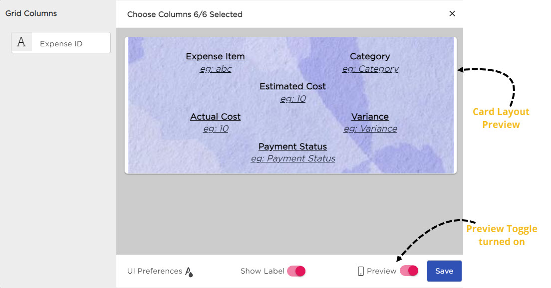
CDs can also adjust the overall UI of the card layout by selecting the UI Preferences icon.
.jpg)
UI Preferences: The UI preferences provide customization options for both Labels and Data for the entire card layout. The properties include:
Font Size: Choose from small, medium, or large font sizes.
Text Wrap: Enables text to continue on a new line within the container.
Font Style: Apply styles like Bold, Italic, or Underlined to labels and data.
Horizontal Alignment: Align text to the left, center, or right.
Text Color: Adjust the text color for both labels and data.
Background Color: Select a background color for the card layout.

Background Image: Add an image as the background for the card layout.

Show Label Toggle: Turn this on or off to show or hide column names in the grid.


Preview Toggle: Toggle on to preview how the Card Layout looks on a mobile device.
UI SETTINGS
.jpg)
.jpg)
CDs can configure the appearance of both Headers and Data in the grid for desktop view with the following configuration options:
For Header:
Alignment: Adjust horizontal and vertical alignment for Header.
Text Wrap: Enable text to wrap within the container to stay visible.
Font Size: Select font sizes: Small, Medium, or Large.
Font Style: Select font styles such as Bold, Italic, or Underline for Header.
Color Options: Customize the colors for:
Border
Background
Text
For Data:
Alignment: Adjust the horizontal and vertical alignment for Data.
Text Wrap: Enable text to wrap within the container to stay visible.
Font Size: Select font sizes: Small, Medium, or Large.
Font Style: Select font styles such as Bold, Italic, or Underline for Data.
Color Options: Customize the colors for:
Border
Background
Text
Hover: Set background and text colors that appear when you hover over data cells to enhance interactivity.
Was this article helpful?
