.png)
Chart Reports
- 5 Minutes to read
- Contributors


Chart Reports
- 5 Minutes to read
- Contributors
Article summary
Did you find this summary helpful?
Thank you for your feedback!
A Chart report helps you convert any raw data into an infographic or pictorial representation and reveals important data relationships to assist you in visualizing your data and making informed decisions. Quixy provides distinct types of chart reports to represent your data based on your requirements or use case.
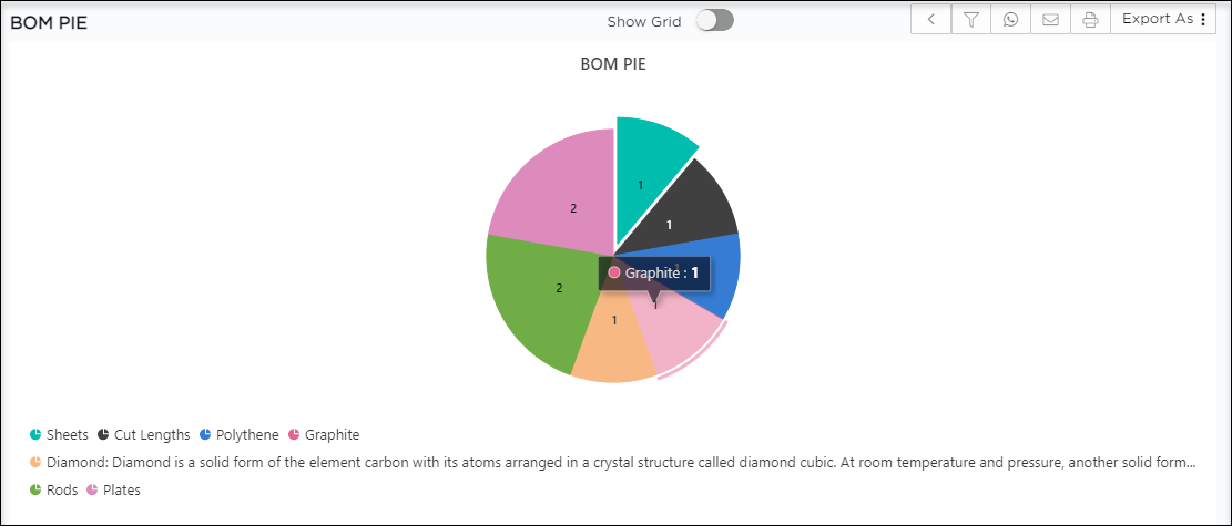
A Sample Chart Report
Create Chart Report
NOTE
The experience of creating Chart Reports will differ slightly from that of creating a Grid, Pivot, or Individual.
- Open the Create Report page.

- On the Create Report page, the first drop-down shows the list of report types.
- Select the Chart option as a type of report from the drop-down.
TIP
The options Chart Report and Charts' Report are closely related. The Chart option will only provide you with individual reports (Only Bar or Line or Pie or Area). Charts, on the other hand, will combine all of the individual reports and display them as a single unit (Bar and Line and Pie and Area).

- Create Report Chart page will display on the screen.

- The definitions for the seven fields that you notice on the Create chart reports page are given below:
- Chart Type: This drop-down menu provides access to the various types of chart reports available in Quixy (i.e., Line, Bar, Area, Pie)
- Type: This drop-down menu provides access to various sub-types for a selected chart type.
- X-axis (Horizontal axis) & Y-axis (Vertical axis) Fields: These drop-downs will display all the data fields present in the data source, choose the data fields respectively to plot the chart.
- Operation: This drop-down menu displays operational values such as Count, Percentage, Average, and so on, which you can use to set the comparison calculation for the report.
- Operation Field: Here, you need to specify on which field (X-Axis or Y-Axis) the operation should work.
EXAMPLE
Assume we need a bar chart to show an employee's leave count. There can be any number of leaves, but we must know how many each employee has taken. In a bar chart, the Y-axis can indicate the number of leaves, the X-axis the employee names, the Operation Field here will be the number of leaves, and the Operation will be Count.
6. Group By: This option allows you to drill down/group data and display it on the same report based on the data fields you choose in the Group By field.
7. Advance Settings: This is to customize the interface of the chart reports based on the requirements.
8. Report Mapping: This connects two reports based on shared data fields so you may jump from one report to the other by clicking on any one segment of the current report.
- Chart type drop-down will display the list of types in charts.

- Following are the different types of chart reports available in Quixy. These four types have their own dedicated sub-types as well.
- Line Chart
- Bar Chart
- Pie Chart
- Area Chart
- Histogram Chart
- Pareto Chart
- Stock Chart
- Waterfall Chart
- Scatter and Bubble Chart
- 3D Chart
- Polar Chart
- Radar Chart
Advanced Settings
Advanced Settings are to customize the properties of the chart reports based on the requirements. In-detail walk-through of each property in Advanced Settings is discussed below.
- Click on the Advanced Settings button.

- The properties window will display on the screen.

- The advanced properties available for every Chart Report are Marker, Legend, Zoom, Sort, X-axis, Y-axis, Data Label, Print, and Export.
Let us understand each option one-by-one starting with Marker.
Marker
Marker is a feature that adds a visual identification to the values passed. These come in the form of graphic icons. You can use them to quickly locate and filter your values in the comparison report.
- In your chart, you can specify different marker shapes as well as multiple-colored borders.
- Enable the marker by checking the Is Visible checkbox.

- If you set the marker as Visible, the marker will display in Triangle shape, as shown below.

Legend
A legend is an area in a chart describing each of the parts of the chart. It is the chunk of text that accompanies each figure in a chart report. Its purpose is to explain the figure clearly and thoroughly, providing readers with all the necessary information to understand the figure without returning to the main text of the data source. You can set the position of the legend to the best fit.
- You can set the position of the Legend in a chart from the position drop-down with options Top, Left, Bottom, and Center.
- Choose the distance seen between legend and the axis line from the Alignment drop-down menu, which includes options such as Near, Far, and Center.

Zoom
The user can change the scale of an axis on a chart by using the zoom function. This function spreads or shrinks the scale of the horizontal or vertical axis. Both the categorical and continuous axes can be zoomed.
- Click on the Is Enable checkbox to enable the Zoom option in the chart report.
- Select the Axis Mode on which you want to enable the zoom.

A visualization of zoom functionality is given below.

The zooming direction depends on the scrolling direction of the chart. The zooming direction cannot be changed since it is defined individually for each chart type. (Use the mouse scroller)
- For charts that scroll horizontally, the zoom changes the scale of the horizontal axis (X-Axis).

- For charts that scroll vertically, the zoom changes the scale of the vertical axis (Y-Axis).

- For charts that do not have a specific scrolling direction, the zoom changes the scale of both axes (XY-Axis).

How to Zoom:
There are four ways of zooming:- Mouse wheel: Use Ctrl plus the mouse wheel to zoom in and out.
- Gesture: On a touch screen, use the pinch and spread gesture.
- Keyboard: Use the [+] and [-] keys to zoom in and out.
Sort
Sorting a report can manipulate the data display according to the alphabetical order (A-Z/Z-A). Sorting of data works in ascending and descending order.
- You can sort the chart data points by using the Sort Option.
- Apply the sorting on either the X-Axis or Y-Axis from the Sort By drop-down.

X-Axis
This is to set the axis properties.

- Title: Enter a name to set it as the title for X-Axis.
- Label Format: Enter a name to display a data label that clarifies the data series.
- Title Color: Pick a color or enter the color code axis title.
- Title Size: Select the size of the title from the drop-down as Large, Medium, or Small.
- Title Alignment: Set the alignment of the title from the drop-down as Center, Far, or Near.
- Label Color: Select the label color from the Color Picker or enter the color code.
- Label Alignment: Select the alignment of the Label from the drop-down as Center, Far, or Near.
Y-Axis
Y-Axis will have the same fields as in the X-Axis (Refer to the X-Axis section to know about the field functionalities.
Data Label
The values that represent the data segmentation on a chart are called data labels.
- Enable the Is Visible checkbox to display the Data Label option on the Chart.
- Select the Alignment of the Data Label from the Alignment drop-down.
- Top
- Middle
- Bottom
- Outer
- The Font Style for the data Label can be selected from the drop-down, which contains Normal, Bold, and Italic.
- The Font Size of the Data Label can be selected as small, Medium, Large.

Print & Export
- Print: Select this option to enable the print option to chart report.
- Export: Select this option to enable the export option to chart report.

Was this article helpful?
