Data representation reports are documents that present and summarize data in a visual and easy-to-understand format. These reports can take various forms, including graphs, charts, tables, and infographics. Their primary purpose is to convey information clearly and concisely so that readers can quickly grasp the underlying trends and patterns.
Data representation reports are used in business, finance, marketing, and scientific fields to analyze data, evaluate performance, and make informed decisions. They can also help to identify potential issues or opportunities that may require further investigation. To create effective data representation reports, it's essential to choose the appropriate type of graphic or visualization based on the presented data and ensure that the information is accurate, relevant, and readily comprehensible to the target audience.
Quixy offers a diverse range of over 35+ different types of reports. The following is a comprehensive list of the available reports.
- Grid Report: A Grid Report presents data in a tabular view, where each column represents a field and each row represents a record. It resembles a spreadsheet.
- Pivot Report: A Pivot Report is a way to organize and summarize large amounts of data in a way that makes it easy to understand. It allows you to take a lot of data and rearrange it so that you can see patterns and trends that might not be immediately apparent.
- Chart Report: A Chart Report helps you convert any raw data into an infographic or pictorial representation and reveals important data relationships to assist you in visualizing your data and making informed decisions. Quixy provides distinct types of chart reports to represent your data based on your requirements or use case.
- Bar Chart: A Bar Chart can be oriented horizontally or vertically and uses rectangular bars of varying lengths that are proportional to the value being visualized.
- Pie Chart: A Pie Chart is a type of graph in which a circle is divided into sectors that each represent a proportion of the whole.
- Line Chart: A Line Chart is a type of chart that displays information as a series of data points connected by straight line segments. A line chart is a way of visually representing an asset's price history using a single, continuous line.
- Area Chart: An Area Chart is a graphical representation of quantitative data. It descends a few line chart characteristics and highlights the area with colors and textures to emphasize the area between the axis and the line.
- Document Report: A Document Report presents the information in an organized format for a specific audience and purpose. Quixy's report creation engine allows you to create high quality, professional document reports that can completely replace the need to create handcrafted reports.
- Individual Report: An Individual Report is used to create a summary report of an individual data record. It is widely used to create pay slips, invoices and so on.
- Gantt Chart: A Gantt chart is a visual representation of a project schedule that shows the tasks, activities, and events in a project along with their corresponding time frames. It provides a clear overview of a project's timeline, helping project managers and teams to plan, track, and manage tasks effectively.
- Custom Reports (XSLT & XML): A Custom Report allows users to create customized reports using XML (eXtensible Markup Language) for data representation and XSLT (eXtensible Stylesheet Language Transformation) for formatting.
How to initiate a Report creation?
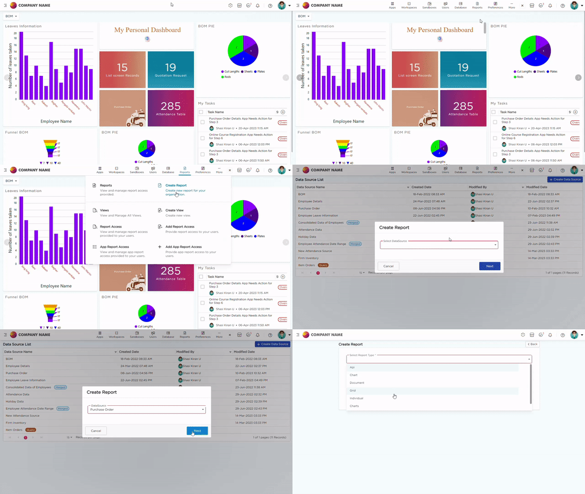
There are two ways to begin creating a report.
Method 1:
- Admin Menu -> Database -> Data Sources.
- Select the desired Data Source to create a report on top of it. Click on it.
- Under Actions pop-up, click Add Reports.

Method 2:
- Go to Admin Menu -> Reports -> Create report.
- Select the Data source.
- Click on Create Report.

AI-NLP Report creation in Live environment
End-users can create reports by providing prompts using "Ask Caddie." Admins can grant AI-NLP access to users, enabling them to generate reports in the Live environment without relying solely on Citizen Developers.
How to provide the NLP-AI Access?
Only admins can provide this access. For more information, check out the video below.
Creating reports in the Live environment using NLP
Only the roles assigned by admins can create reports in the live environment. For more details, check out the video below
.png)


