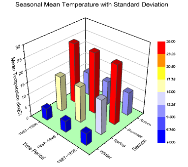
3D charts are graphical representations of data that use three-dimensional space to display information. Unlike 2D charts, which plot data points on a flat plane, 3D charts add depth, allowing for a more immersive and detailed visualization. This added dimension can help reveal patterns and relationships that might not be as apparent in 2D representations.
NOTE
To understand the Advanced Settings, Report Mapping, and other functionalities, it is recommended that you first read the Chart Reports parent article. To maintain the continuity of this feature, a few references from the parent article will be used in this article.
Advantages of 3D Charts
Enhanced Visualization: The third dimension provides a more comprehensive view of data, making it easier to identify trends, outliers, and correlations.
Improved Insight: With the added depth, 3D charts can uncover hidden insights that are not immediately visible in 2D charts.
Engagement: 3D charts are visually appealing and can capture the audience's attention more effectively, making presentations and reports more engaging.
How to create a 3D Chart in Quixy?
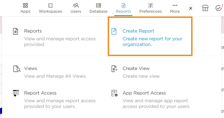
Click on Admin Menu → Reports → Create Report.
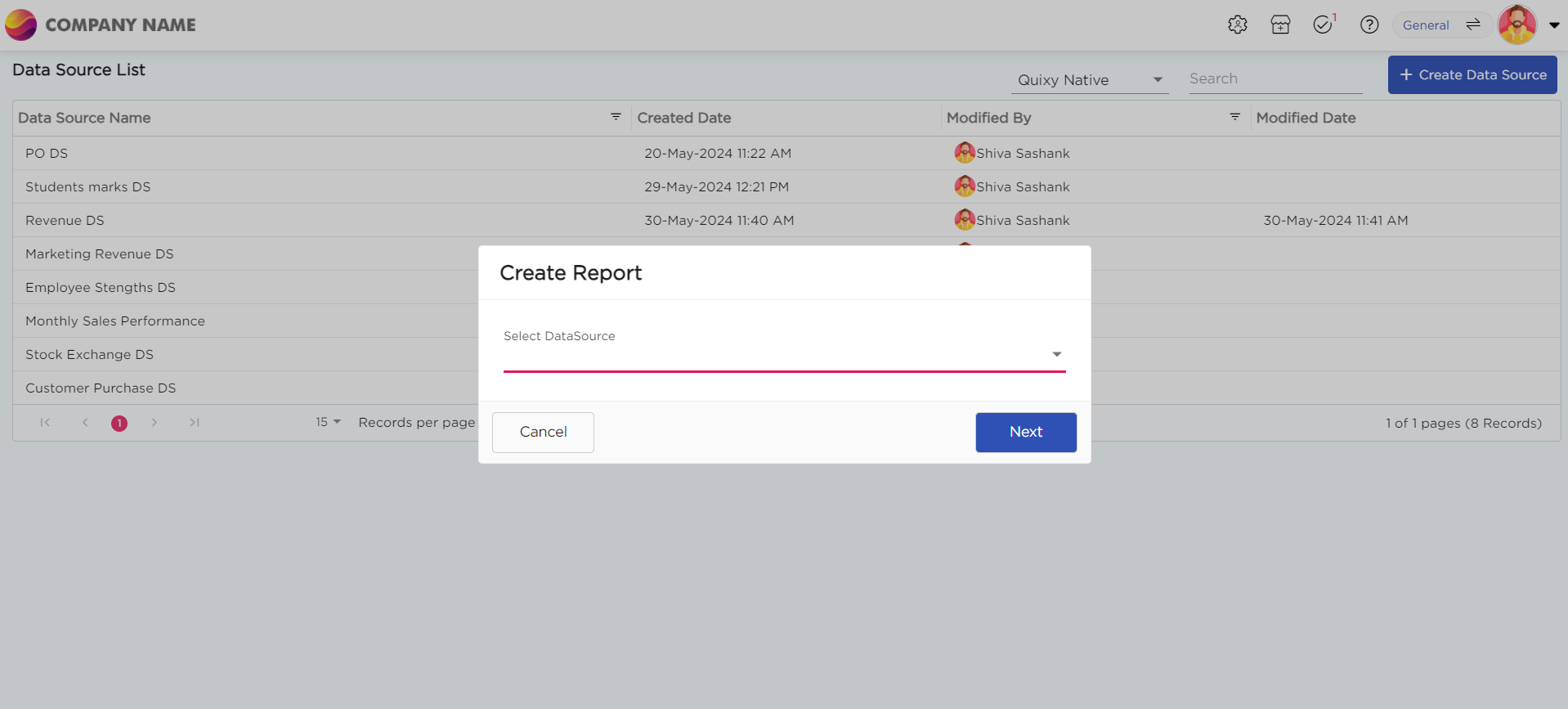
Select the data source that you need to use to generate reports.
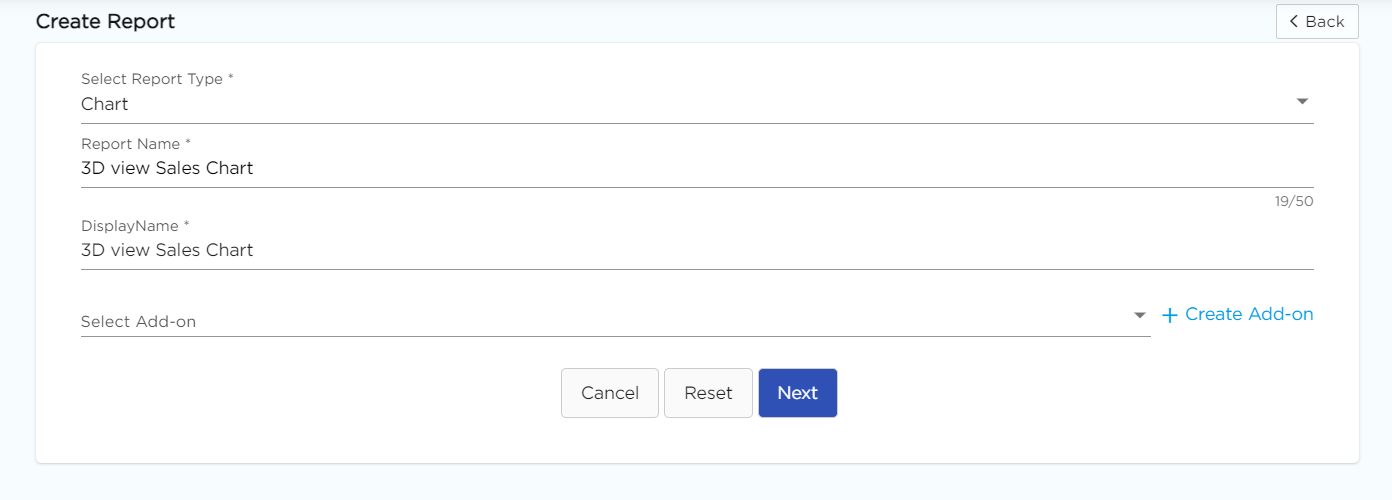
Select the report type as Chart and give the report a name.
Choose 3D Chart from the Chart type drop-down menu.
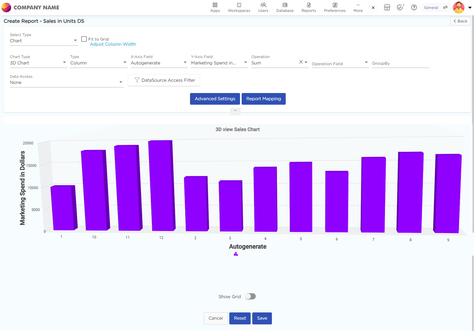
Select the data fields in Group by column to see a visual representation of a consolidated data segmentation/data drill-down for the selected data field in the same selected sequential order.
Click on Save.
Sub-types of 3D Charts in Quixy
These 3D chart sub-types offer various ways to visualize data, catering to different presentation needs and making complex data more accessible and understandable.
3D 100% Stacked Bar: Visualizes contributions of individual items to the whole, with each bar segment representing a percentage of the total.

3D 100% Stacked Column: Similar to the 100% stacked bar, but in a vertical format. Each column segment represents a percentage of the total, providing a visual comparison of proportions across categories.

3D Back-to-Back Column: Displays two sets of data side by side in a single column, allowing for easy comparison between two groups or categories.
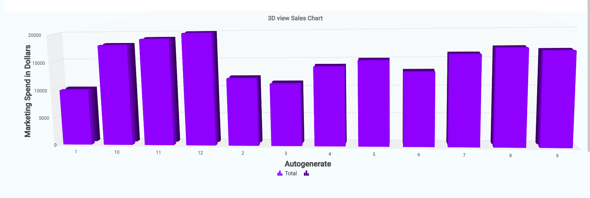
3D Bar: Represents data with horizontal bars, providing a clear visual comparison of values across different categories with the added depth of 3D.

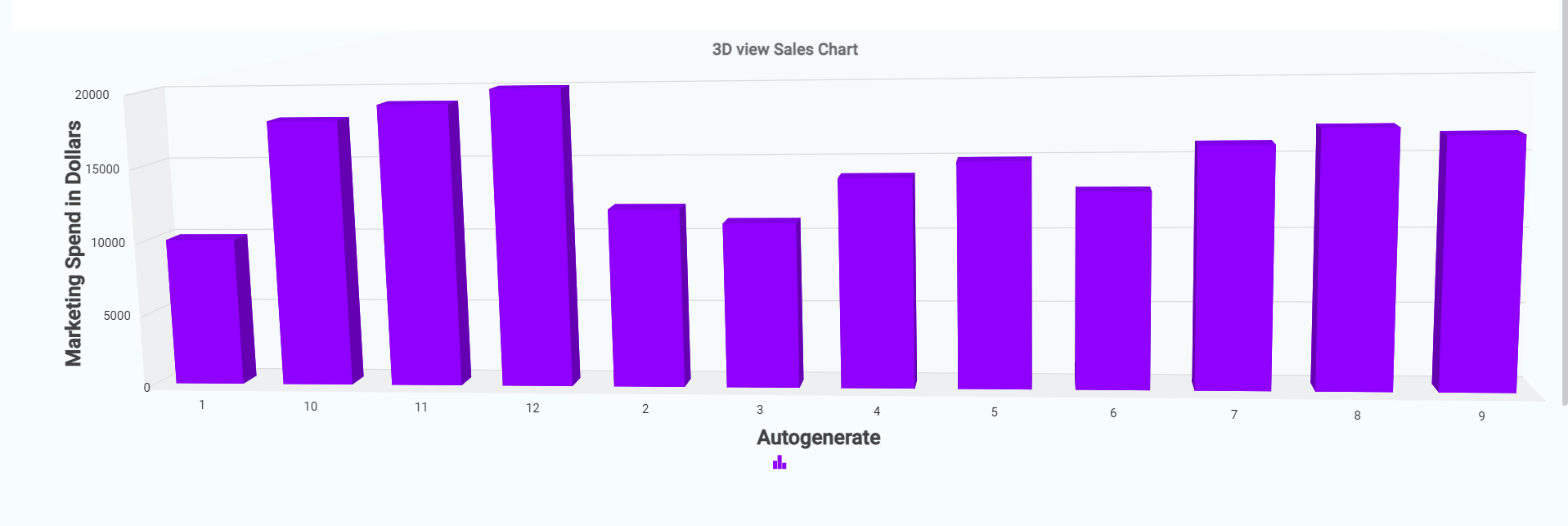
3D Column: Uses vertical columns to display data, enhancing the visual comparison of values and trends across categories with a three-dimensional perspective.
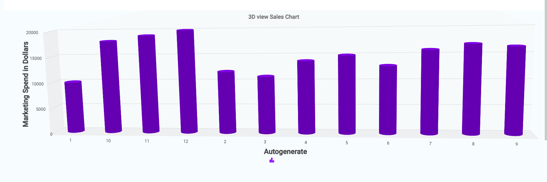
3D Cylindrical Column: Similar to the 3D column chart but uses cylindrical shapes for a more stylized and visually appealing representation of data.
3D Stacked Bar: Shows the total of different data series stacked horizontally, allowing for the comparison of overall values and the contribution of each series to the total.
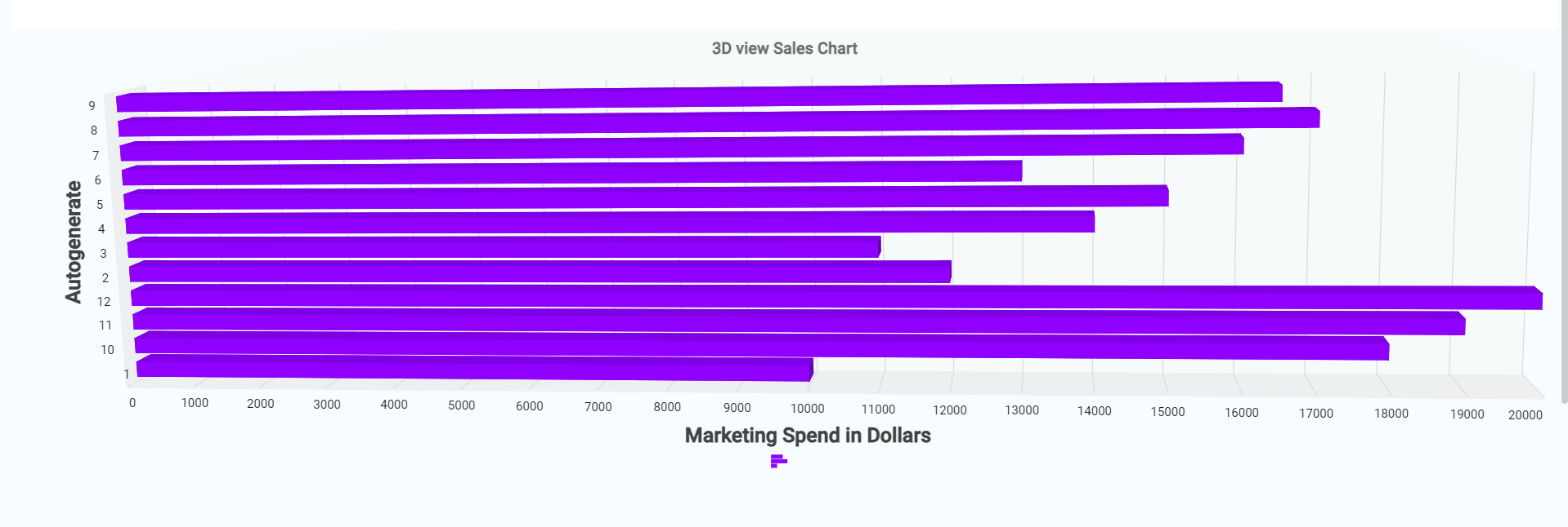
3D Stacked Column: Similar to the 3D stacked bar but with vertical columns. This chart type stacks data series on top of each other, making it easy to see the total value and the contribution of each series.

.png)


