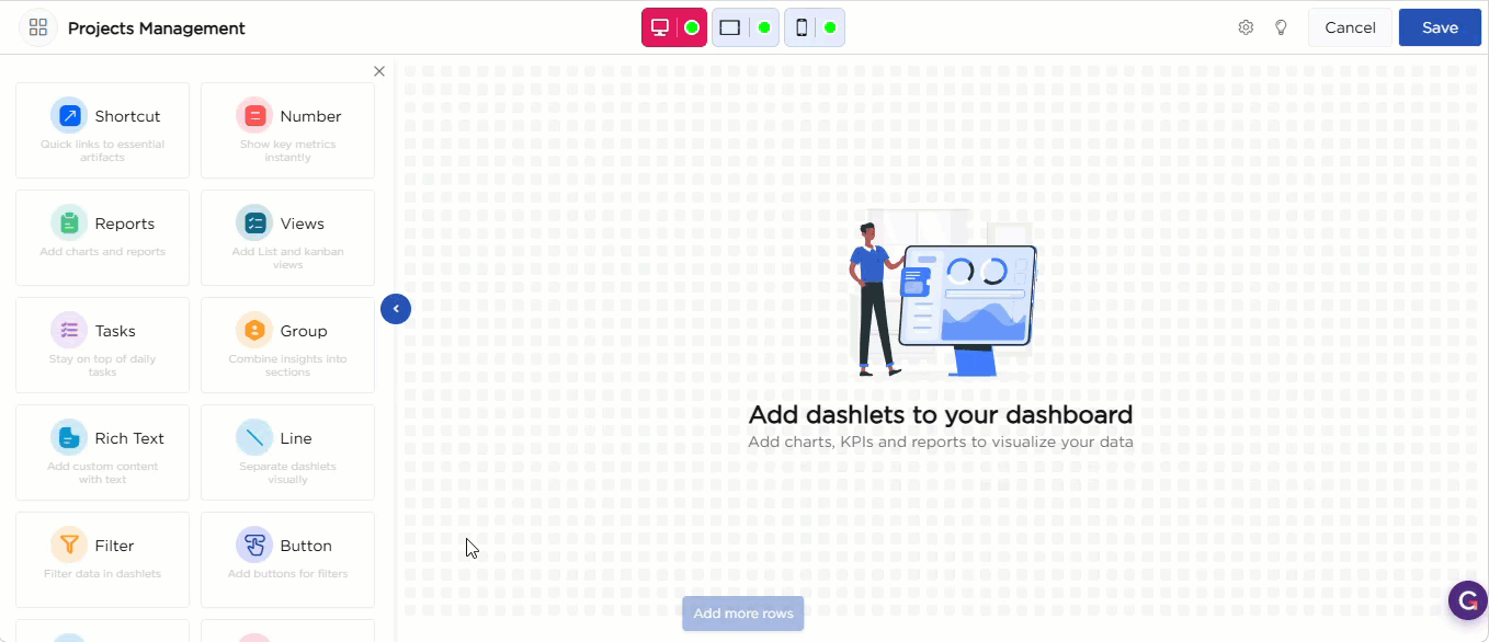
Once you drag and drop the dashlet onto the canvas and click the dashlet, a blue line appears surrounding the dashlet border, and a settings icon shows on the right side of the dashlet. When you click the settings icon, the properties panel opens on the right. The properties panel is divided into two sections, General and Display.
¶ 1. General Settings
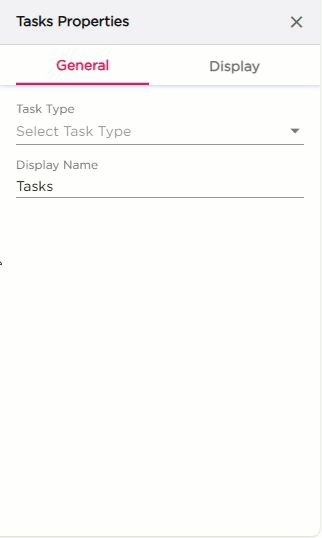
The General settings decide which tasks the dashlet should show and how it should work on the dashboard.
| S.No | Setting | Description |
|---|---|---|
| 1 | Task Type |
Select the type of task list you want to display:
|
| 2 | Display Name | Enter the name that should appear on the Tasks dashlet |
| 3 | Show Pagination | Turn this on if the task list has multiple pages |
| 4 | Click Action |
Select what should happen when a task is clicked:
|
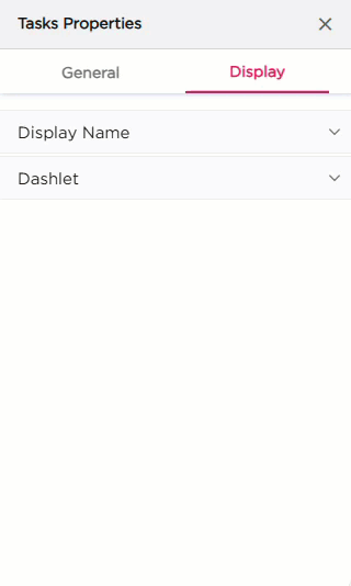
¶ 2. Display Settings
The Display settings control the appearance of the Tasks dashlet. It includes two groups of settings: Display Name and Dashlet.
| Section | Settings | Description |
|---|---|---|
| Display Name | Show Display Name | Show or hide the title on the dashlet. |
| Text Color | Set the color of the title text. | |
| Hover Text Color | Set the color when hovering on the title. | |
| Text Size | Adjust the font size. | |
| Font Style | Apply Bold, Italic, or Underline. | |
| Horizontal Alignment | Align the title Left, Center, or Right. | |
| Spacing | Add top, right, bottom, or left padding to the title area. | |
| Dashlet | Background (Color, Image, Both) | Choose the dashlet background style. |
| Background Color | Set the solid background color. | |
| Hover Background Color | Set the background color on hover. | |
| Show Border | Turn the border on or off. | |
| Shadow Effect | Add a shadow around the dashlet. | |
| Hover Shadow Effect | Add a shadow when hovered. | |
| Border Radius | Set the roundness of the dashlet corners. | |
| Spacing | Add spacing inside the dashlet. |