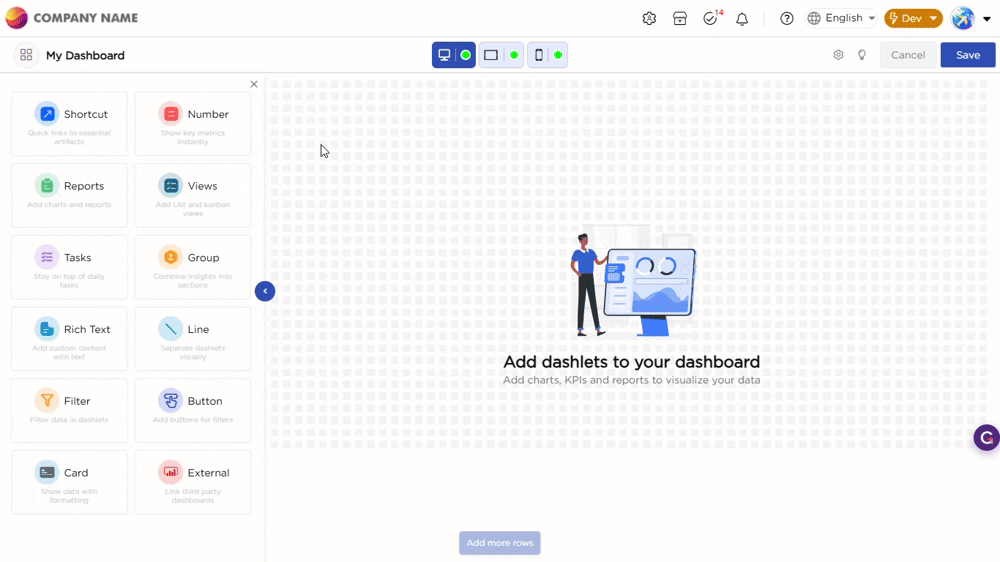
Once you drag and drop the dashlet onto the canvas and click the dashlet, a blue line appears surrounding the dashlet border, and a settings icon shows on the right side of the dashlet. When you click the settings icon, the properties panel opens on the right. The properties panel is divided into two sections, General and Display.
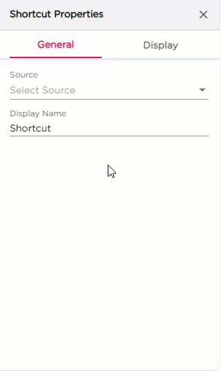
¶ 1. General Settings
The General settings control what the shortcut opens and how it should work on the dashboard.
| S.No | Setting | Description |
|---|---|---|
| 1 | Source | Select what the shortcut should open. You can choose App, Dashboard, Views, or Report |
| 2 | Source Configuration |
After selecting the Source:
|
| 3 | Display Name | Enter the name that should appear on the Shortcut dashlet |
| 4 | Click Action |
Select how the shortcut should open:
|
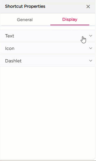
¶ 2. Display Settings
The Display settings control the appearance of the Shortcut dashlet. It includes three groups of settings: Text, Icons, and Dashlet.
| Category | Property | Description |
|---|---|---|
| Text | Show Display Name | Toggle to show or hide the shortcut label. |
| Text Color | Set the color of the display name. | |
| Hover Text Color | Set the color of the text when the user hovers over the dashlet. | |
| Text Size | Adjust the size of the display name text. | |
| Text Wrap | Enable wrapping of long text. | |
| Font Style | Apply Bold, Italic, or Underline. | |
| Horizontal Alignment | Align the text to left, center, or right. | |
| Vertical Alignment | Align the text to top, middle, or bottom. | |
| Padding | Set spacing around the text (Top, Right, Bottom, Left). | |
| Icon | Show Icon | Toggle to show or hide the icon. |
| Change Icon | Select and apply a different icon. | |
| Icon Size | Choose Small, Medium, or Large. | |
| Icon Alignment | Align the icon vertically or horizontally. | |
| Dashlet | Dashlet Background | Choose Color, Image, or Both. |
| Background Color | Set the background color. | |
| Hover Background Color | Set background color on hover. | |
| Show Border | Toggle the border around the dashlet. | |
| Shadow Effect | Add a shadow to the dashlet. | |
| Hover Shadow Effect | Apply a shadow when hovered. | |
| Show Tooltip | Enable or disable the tooltip. | |
| Border Radius | Set rounded corners for the dashlet. | |
| Spacing | Add spacing inside the dashlet. |