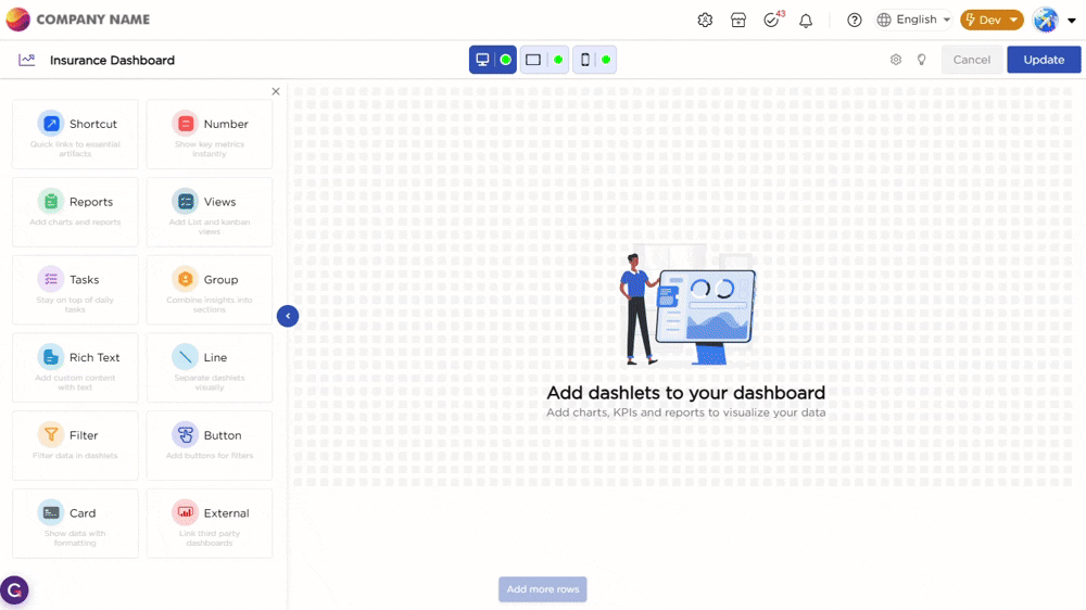
Once you drag and drop the dashlet onto the canvas and click the dashlet, a blue border appears around the dashlet to indicate it is selected. You will also see action icons on the dashlet, including a pen icon and a settings icon.
¶ 1. Add Content to the Rich Text Dashlet
To add content, click the pen icon on the dashlet. This opens the editor directly on the canvas.
You can type text, add short messages, or paste HTML for custom formatting.
Once you finish editing, click the tick icon to save the content. This lets you quickly place headings, labels, instructions, or simple branding elements on the dashboard without leaving the canvas.
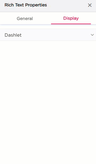
After saving the content, and when you click the settings icon, the properties panel opens on the right. The properties panel is divided into two sections, General and Display.
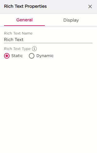
¶ 2. General Settings
The General settings control the name, content type, and runtime behavior of the Rich Text dashlet.
| S.No | Setting | Description |
|---|---|---|
| 1 | Rich Text Name | Enter the name of the Rich Text dashlet as shown in the properties panel |
| 2 | Rich Text Type |
Select how the Rich Text dashlet stores and updates its content.
|
| 3 | Runtime Behavior |
Choose how the Rich Text content loads at runtime.
|
¶ 3. Display Settings
The Display tab controls how the Rich Text dashlet looks:
| Section | Settings | Description |
|---|---|---|
|
Dashlet
|
Background (Color, Image, Both) | Choose the dashlet background style. |
| Background Color | Set the solid background color. | |
| Hover Background Color | Set the background color on hover. | |
| Show Border | Turn the border on or off. | |
| Shadow Effect | Add a shadow around the dashlet. | |
| Hover Shadow Effect | Add a shadow when hovered. | |
| Border Radius | Set the roundness of the dashlet corners. | |
| Spacing | Add spacing inside the dashlet. |