Once you drag and drop the dashlet onto the canvas and click the dashlet, a blue line appears surrounding the dashlet border, and a settings icon shows on the right side of the dashlet. When you click the settings icon, the properties panel opens on the right. The properties panel is divided into two sections, General and Display.
¶ 1. General Settings
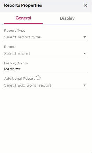
The General settings control what report the dashlet should show and how it behaves on the dashboard.
| S.No | Setting | Description |
|---|---|---|
| 1 | Report Type | Select the type of report you want to display from the drop-down list |
| 2 | Report | After selecting the report type, choose the specific report from the drop-down. After selecting a report, additional options such as Show Filter, Show Pagination, and Click Action will appear |
| 3 | Display Name | Enter the name that should appear on the dashboard for this report |
| 4 | Show Filter | Turn this on if you want users to filter the report directly on the dashlet |
| 5 | Show Pagination | Turn this on if the report has multiple pages |
| 6 | Click Action |
Select what should happen when the report is clicked:
|
| 7 | Additional Report |
|
¶ 2. Display Settings
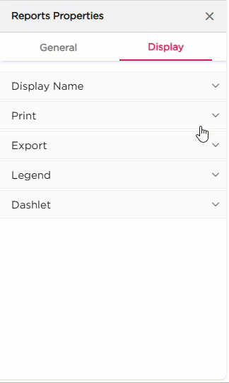
The Display settings control the appearance of the Reports dashlet. It includes four groups of settings: Display Name, Print, Export, Legend, and Dashlet.
| Category | Property | Description |
|---|---|---|
| Display Name | Show Display Name | Toggle to show or hide the display name. |
| Text Color | Set the color of the display name. | |
| Hover Text Color | Set the text color when hovered. | |
| Text Size | Adjust the size of the display name text. | |
| Font Style | Apply Bold, Italic, or Underline. | |
| Horizontal Alignment | Align the text to the left, center, or right. | |
| Spacing | Set spacing around the text (Top, Right, Bottom, Left). | |
| Is Visible | Toggle to show or hide the print option. | |
| Export | Is Visible | Toggle to show or hide the export option. |
| Legend | Is Visible | Toggle to show or hide the legend in chart reports. When toggled on, additional options such as Position and Alignment will appear. |
| Position | Choose where the legend appears (Top, Bottom, Left, Right). | |
| Alignment | Align the legend (Left, Center, Right). | |
| Dashlet | Dashlet Background | Choose Color, Image, or Both. |
| Background Color | Set the background color. | |
| Hover Background Color | Set the background color on hover. | |
| Show Border | Toggle the border. | |
| Shadow Effect | Add a shadow to the dashlet. | |
| Hover Shadow Effect | Add a shadow when hovered. | |
| Border Radius | Set rounded corners for the dashlet. | |
| Spacing | Add spacing inside the dashlet. |