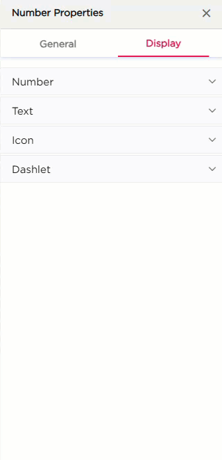
¶ 1. Display Settings
The Display tab controls how the Number dashlet looks. Options are grouped into four sections: Number, Text, Icon, and Dashlet.
| Section | Settings | Description |
|---|---|---|
| Number | Number Color | Set the color of the numeric value. |
| Number Hover Color | Set the color of the value on hover. | |
| Number Size | Adjust the font size of the number. | |
| Horizontal Alignment | Align the number Left, Center, or Right. | |
| Vertical Alignment | Align the number Top, Center, or Bottom. | |
| Spacing | Add top, right, bottom, or left padding around the number. | |
| Text | Show Display Name | Toggle to show or hide the number label. |
| Text Color | Set the color of the display name text. | |
| Hover Text Color | Set the color when hovering on the display name. | |
| Text Size | Adjust the font size of the display name. | |
| Text Wrap | Allow the display name to wrap into multiple lines. | |
| Font Style | Apply Bold, Italic, or Underline. | |
| Vertical Alignment | Align the display name vertically. | |
| Spacing | Add top, right, bottom, or left padding to the text area. | |
| Icon | Show Icon | Show or hide the icon on the dashlet. |
| Change Icon | Select or change the icon. | |
| Icon Size | Set the size of the icon. | |
| Icon Alignment | Align the icon relative to the content. | |
| Dashlet | Background (Color, Image, Both) | Choose the dashlet background style. |
| Background Color | Set the solid background color. | |
| Hover Background Color | Set the background color on hover. | |
| Show Border | Turn the border on or off. | |
| Shadow Effect | Add a shadow around the dashlet. | |
| Hover Shadow Effect | Add a shadow when hovered. | |
| Show Tooltip | Enable or disable the tooltip. | |
| Border Radius | Set the roundness of the dashlet corners. | |
| Spacing | Add spacing inside the dashlet. |