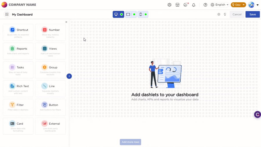
Dashlets are the core elements placed on the dashboard canvas. After a dashlet is dragged and dropped from the dashlet panel onto the canvas, users manage its position, size, and behavior directly within the layout. These actions help structure the dashboard in a clear and organized way based on what the dashboard needs to display.
¶ 1. Dashlet Behavior on the Canvas
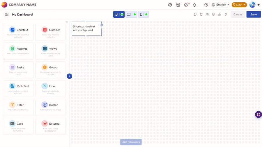
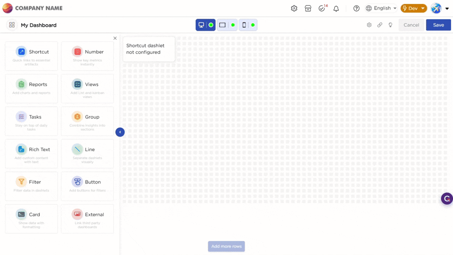
When you drag and drop a dashlet onto the dashboard canvas and select it, a blue border appears around the dashlet to show that it is active. A settings icon appears on the right side of the dashlet. When you click the settings icon, the dashlet properties panel opens on the right, where you can configure the dashlet.
Refer to the Gif below for your understanding:
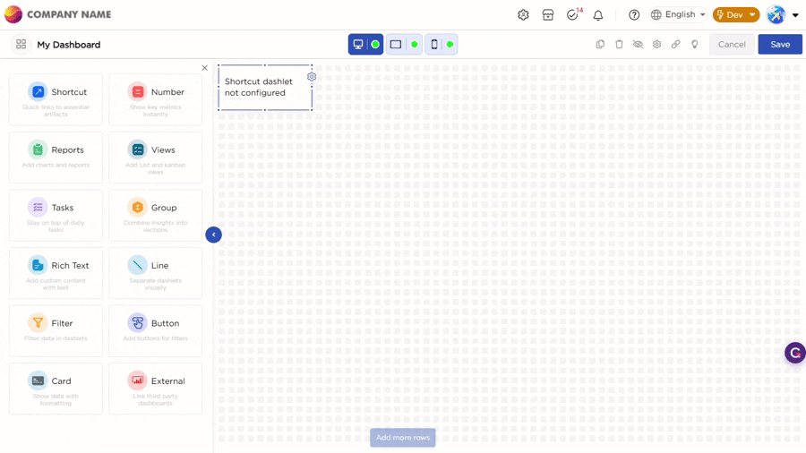
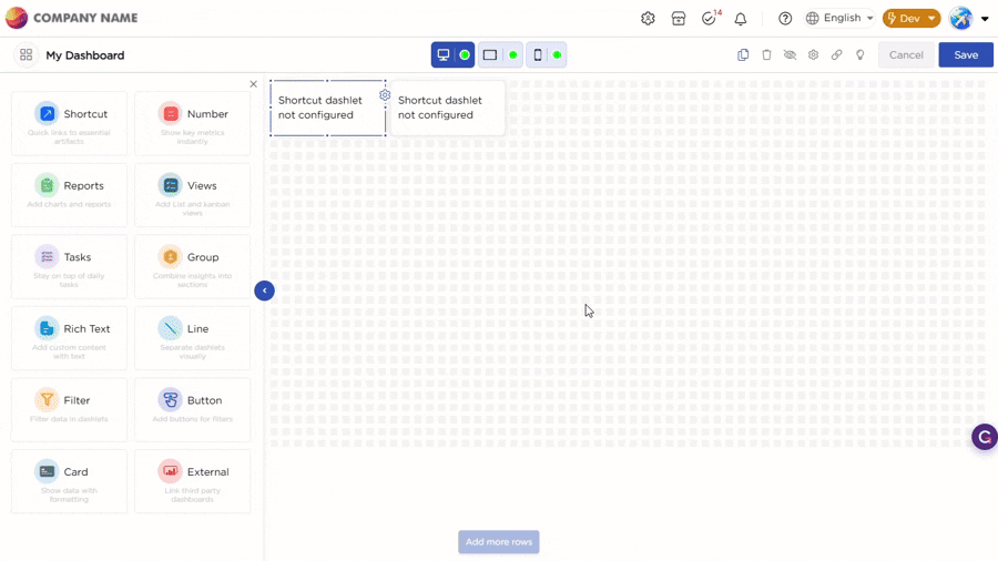
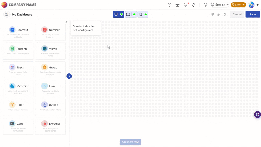
You can move or resize the dashlet directly on the canvas, and the changes are applied instantly. Each device has its own layout, so dashlets can be arranged differently for Desktop, Tablet, and Mobile.
Refer to the Gif below for your understanding:
¶ 2. Dashlet Actions
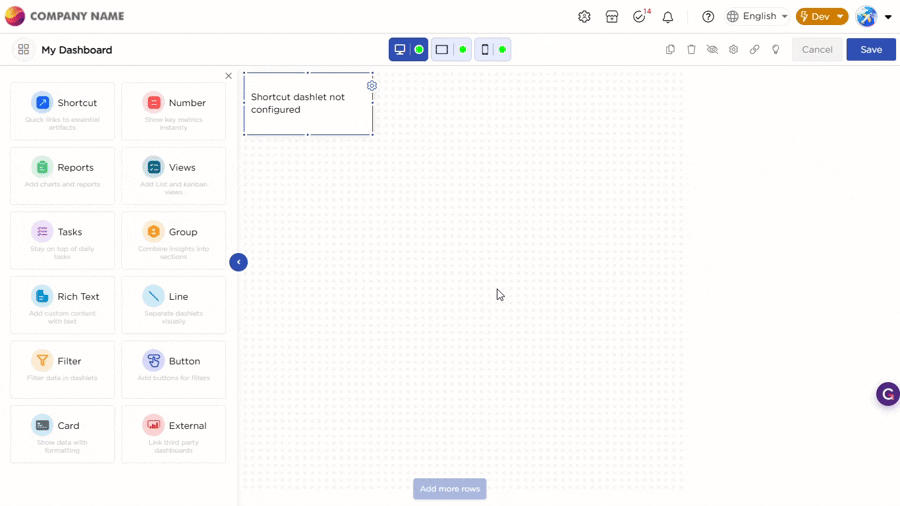
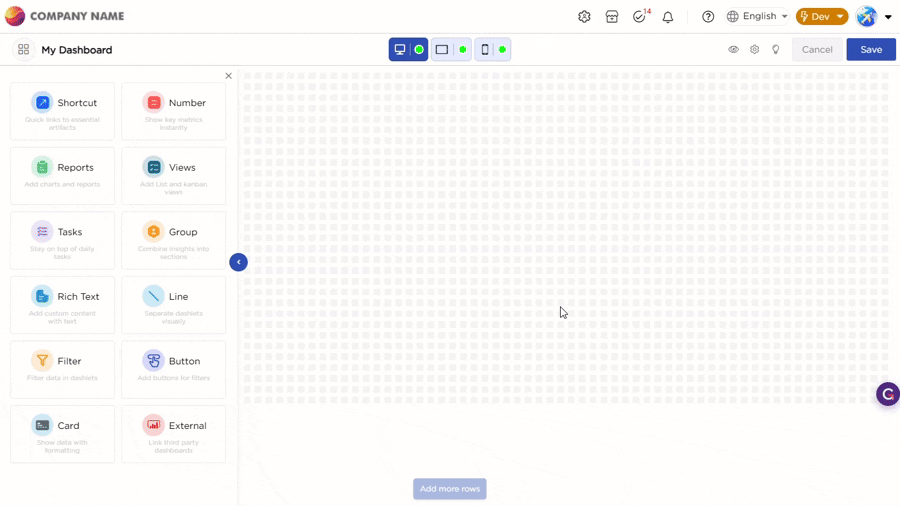
Dashlet actions are available only when a dashlet is selected. These actions apply to the selected dashlet and help you manage how it appears and behaves on the dashboard.
When you select a dashlet, the top toolbar displays the available actions:
| Actions | Description | Example |
|---|---|---|
| Resize | Drag the edges of the dashlet to change its size on the dashboard canvas. |
 |
| Configure | Click the settings icon to open the dashlet properties panel. In this panel, you can define the data source, appearance, and behavior. |
 |
| Copy | Creates a duplicate of the selected dashlet on the dashboard. |
 |
| Delete | Removes the selected dashlet from the dashboard. |
 |
| Hide Dashlet | Hides the dashlet only for the currently selected device. The dashlet remains visible on other devices unless it is hidden there as well. |
 |
| Unhide Dashlet | Displays the dashlet again on the currently selected device if it was previously hidden. |
 |