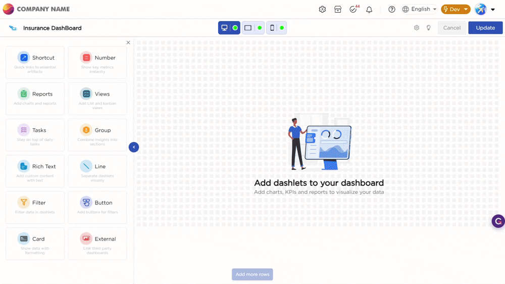
Once you drag and drop the dashlet onto the canvas and click the dashlet, a blue line appears surrounding the dashlet border, and a settings icon shows on the right side of the dashlet. When you click the settings icon, the properties panel opens on the right. The properties panel is divided into two sections, General and Display.
¶ 1. General Settings
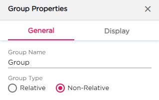
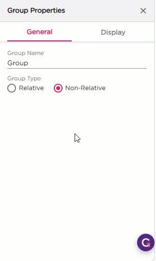
The General settings let you set the group name and choose how the dashlets inside the group should be arranged.
| S.No | Setting | Description |
|---|---|---|
| 1 | Group Name | Enter the name you want to show on the group. The name appears on the group header on the canvas |
| 2 | Group Type |
Select how the dashlets inside the group should behave:
|
¶ 2. Display Settings
The Display settings control the appearance of the Group dashlet. It includes two groups of settings: Group Name and Dashlet.
| Section | Settings | Description |
|---|---|---|
| Group Name | Name | Toggle to show or hide the group name on the border. |
| Positioning | Choose where the group name should appear on the border. | |
| Alignment | Align the group name Left, Center, or Right. | |
| Spacing | Add padding around the group name (Top, Right, Bottom, Left). | |
| Dashlet | Dashlet Background (Color, Image, Both) | Choose the background style for the group container. |
| Background Color | Set the background color. | |
| Hover Background Color | Set the background color on hover. | |
| Show Border | Turn the border on or off. | |
| Sticky | Keep the group fixed in place when scrolling. | |
| Shadow Effect | Add a shadow around the group. | |
| Hover Shadow Effect | Add a shadow on hover. | |
| Border Radius | Set the roundness of the group corners. | |
| Spacing | Add spacing inside the dashlet. |