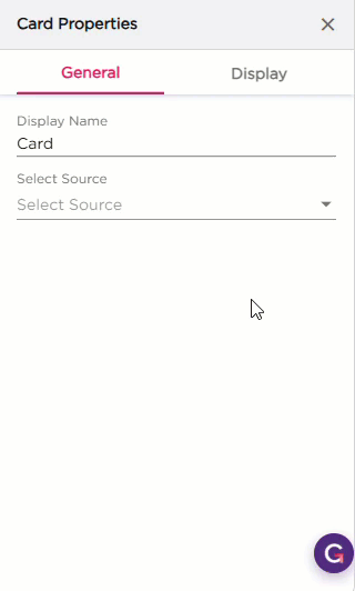
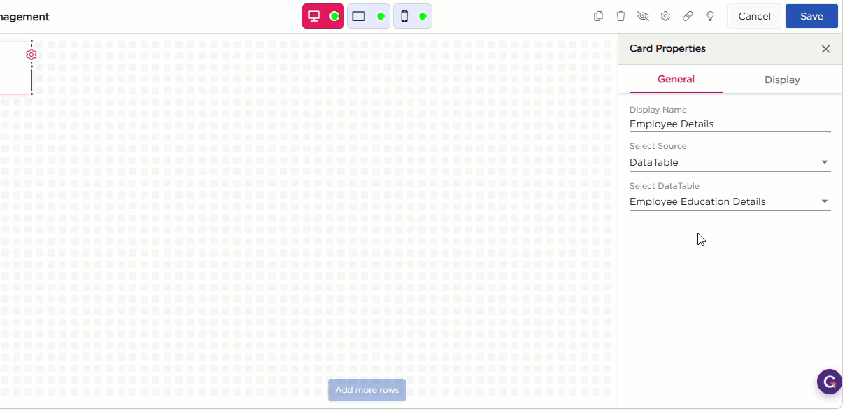
Once you drag and drop the dashlet onto the canvas and click the dashlet, a blue line appears surrounding the dashlet border, and a settings icon shows on the right side of the dashlet. When you click the settings icon, the properties panel opens on the right. The properties panel is divided into two sections, General and Display.
¶ 1. General Settings
The General settings control what data the Card dashlet displays and how it behaves on the dashboard.
| S.No | Setting | Description |
|---|---|---|
| 1 | Display Name | Enter the name that should appear on the Card dashlet |
| 2 | Select Source | Select the data source for the card. You can choose DataTable or DataSource |
| 3 | Source Configuration |
After selecting the Source use this dropdown to pick the specific table or data source from the list.:
|
¶ 2. Display Settings
The Display settings control the appearance of the Shortcut dashlet. It includes two groups of settings: Layout and Dashlet.
| Section | Setting | Description |
|---|---|---|
| Layout | Layout Style | Select a predefined layout for the card. The layout controls how the fields appear inside the card. |
| Customize | Open the customization window to choose and arrange the fields shown in the card. | |
| Customize Options | Dashlet Fields | View available field types, such as Icon, Static Text, and Link, to add to the card. |
| Selected Columns | Displays the fields that are part of the current layout. You can reorder or remove them. | |
| UI Preferences | Set basic display preferences for the layout. | |
| Combine Field Values | Turn this on to merge multiple field values into a single line. | |
| Show Label | Show or hide field labels inside the card. | |
| Preview | View how the card looks while configuring the layout. | |
| Dashlet | Show Border | Show or hide the card border. |
| Shadow Effect | Add a shadow around the card. | |
| Hover Shadow Effect | Add a shadow when hovering over the card. | |
| Border Radius | Set the roundness of the card corners. | |
| Spacing | Add padding inside the card. |