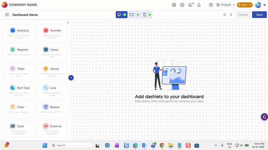
Dashboards support three devices: Desktop, Tablet, and Mobile. The device buttons above the canvas allow you to switch between devices and see how the dashboard appears on each one. This helps users design dashboards that are relevant and usable on different screen sizes.
¶ 1. Dashlet Configuration and Layout by Device
When you add a dashlet to a dashboard, it appears on Desktop, Tablet, and Mobile by default. The dashlet configuration is shared across all devices and cannot be changed separately. Any change made to a dashlet applies to every device, which keeps data and behavior consistent.
While the configuration stays the same, the dashboard layout can be adjusted separately for each device. You can move, resize, and arrange dashlets differently on Desktop, Tablet, and Mobile based on the available screen space.
In Tablet mode, you can also switch between landscape and portrait while arranging dashlets to ensure the layout works well in both orientations and that important information is easy to view.
¶ 2. Dashlet relevance per device
Not all dashlets are required on every device. A dashboard designed for Desktop may include many dashlets, but some of them may not be relevant or necessary on Tablet or Mobile.
Users can configure the dashboard based on device relevance by hiding dashlets that are not useful for a particular device and keeping only the dashlets that matter. This allows users to focus on key information on smaller screens while retaining detailed views on larger screens.
Dashlet visibility can be controlled separately for each device, without changing the dashlet configuration itself.
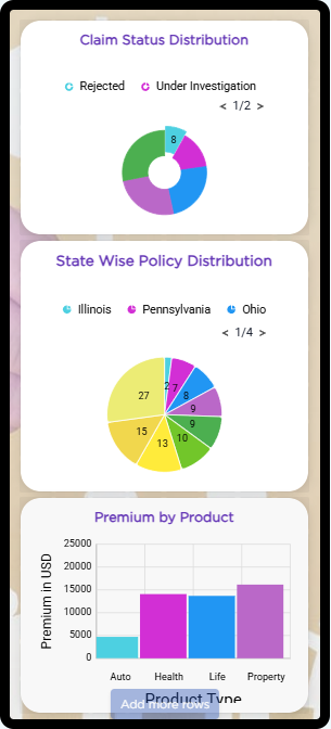
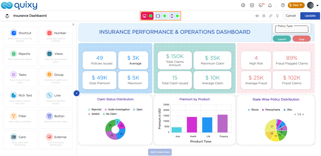
The following table shows how the dashboard layout can be adjusted for different devices by displaying only the dashlets that are relevant for each screen size.
| Device | Dashboard View |
|---|---|
| Desktop |
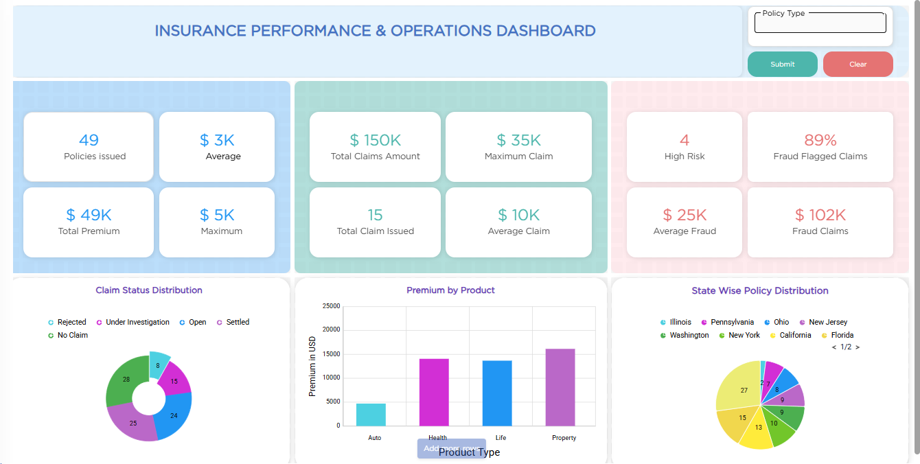 |
| Tablet |
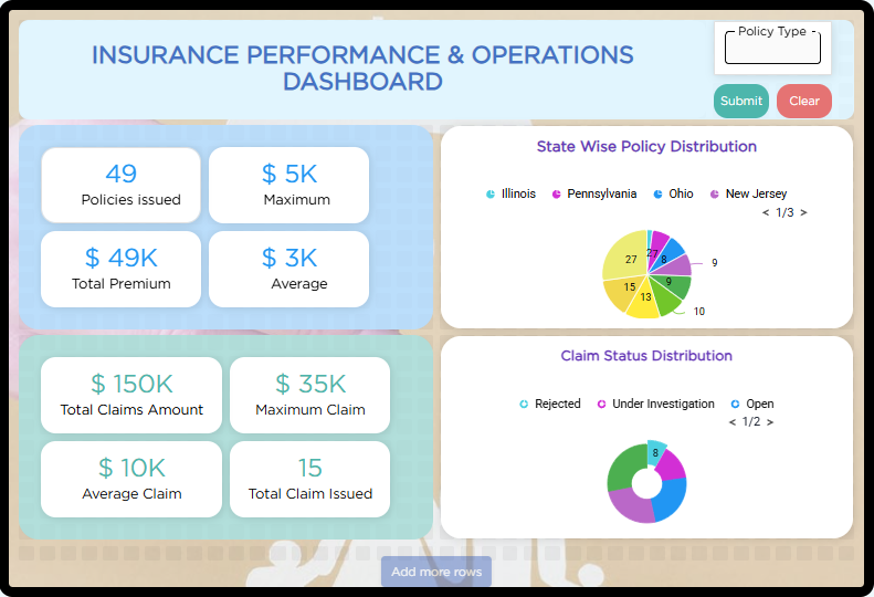 |
| Mobile |
 |
¶ 3. Dashboard visibility by device
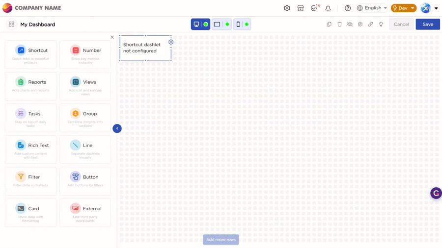
Users can also control whether the entire dashboard should be available on a specific device. Each device button includes a visibility indicator.
- A green indicator means the dashboard is visible on that device.
- A grey or inactive indicator means the dashboard is hidden on that specific device.

This is useful when a dashboard is relevant only for certain devices, such as Desktop and Tablet, and not required on Mobile.