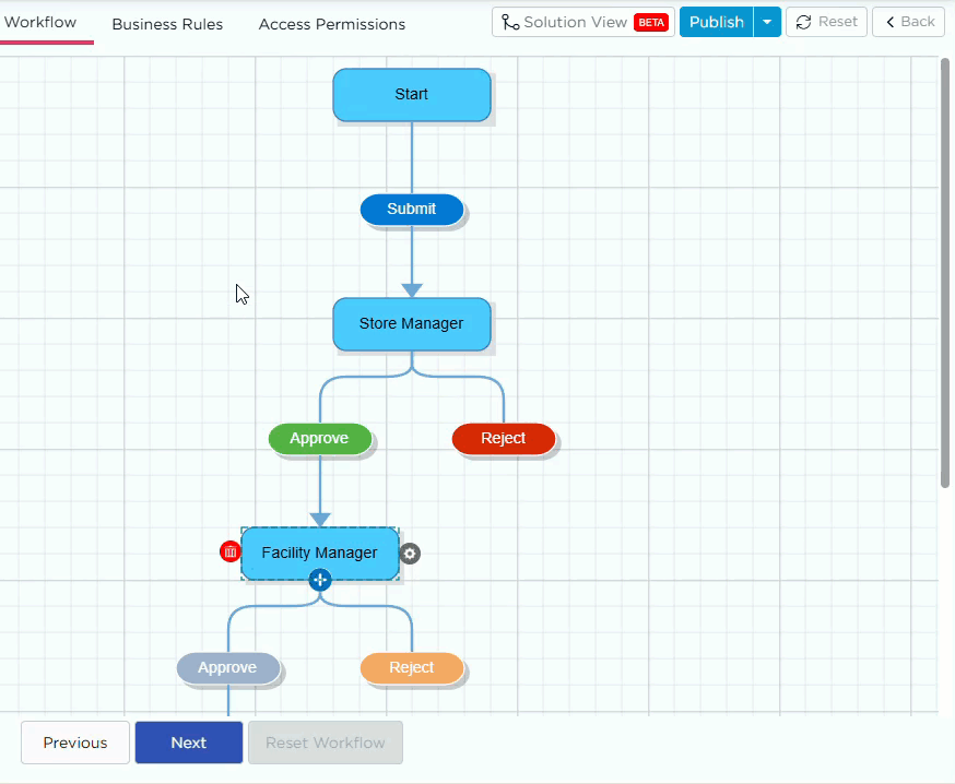
Every workflow step includes actions that determine what happens next — such as Submit, Approve, or Reject.
Each action can have its own set of Action Properties that define its appearance, notifications, and behavior when the action is triggered.
These configurations ensure that each user action performs precisely as intended, communicates effectively to the next step, and aligns with business rules.
¶ 1. Accessing Step Action Properties
- In the Workflow Designer, click on a step action button.
- Under that step, select any action button (for example, Submit or Approve).
- The Properties panel appears on the right side of the screen.
- Use this panel to configure the button’s visual and functional properties.

¶ 2. Step Action Properties Explained
| Property | Description |
|---|---|
| Button Name | The name displayed on the action button (e.g., Submit, Approve, Reject). |
| Button Color | Sets the button’s background color. Helps distinguish between different action types visually. |
| Button Text Color | Defines the color of the text on the button to ensure contrast and readability. |
| Enable Step Action Confirmation | When enabled, prompts the user for confirmation before executing the action (e.g., “Are you sure you want to submit?”). This prevents accidental task submissions. |
| Validate using OTP | Requires users to enter a one-time password (OTP) before proceeding. Useful for sensitive or approval-based workflows. |
| Enable Notifications |
Sends notifications related to the selected action. You can enable one or more of the following:
|
| Custom Notification | Allows you to create a custom message for task notifications instead of the default text. |
| Toaster Message |
Displays a short success message (toaster popup) when the action is triggered. You can include dynamic placeholders like: Example: “{{GroupName}} - {{ButtonName}} - {{NextGroupName}} is pending.” |
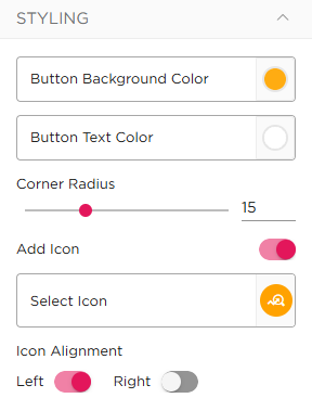
¶ 3. Customize Step Action Buttons
You can customize the appearance of step action buttons to match your application design. To configure a button, select the required step action (for example, Submit). The properties panel displays the available styling options. You can modify the following properties:
| Property | Description |
|---|---|
| Button Background Color | Sets the background color of the button |
| Button Text Color | Defines the text color for better visibility |
| Corner Radius | Controls the roundness of the button edges |
| Button Size (W × H) | Defines the width and height of the button |
| Add Icon | Allows you to add an icon to the button for better visual identification |
These settings are applied to the selected action button and are reflected in the application during runtime.
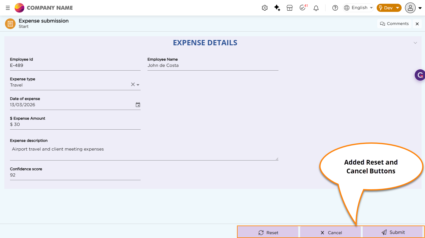
¶ 4. System Default Buttons
System Default Buttons are predefined action buttons provided by the system. These buttons are not part of workflow transitions but help users perform common actions during form interaction. They are configured at the step level from the System Default Buttons section in the properties panel. You can enable and customize the following buttons:
| Button | Description |
|---|---|
| Cancel | Allows users to exit the screen without saving any changes |
| Reset | Clears all entered data in the form |
Once enabled, these buttons appear along with the step action buttons during runtime. You can customize these buttons using the available properties:
| Property | Description |
|---|---|
| Button Background Color | Sets the background color of the button |
| Button Text/Icon Color | Defines the text or icon color |
| Corner Radius | Controls the roundness of the button edges |
| Button Size (W × H) | Defines the width and height of the button |
| Step Action Confirmation | Prompts users for confirmation before performing the action |
Only one Reset and one Cancel button can be added per step.
Refer to the image below to see how Reset and Cancel buttons appear in the application: