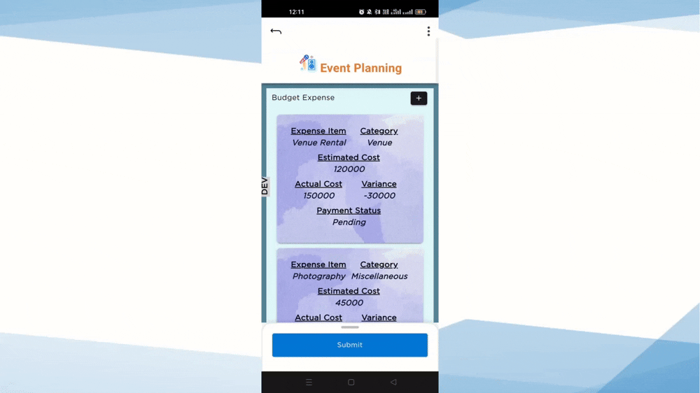
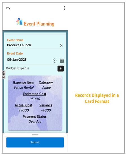
The Card Layout organizes records into individual cards on mobile screens, making it easier to view and interact with records. This layout is optimized for smaller screens and improves data readability.
¶ 1. Choose Card Layout
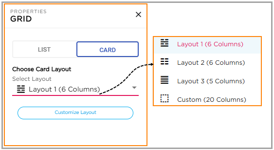
CDs can select the preferred card layout style from the available layout options. The supported card layouts are:
- Layout 1 (6 Columns)
- Layout 2 (6 Columns)
- Layout 3 (5 Columns)
- Custom Layout (Up to 20 Columns)
¶ 1.1 Predefined Layouts
Layout 1, Layout 2, and Layout 3 are predefined layouts. CDs can add or remove columns, but the overall layout structure remains fixed. Columns cannot be reordered, moved, or resized.
¶ 1.2 Custom Layout
The Custom Layout option allows CDs to display up to 20 columns. Columns can be rearranged and resized based on business requirements.
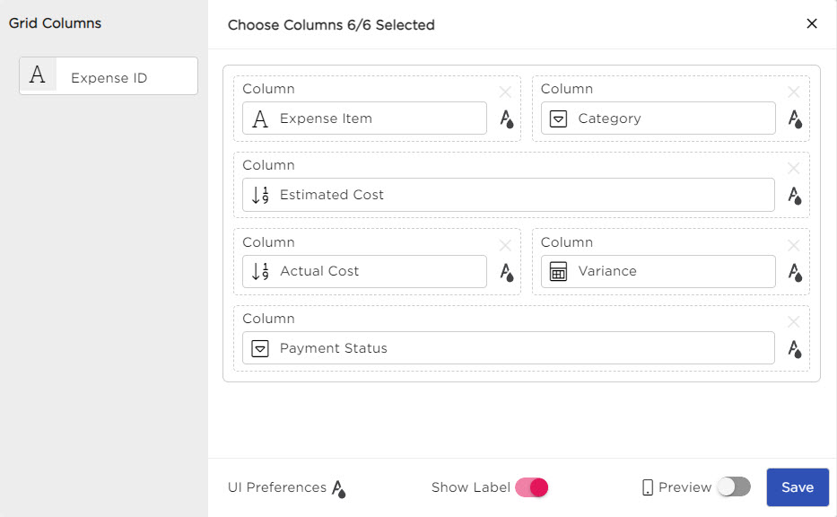
¶ 2. Customize Layout
After selecting a card layout, click Customize Layout to open the customization panel. The customization panel allows CDs to:
- Configure column-level customization
- Modify label and data appearance
- Configure UI preferences
- Preview the card layout
¶ 3. Column-Level Customization
CDs can customize the appearance and behavior of individual columns for both Labels and Data by selecting the UI customization icon corresponding to the required column.
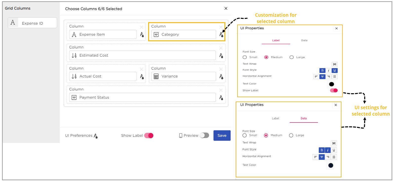
¶ 3.1 Label Customization
The following properties are supported for Labels:
| Property | Description |
|---|---|
| Font Size | Allows CDs to select small, medium, or large font sizes for labels. |
| Text Wrap | Enables label text to wrap within the container for better visibility. |
| Font Style | Allows CDs to apply styles such as Bold, Italic, or Underline to labels. |
| Horizontal Alignment | Aligns label text to the Left, Center, or Right. |
| Text Color | Allows CDs to customize the label text color. |
| Show Label Toggle | Allows CDs to show or hide column labels in the card layout. |
¶ 3.2 Data Customization
The following properties are supported for Data:
| Property | Description |
|---|---|
| Font Size | Allows CDs to select small, medium, or large font sizes for data values. |
| Text Wrap | Enables data text to wrap onto a new line when content exceeds the container width. |
| Font Style | Allows CDs to apply styles such as Bold, Italic, or Underline to data values. |
| Horizontal Alignment | Aligns data text to the Left, Center, or Right. |
| Text Color | Allows CDs to customize the data text color. |
¶ 4. UI Preferences
The UI Preferences section allows CDs to customize the overall appearance of the Card Layout for both Labels and Data.
| Property | Description |
|---|---|
| Font Size | Allows CDs to select small, medium, or large font sizes for labels and data. |
| Text Wrap | Enables text to continue on a new line within the container when content exceeds the available space. |
| Font Style | Allows CDs to apply styles such as Bold, Italic, or Underline to labels and data. |
| Horizontal Alignment | Aligns text to the Left, Center, or Right. |
| Text Color | Allows CDs to customize the text color for labels and data. |
| Background Color | Allows CDs to apply a background color to the card layout. |
| Background Image | Allows CDs to apply an image as the background for the card layout. |
| Show Label Toggle | Allows CDs to show or hide column labels in the card layout. |
| Preview Toggle | Allows CDs to preview the Card Layout on a mobile device before saving the configuration. |
Refer to the following GIF to view the Card Layout experience on mobile devices: