Navigate to the form builder, under Basic Elements category drag and drop the Grid element into the application. Once added, a panel will appear on the right side showing the Grid Properties. These properties are organized into five sections:
- Field Configurations
- Grid Options
- Advanced Grid Options
- Mobile Settings
- UI Settings
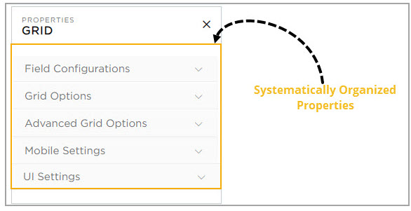
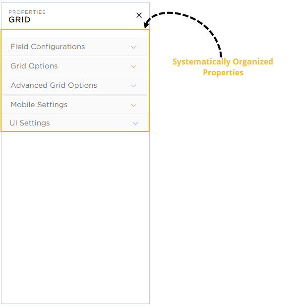
Let’s explore each section in detail, one by one.
¶ 1. Field Configurations
In this section, you can perform the following actions:
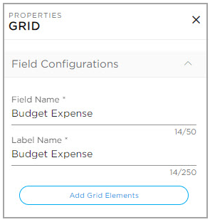
- Field Name: Provide a unique name for the field which is visible for CDs while building application.
- Label Name: Provide a unique name for the field which will be visible for the end-users.
- Add Grid Elements: Use this option to add columns to the Grid.